During a recent visit to the Firefly Trail, a 39-mile rail-trail under construction in Northeast Georgia, I was reminded of how a well-placed piece of beautiful sculpture can enhance a natural setting. Or as the folks at Kingsbrae Garden so eloquently put it “how crafted art and crafted nature can be joined for a beautiful and harmonious spectacle”.
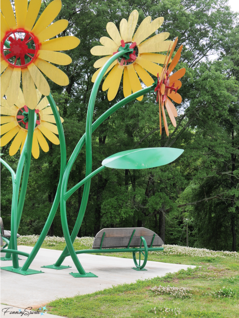
This vibrant sculpture, Trail Blossom, is the amazing work of Rick Herzog.
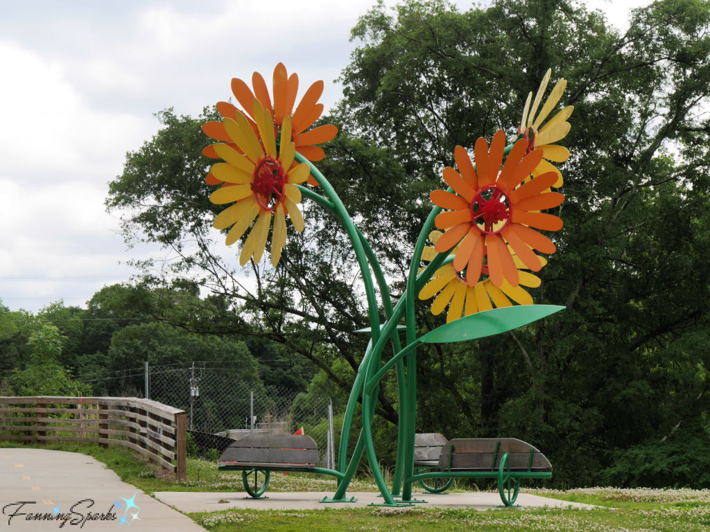
It is located along the Firefly Trail in Dudley Park. It’s a stunning focal point but it also serves as a resting spot for trail walkers and riders. Notice how the leaves create little roofs over the benches…genius!
The Trail Blossom sculpture got me thinking about the outstanding sculpture parks and gardens I’ve had a chance to visit.
Skulpturenpark Köln in Cologne, Germany
One of these parks, Skulpturenpark Köln, featured contemporary sculptures by internationally established artists. I visited in 2009 when we lived in Cologne, Germany. Here are a few of my favorite sculptures from that visit.
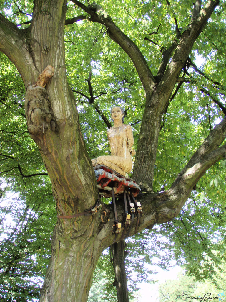
This piece by German artist, Bernd Kastner, is called Menschliche Kӓlte (Human Coldness). The graceful female nude is sculpted from terracotta. I love her unusual placement.
Here’s another memorable sculpture. It’s an untitled work by James Lee Byars who was an American conceptual and performance artist specializing in installations and sculpture. Influenced by Zen-Buddhism, he strived to enable viewers of his artistic work to experience silence and emptiness.
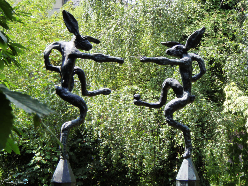
This two-piece work, by Welsh sculptor Barry Flanagan, is called Large Mirror Nijinski. It portrays two hares, mirror images of one another, posed like Vaslav Nijinsky who was a Russian ballet dancer and choreographer cited as the greatest male dancer of the early 20th century.
Cornerstone Gardens in Sonoma, California, USA
The second destination I’d like to share is Cornerstone Gardens in California’s wine country. This ever-changing series of gardens showcases innovative designs celebrating the connection between art, architecture and nature.
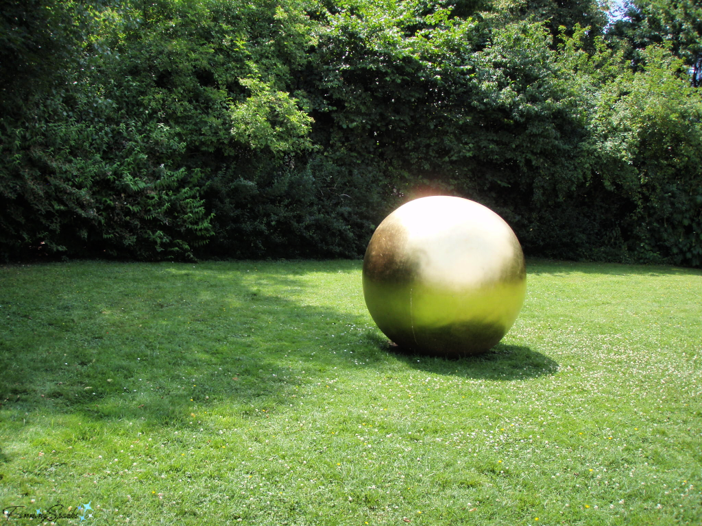
The below setting, Mediterranean Meadow, was designed by John Greenlee. Greenlee is an internationally known horticulturist, landscape designer and author specializing in ornamental grasses. He is a strong proponent of replacing the traditional lawn with natural alternatives. The dramatic, large metal orbs are the work of American sculptor Ivan McLean.
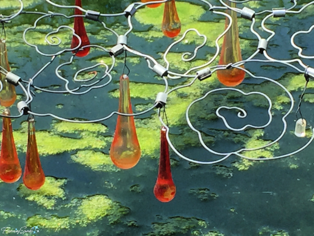
This next installation garden, Red Lantern by Andy Cao and Xavier Perrot, is simply spectacular. It was described as: “an assemblage of Chinese-inspired elements referencing the migrant workers who came to California during the mid-19th century Gold Rush and stayed to build the Central Pacific Railroad. Themes of migration, diaspora and assimilation are at the heart of Cao and Perrot’s creative process where serendipity, imaging and beauty coexist through Incidental Placemaking.”
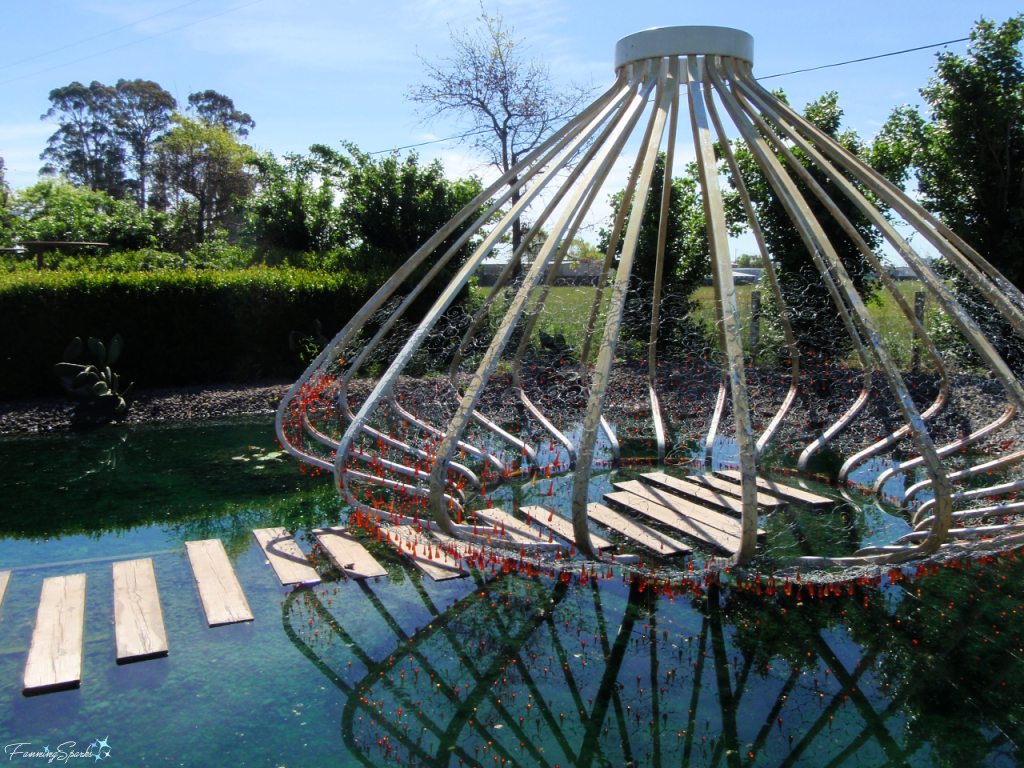
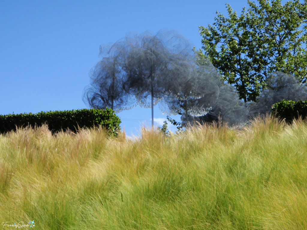
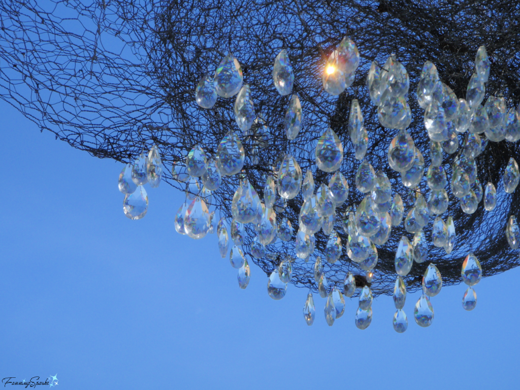
A second work by the same talented team is called Bai Yun (White Cloud). White Cloud is a cumulus cloud sculpted from swirls of wire mesh and hung with clear cut crystals which shimmer “from morning to moonlight”.
Kingsbrae Garden in St. Andrews, New Brunswick, Canada
Kingsbrae Garden, in St. Andrews by-the-Sea New Brunswick, combines art and horticulture to great effect. The Sculpture Garden houses an extensive collection featuring previous winners of the Canadian Sculpture Competition. Here are a few pieces that caught my eye.
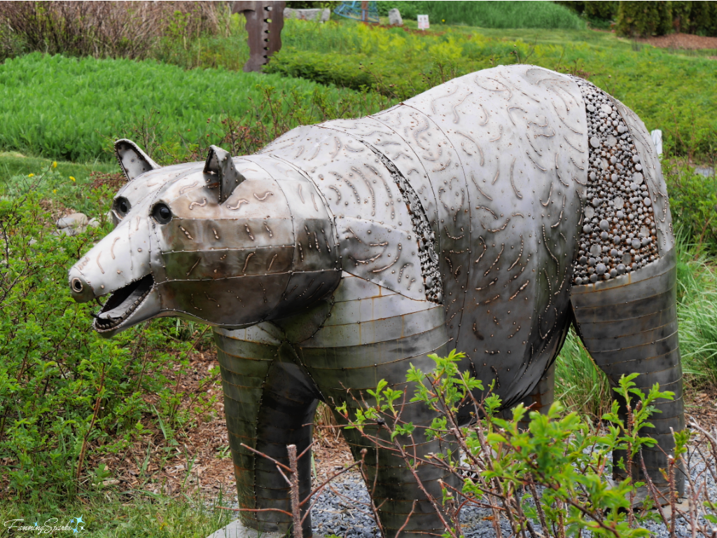
This first piece called Ursus Deux, by Michel Beaudry, was the 2018 Student Choice Award. “It represents the bear as our continent’s mythical symbol of strength and endurance”.
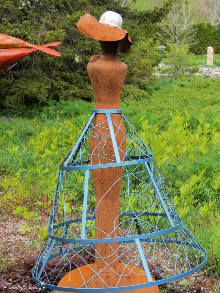
This sculpture by Fiona Legg is another entry from 2018. It’s titled “Excuse Me, Ma’am? You Have a Hole in Your Ozone Layer” and is described as: “Mother Earth is surrounded by a porous ozone layer ‘skirt’ with a noticeable hole in it—just like the hole in the ozone layer in the Antarctica.”
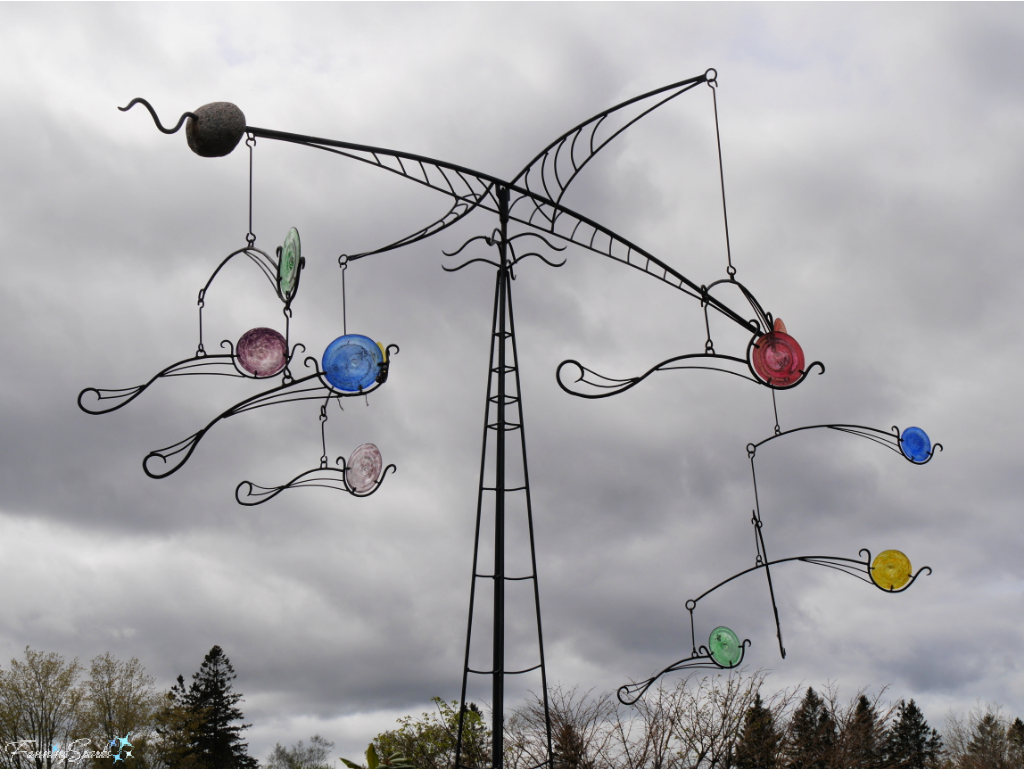
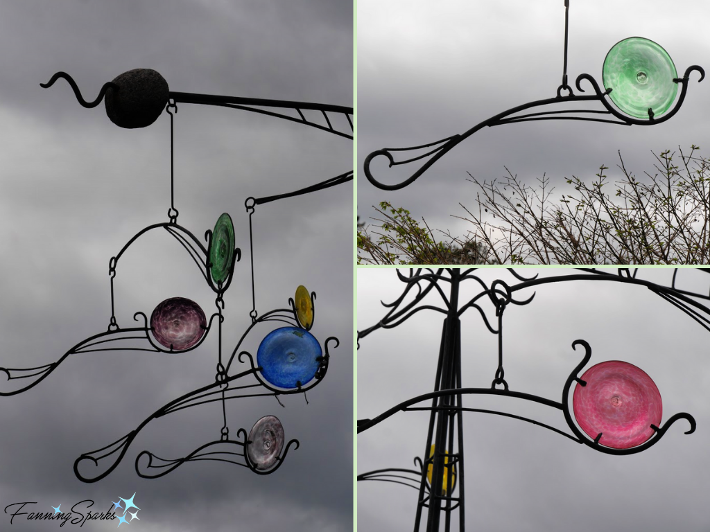
I’ve saved my all-time favorite sculpture for last. Wind Dance is a kinetic glass and metal sculpture by Don Pell. Pell, a Canadian glass blower, sculptor and ironworker, is reported to be particularly proud of the work he did for Kingsbrae Garden. It’s little wonder! Check out this beautiful work of art!
More Info
The Firefly Trail is a planned 39-mile rail-trail from Athens to Union Point in Northeast Georgia, connecting Athens-Clarke, Oglethorpe, and Greene Counties.
The Skulpturen Park Köln in Cologne, Germany presented contemporary sculptures by internationally established artists, in a series of two year exhibitions, since 1997. It appears to be closed until further notice.
Cornerstone Gardens is a cultural and creative haven in Sonoma, California, USA which celebrates the connection between art, architecture and nature.
Kingsbrae Garden is a multi-award winning 27-acre horticultural masterpiece located in beautiful St. Andrews by-the-Sea, New Brunswick, Canada.
The International Directory of Sculpture Parks & Gardens is a great online resource listing sculpture parks, sculpture gardens, outdoor university collections, sculpture trails, and earthworks from around the globe.
Today’s Takeaways
1. “Crafted art and crafted nature can be joined for a beautiful and harmonious spectacle”. Kingsbrae Garden.
2. Outdoor sculpture depicts a delightful variety of subjects in an astonishing array of styles.
3. A sculpture park, garden or trail can be an enjoyable, socially-distanced, outdoor destination.


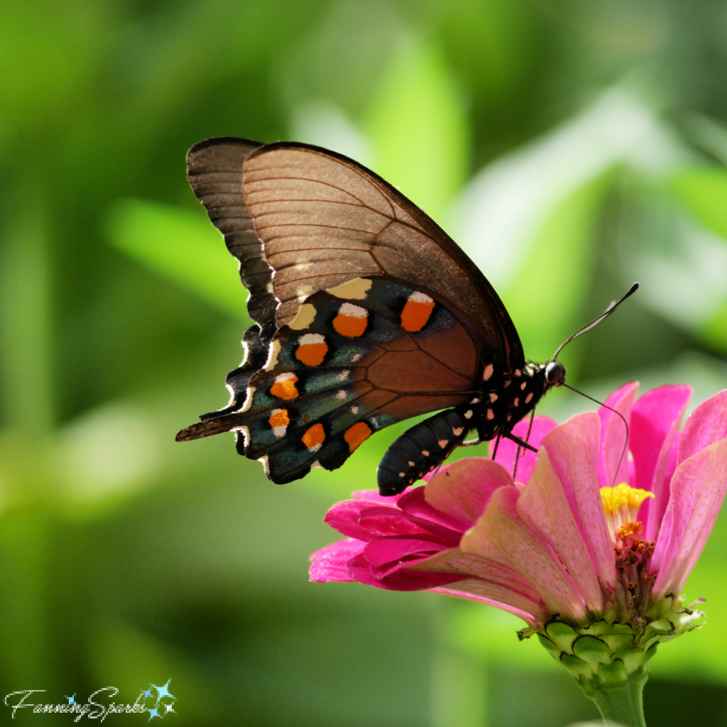
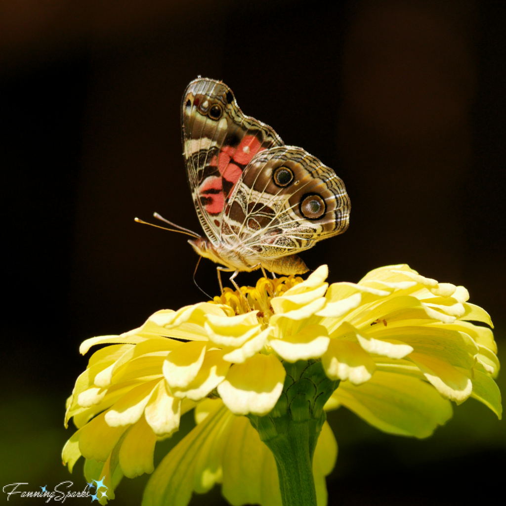 Pictured below is a splendid Gulf Fritillary (Agraulis vanillae) on a purple coneflower. It is sometimes called the “Passion Butterfly”—I assume because the passion vine (Passiflora) is its host plant.
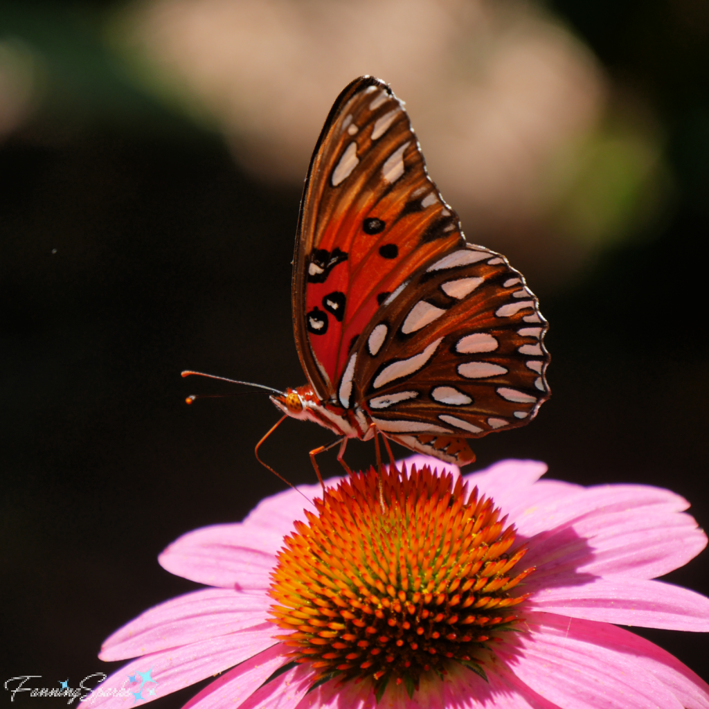 And another shot of the Gulf Fritillary from a different angle.
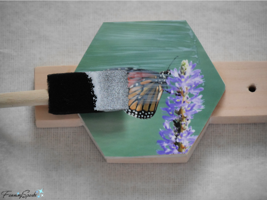
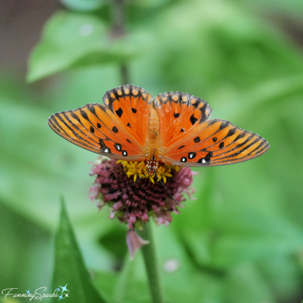 This is the spectacular and much-loved Monarch (Danaus plexippus) on pickerelweed.

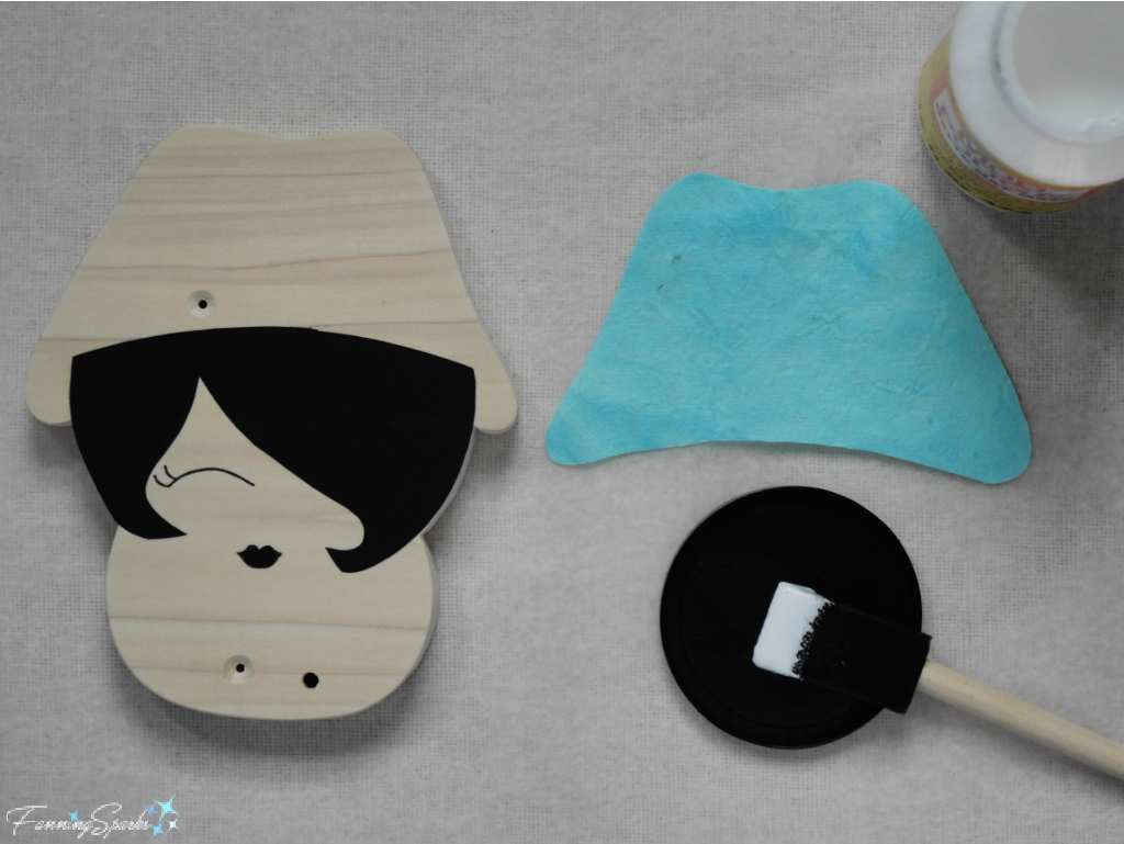
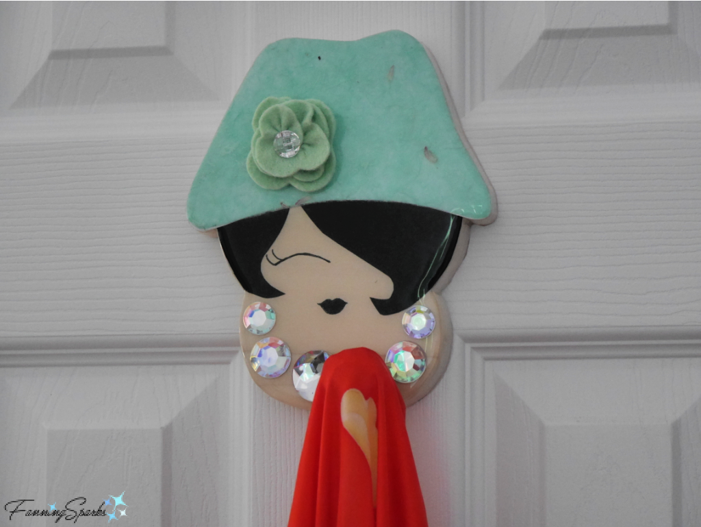
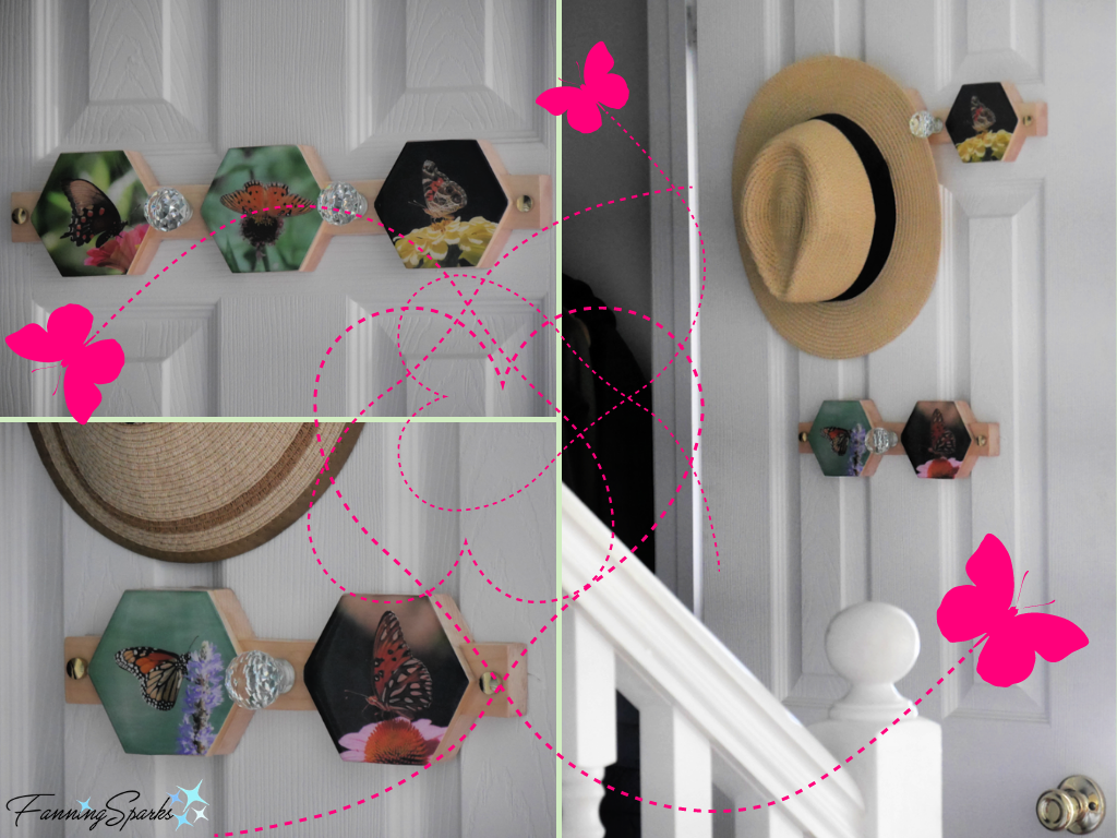
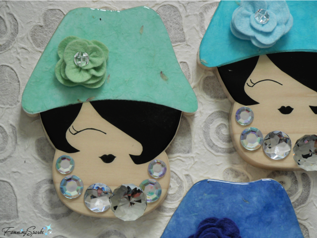 Three of these charismatic faces now inject a jolt of personality inside my clothes closet. They could, of course, be installed in any number of places and be used for a variety of purposes…in a bedroom to hold belts, bags, hats or jewelry…in a bathroom to hold robes or towels…or by the front door to hold bags, keys and face masks. Why not scan today’s DIY tutorial while you think about the perfect spot for your own Sassy Lady Robe Hook?
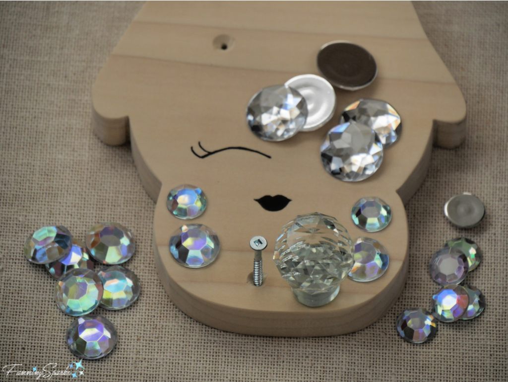
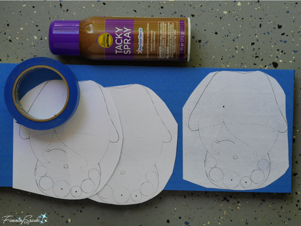
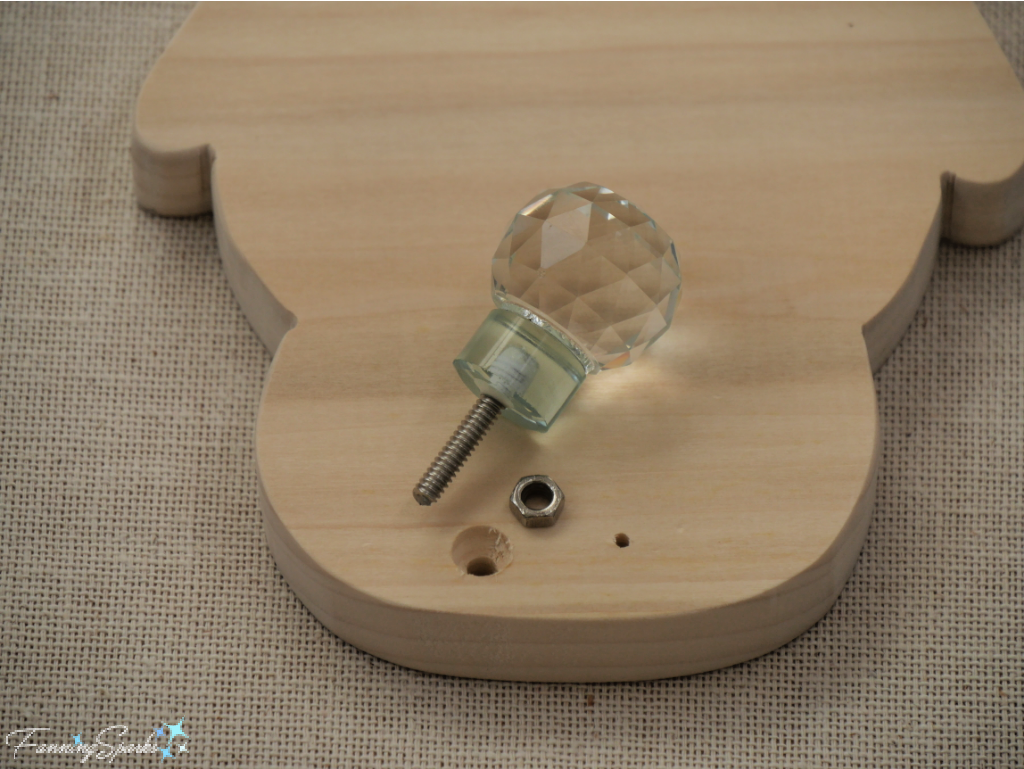
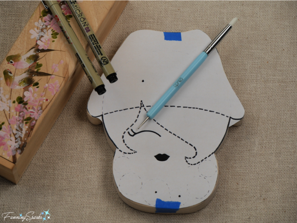
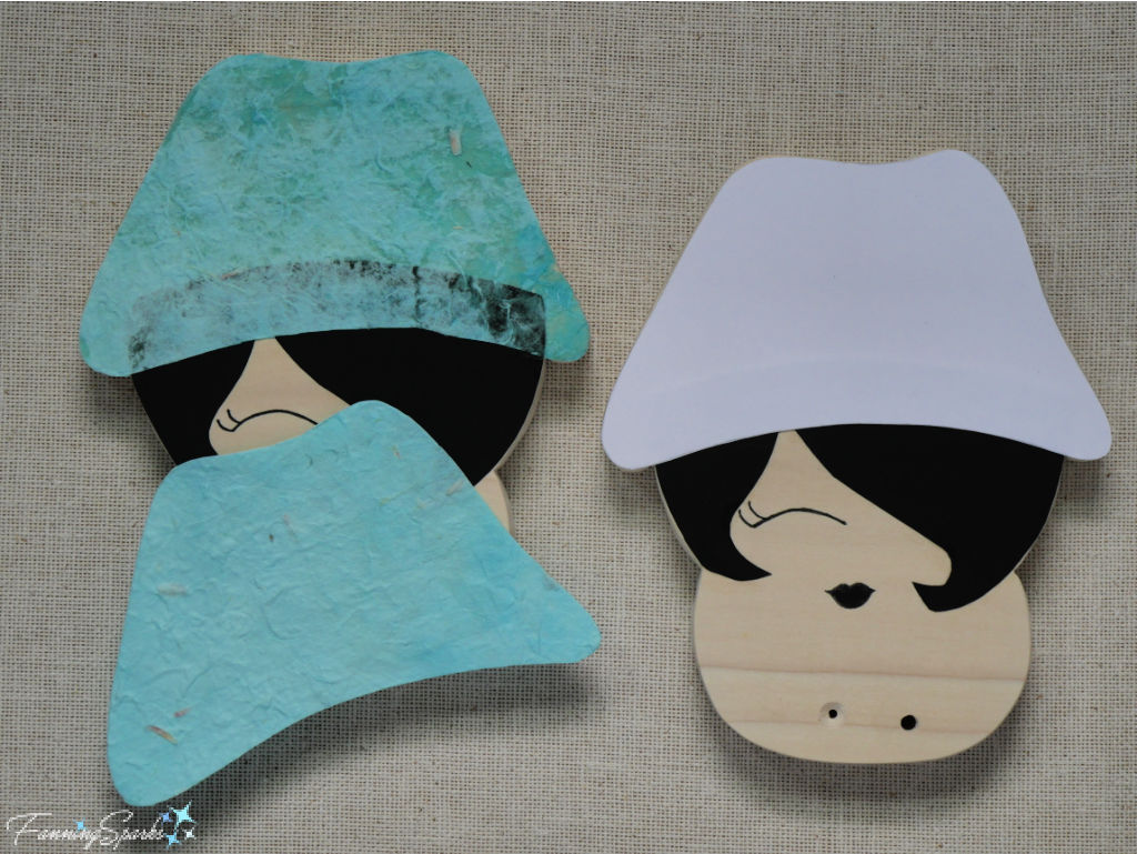
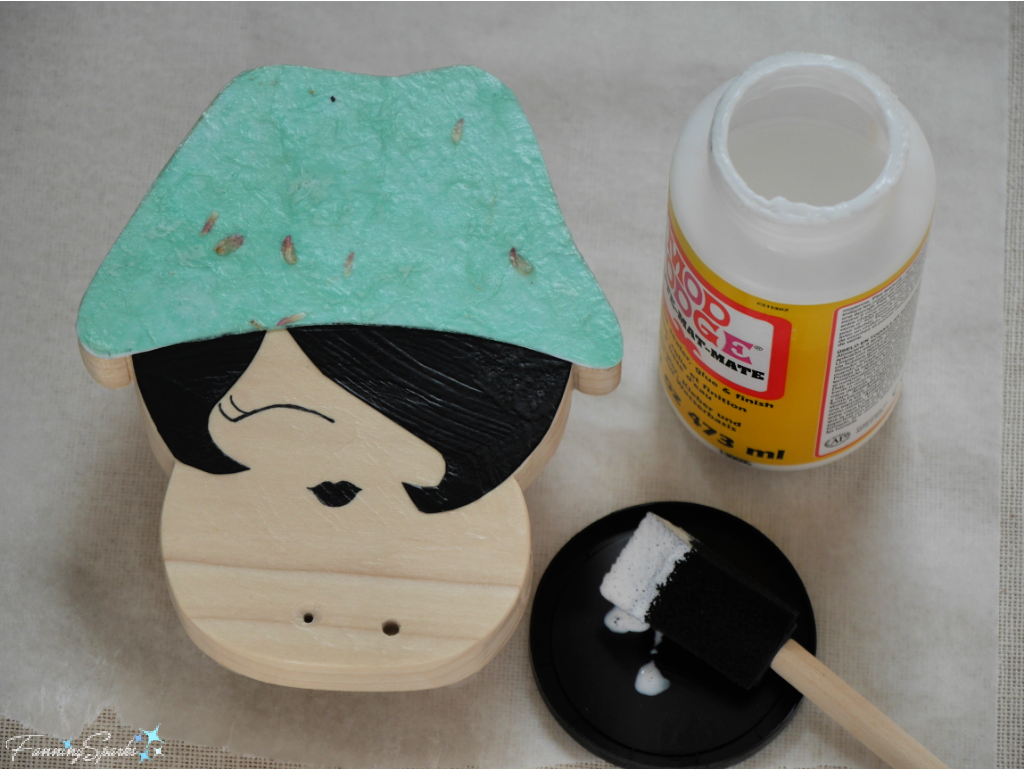
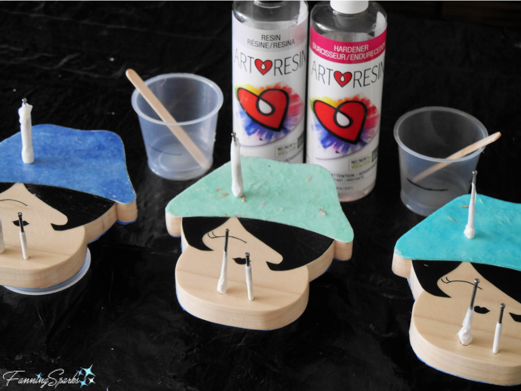
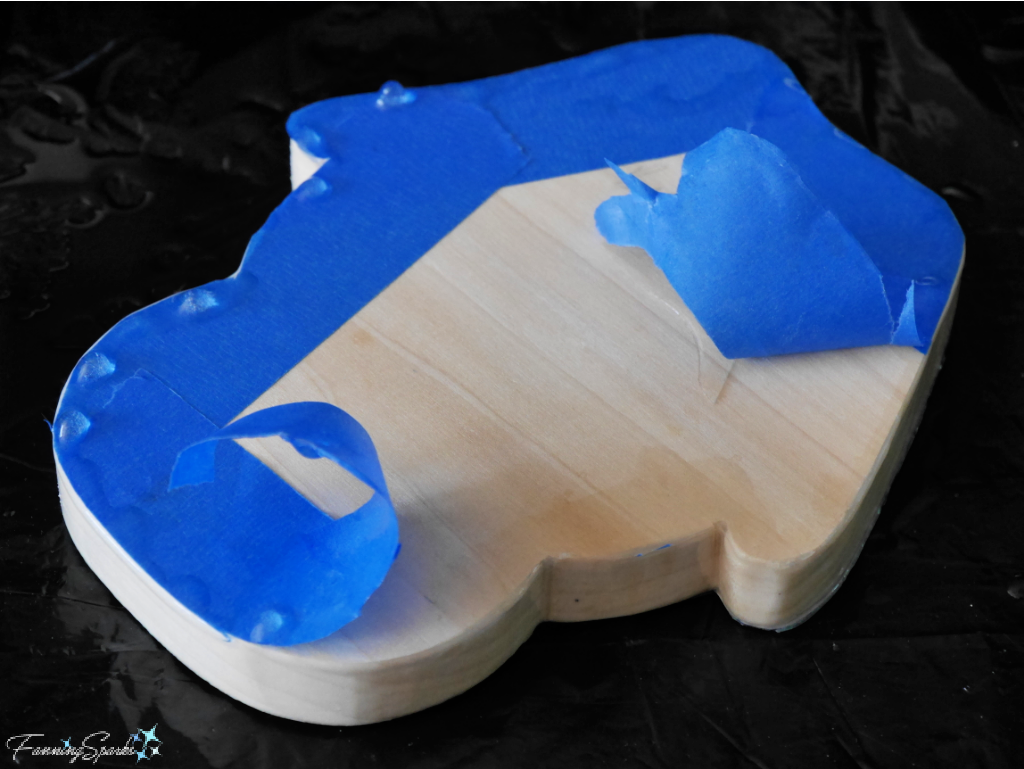
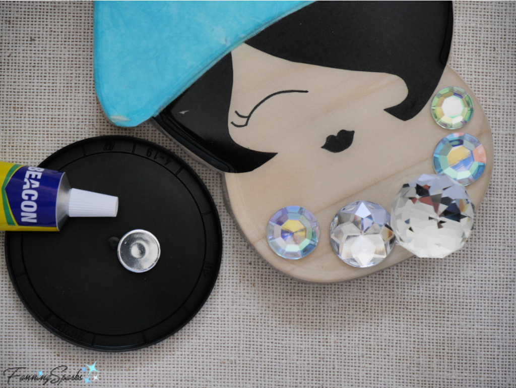
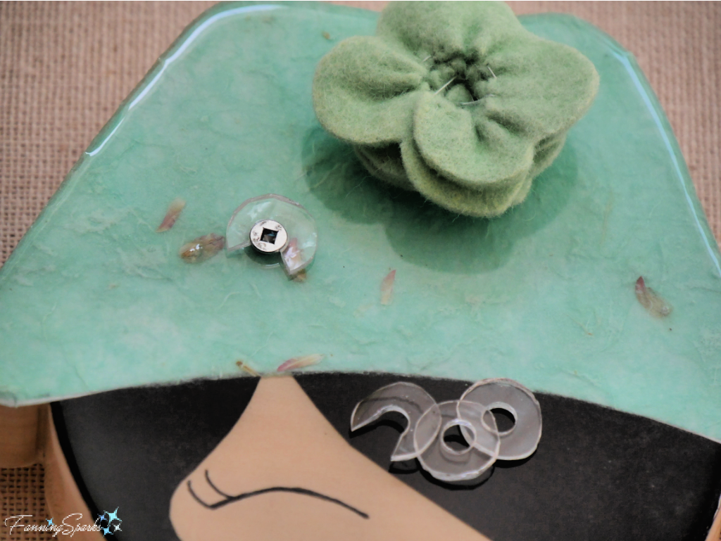
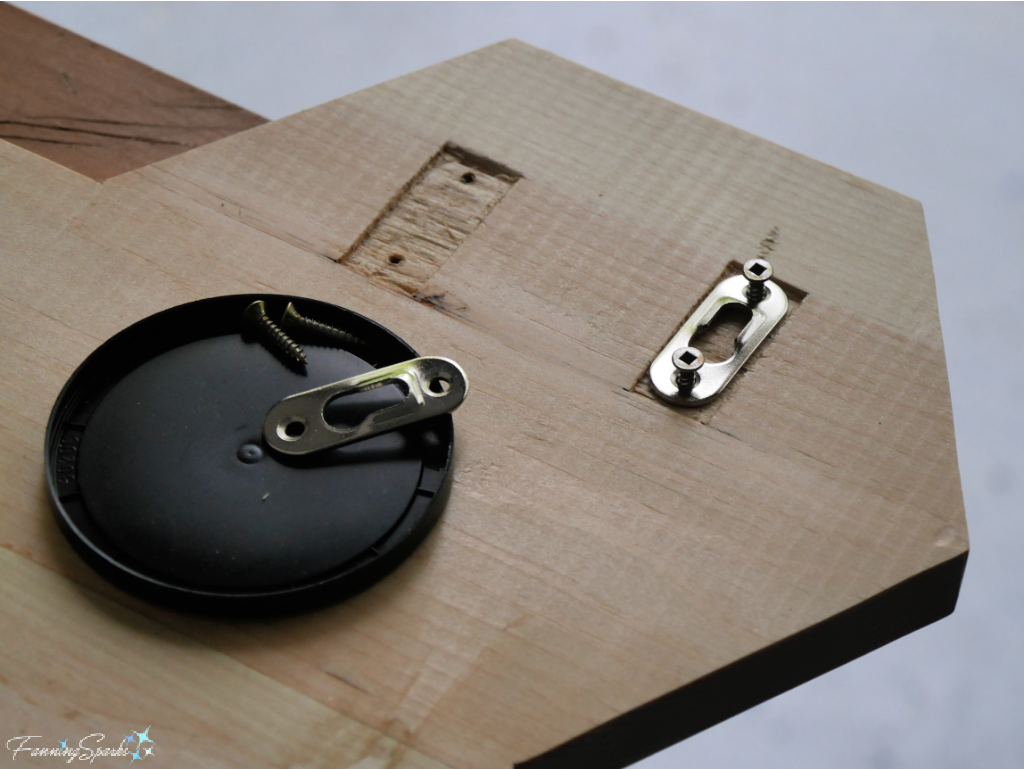
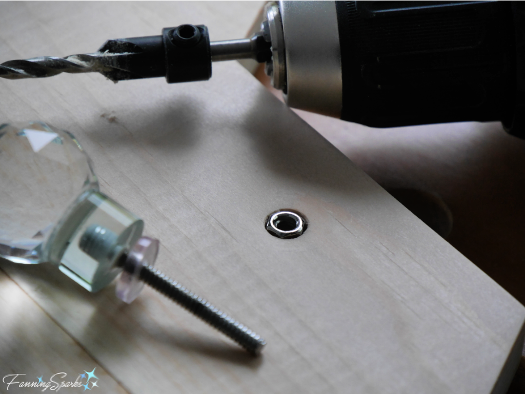
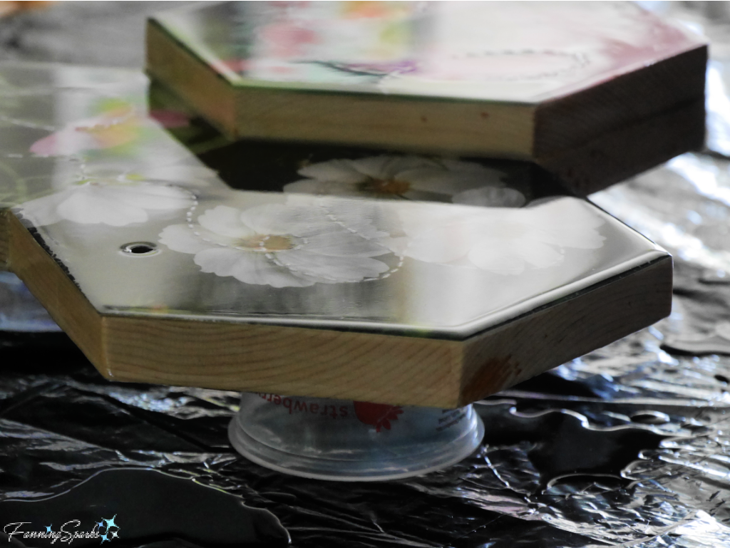
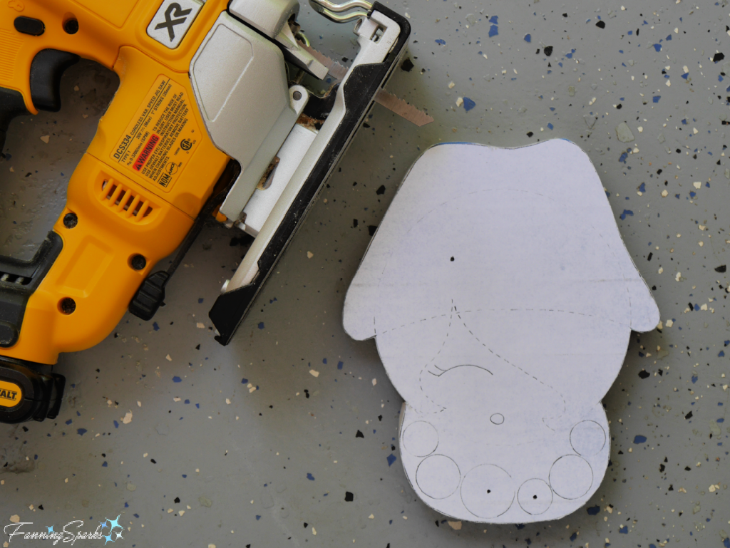 Step 3. Drill Wood Head Mark the 3 spots—1 in the hat and 2 in the bead necklace—to be drilled by indenting them with a sharp-pointed tool. Remove the paper pattern and the painter’s tape. Use a pencil to label the back.