
There’s no shortage of interior decorating advice available online. From well-known, experienced interior designers to DIY enthusiasts, everyone seems to have an opinion to share. They offer beautifully styled photos, detailed step-by-step guides, elaborate reveals, decorating mistakes to avoid, secret decorating tips and guidance on the latest trends. Looking for commonality and searching for guidance that is relevant to a specific situation can be daunting. As a result, I’ve attempted to piece together some of the most helpful decorating advice I could find into this blog post.
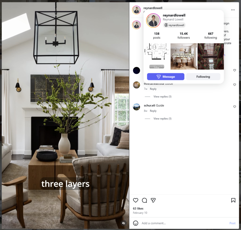
One idea which seems to be popping up frequently is the notion of “slow decorating”. In keeping with the other “slow movements”, such as slow food, slow travel and slow stitching, slow decorating is about enjoying an unhurried process instead of racing towards end results. As interior decorator and popular YouTuber Reynard Lowell puts it “Great design takes time. Allow your space to evolve naturally as you collect items that you truly love. Not every decision needs to be made at once. … You don’t have to rush! There’s no problem with spending years curating your space!”.
Shown below is an example of the work Reynard Lowell shares on Instagram.
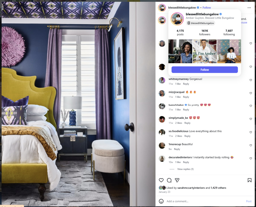
Amber Guyton, interior designer and founder of Blessed Little Bungalow, concurs ― “Interior design is a marathon, not a sprint. Rushing to decorate often leads to regret, buyer’s remorse, and costly mistakes. Take your time”. Now, this is a strategy I can definitely get behind!
Shown below is an example of Blessed Little Bungalow’s work from Instagram.
 Granted, decorating slowly isn’t feasible in every situation. Building a new house, undertaking a major renovation or engaging a professional decorator, for instance, would obviously dictate the timeline for many decorating decisions. But given the option, taking a more measured approach and letting decisions build upon each other would likely be more enjoyable for most amateur decorators.
Decorating slowly allows the space to evolve leading to rooms that feel layered, intentional and inviting. As an added bonus, slow decorating also buys time to incorporate one-of-a-kind, hand-crafted elements – either carefully selected from artisans or created by the decorator/maker themselves.
This custom storage cabinet I recently created for my studio (see Wrapping Up the Storage Bin Mini Gallery Project) could be considered an example of slow decorating. 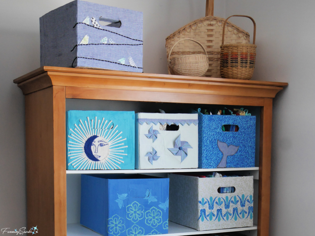 It’s worth clarifying that slow decorating does not mean decorating without a plan. As I see it, it’s just that the plan evolves ― it starts out high level and the details are filled in over time.
Regardless of the speed at which a decorating project is undertaken, the first step is always to define an aesthetic direction. The idea is to identify a visual and emotional personality, or mood, for a space. It may sound intimidating but defining an aesthetic direction is really just about choosing elements and styles which appeal to the homeowner’s personal taste.
A popular way to kick off this process is to gather inspiration using Pinterest. “Pinterest works like a visual search engine” explains Daniel Harris in the article Best Tools for Creating a Mood Board: Canva vs Pinterest vs Adobe Express. “Within minutes you can gather hundreds of references for colors, furniture styles, lighting, or materials.”
In her article, How to Design a Room: The 8 Steps You Need to Know to Create Your Dream Space, prominent interior stylist and TV personality Emily Henderson explains “Go to Pinterest … and pin any room that really draws your eye. … Don’t look at specific pieces as much as the overall vibe. Once you have 40-50 pins, evaluate for commonalities. Maybe they are all full of wallpaper and unexpected furniture, or maybe they are all super calm and neutral. You don’t have to label your style if you can get closer to the general vibe, color palette, and shape of furniture that you are drawn to.”
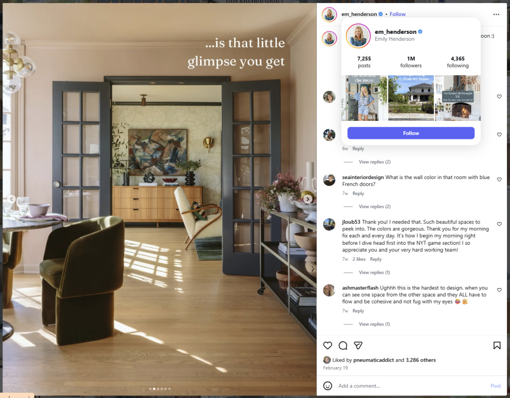
This is an example of Emily Henderson’s work. The full caption for this Instagram post read “One of my favorite design details is that little glimpse you get from one space to another.”
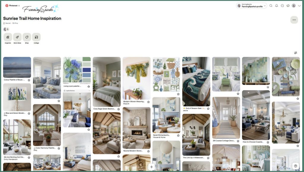
I’m a big fan of Pinterest (see FanningSparks’ public Pinterest boards), so gathering inspiration for the aesthetic direction for our Sunrise Trail Home was a fun exercise. Here’s a look at the Pinterest board in its current state.
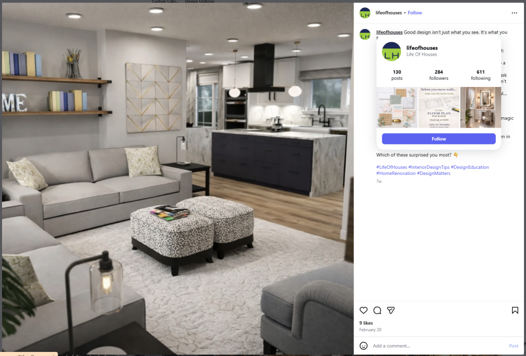
It’s tempting to leap directly from gathering inspiration to gathering actual objects but there are other factors to think about first. For instance, it’s important to carefully consider the functionality of the space. The designers at Life of Houses put it this way: “Design isn’t just about how a space looks — it’s about how it lives. … every project starts with understanding how you move, gather, work, and rest in your home”.
An example of Life of Houses’ design work is shown below.
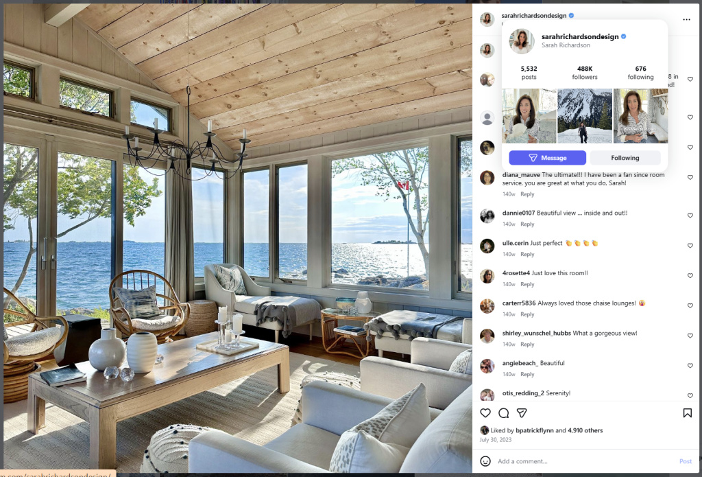
The architecture of the home should also be considered in defining the aesthetic direction. Sarah Richardson, a prominent interior designer, author and TV personality, recommends designing to complement the house’s structure and honour the building’s inherent character. “You don’t want to go ultra-modern if your space has traditional bones“, she advises.
This gorgeous waterfront room is a great example of Sarah Richardson’s style.
Emily Henderson concurs. “Consider your architecture!” she advises. “We always consider the style and era of the house when creating a room. The architecture of your space can help guide you towards a style that will feel symbiotic with your home, but it doesn’t have to be rigid, nor should it. Creating a time capsule or putting on a decorative ‘costume’ isn’t the goal … consider the architecture and what feels ‘right’ without making it all that theme … The key is to weave in a few key pieces that makes it feel like the decorating is cohesive with the design of the home.”
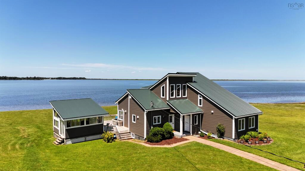
Shown below is a photo of our new-to-us, contemporary coastal home in Nova Scotia. See the previous blog post Hello Sunrise Trail Nova Scotia! for lots more photos. In that same post, I described some of its modern-house characteristics including clean geometry, natural light, open floor plans, neutral colours and natural materials, and integration with outdoor spaces. In light of the advice from the experts, my objective is to incorporate these characteristics into the aesthetic direction for our home.
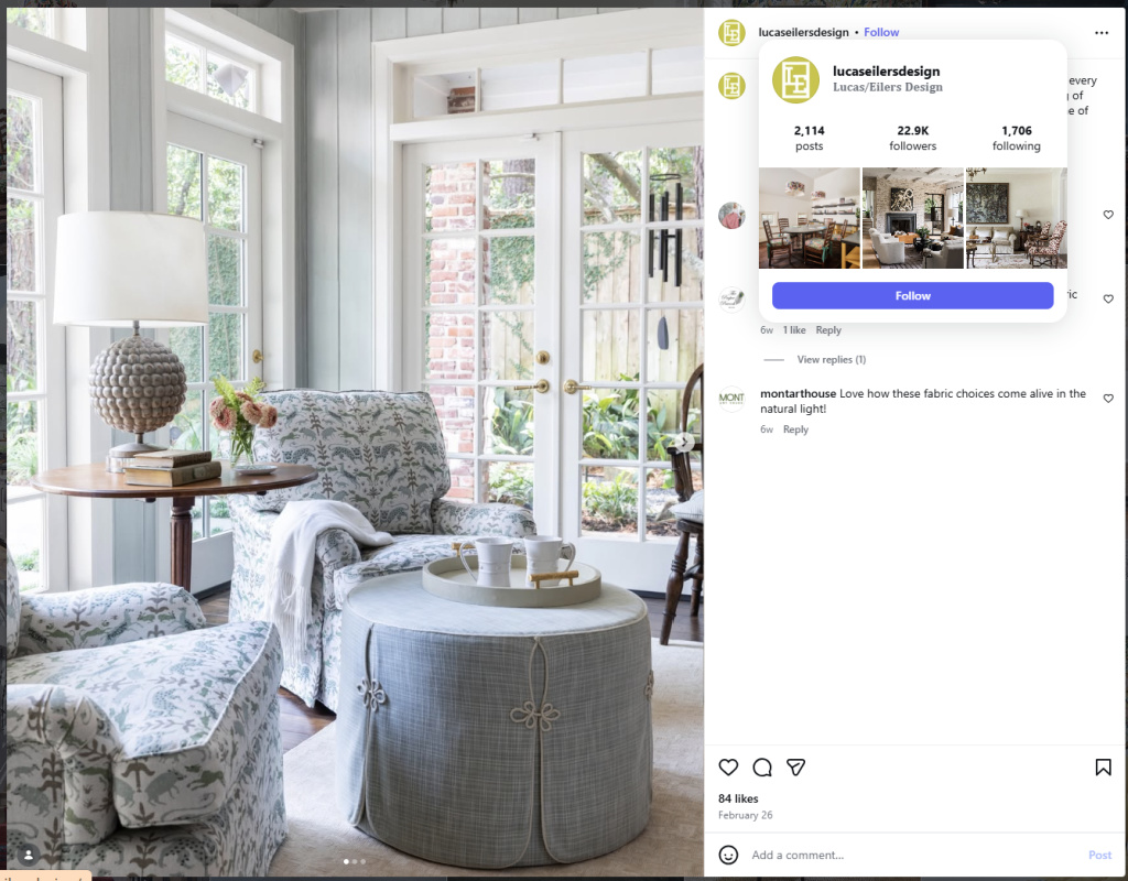
A home’s location may also factor into the aesthetic direction. For instance, as Sandra Lucas, prominent designer, author and co-founder of Lucas/Eilers Design Associates, suggests “Choosing interior colors borrowed from the views is another way to create a connection to the home’s surroundings.”
This is an example of Lucas/Eilers Design as shared on Instagram.
In the article Sarah Richardson’s Top Three tips for Pattern Choice, she explains “I tend to look to the natural landscape for all of my inspiration for palettes and for combinations”. When it comes to mixing cool and warm colours in a room, her advice is to “think of the colour of hay in a field or the colour of sunshine or the colour of clay, those are all warm, earth-toned elements. Then think of the cool elements. Think about water, think about the sky, think about the colour of rain, fog, snow, stone, rock. That’s how I differentiate the palettes.”
“If you can train your eye to see in terms of your natural world, it allows you to create a slightly more subdued palette that is livable, adaptable and definitely something that will stand the test of time.”
Along the same lines, I found this advice from the article 23 Coastal Décor Ideas to Give Your Home a Beachy Vibe—No Matter Where You Live by lifestyle reporter Wendy Rose Gould to be most relevant to our situation: “Coastal scenes evoke a range of blues from both the sky and sea, so consider leaning into that color palette in your home”.
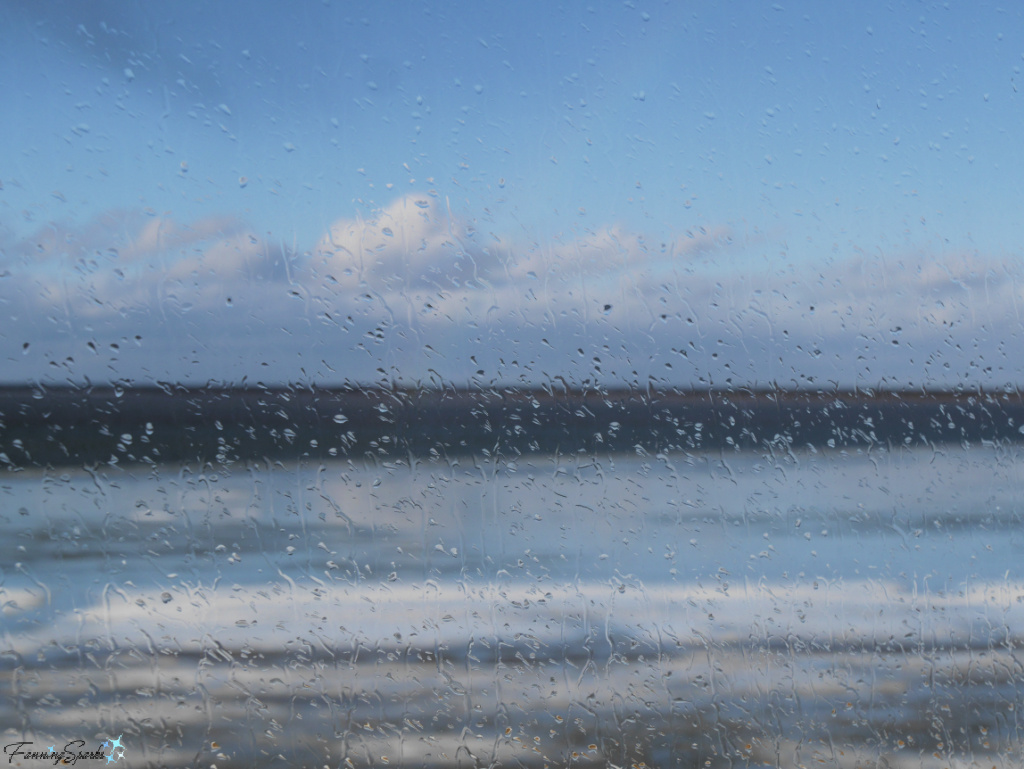
The “range of blues from both sky and sea” which Gould mentions are on full display in our new home. We enjoy beautiful, panoramic views which feature the sea and the shoreline. These coastal scenes vary significantly from season to season but the range of blues ― and greens ― is never-ending.


This photo, taken through a rain-streaked window, blurs the scene and calls attention to the colour palette instead.
Colour is, of course, one of the primary elements in a home’s aesthetic direction. It is also one of the seven basic components of design which are applied to everything from interiors to visual graphics to physical products to fashion.
As interior and spatial designer, Tami Faulkner, explains in her article, How I Use the Elements of Design to Create Beautiful Interiors, “Design elements are the basic components such as line, shape, form, color, texture, pattern, and space. These are the raw materials from which a design is created.”
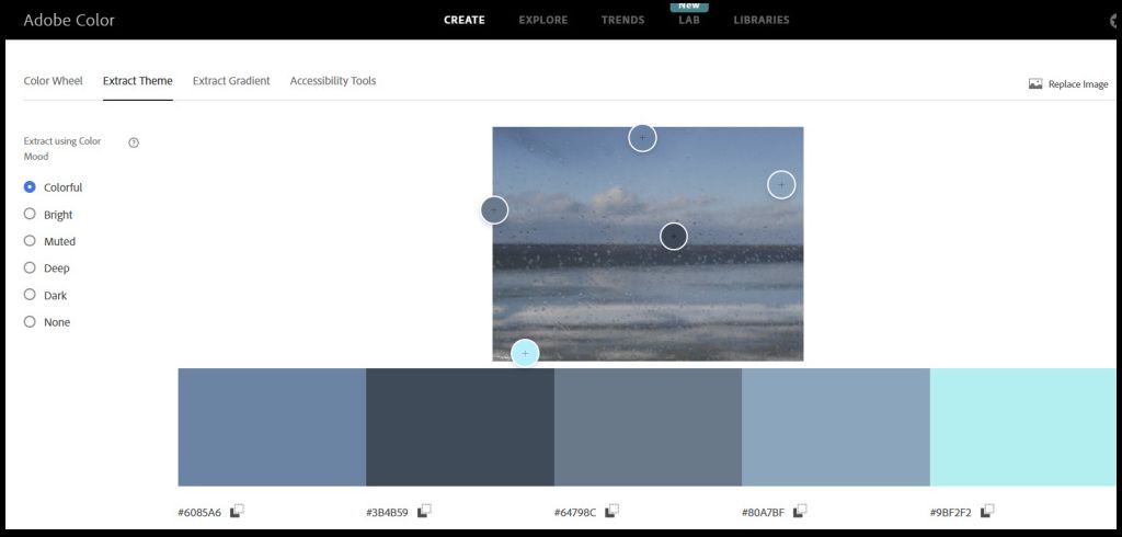
My raindrop-blurred photo was an ideal image to run through a colour palette generator like Adobe Color. I uploaded my photo to Adobe Color > Create > Extract Theme and got the below results. The tool offers a “color mood” option which I set to “colorful”. It’s easy to switch between the colour moods to see variations of the colour palette. It’s also easy to move the colour pucks around to personalize it.
Another factor which can impact a desired aesthetic direction is existing hard finishes such as countertops, wall and floor tiles, carpets and wood floors. In her article When it Comes to Decorating, Skip the Colour Theory: Try This Instead, colour expert/ designer Maria Killam explains: “The rooms in your home that have hard finishes … already have a starting point limiting your colour palette”.
Shown below is an example of Maria Killam’s work on Instagram.
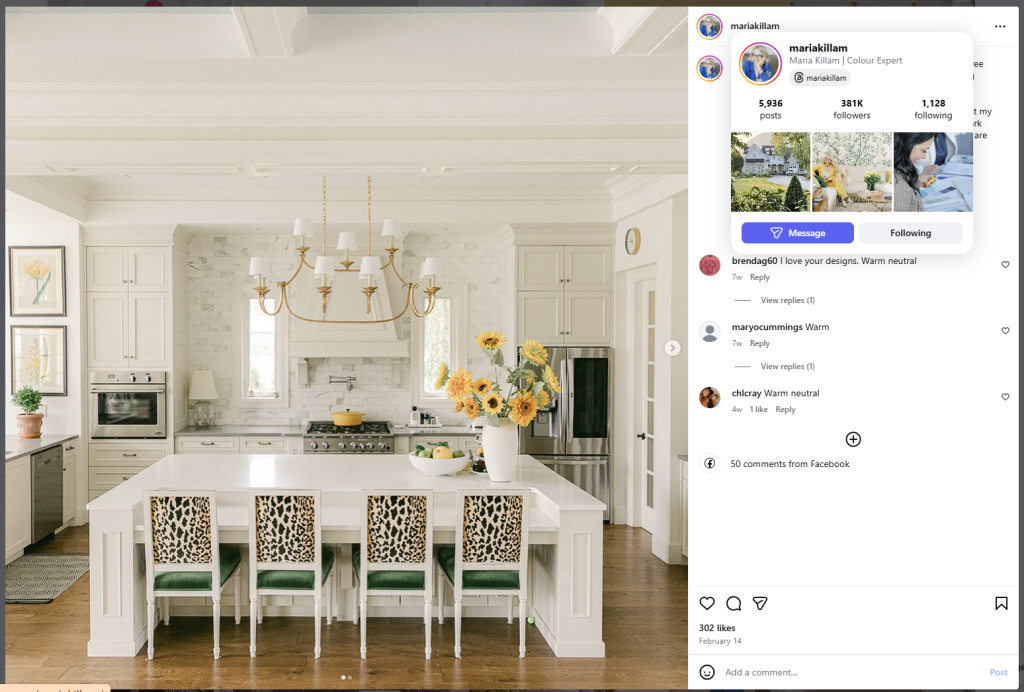
“When you’re creating a colour palette for a room with these types of existing finishes, you need to look first at the colours already there. I call these finishes ‘bossy’ because they dictate which colours you can add, or combine together, for your wall colour and decorating palette.”
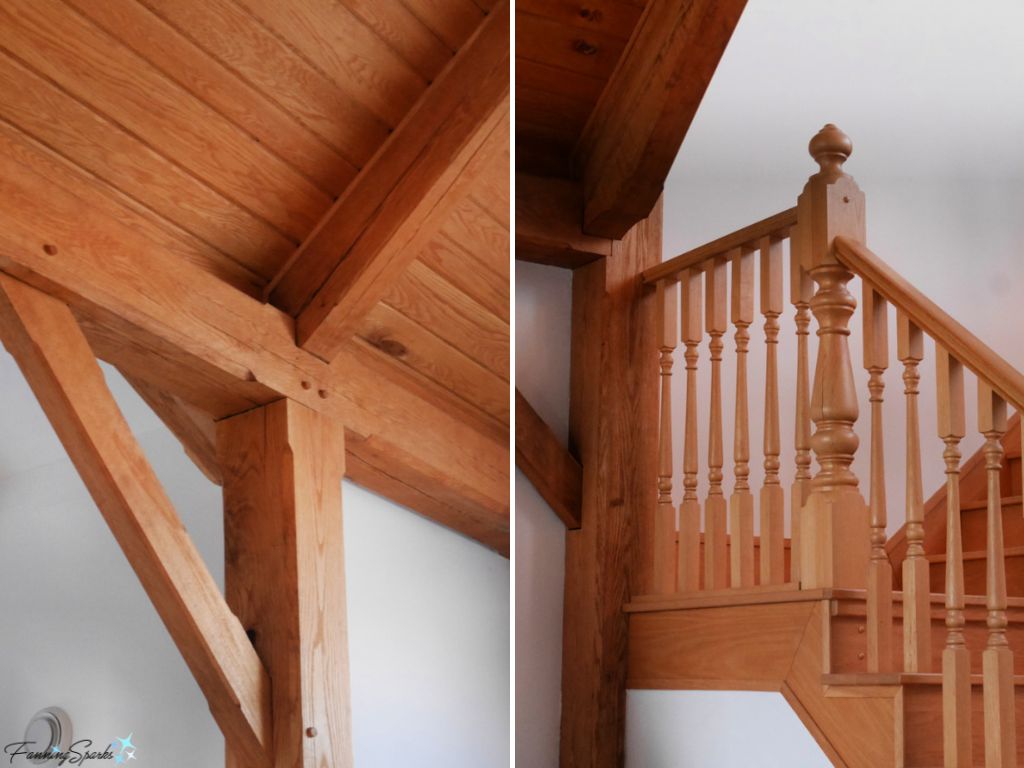
Our new home has a splendid exposed post-and-beam construction, cathedral-style vaulted ceiling and an open staircase ― all in the warm, rich colours and distinctive grain of natural oak. To my eye, the wood is a bossy finish.
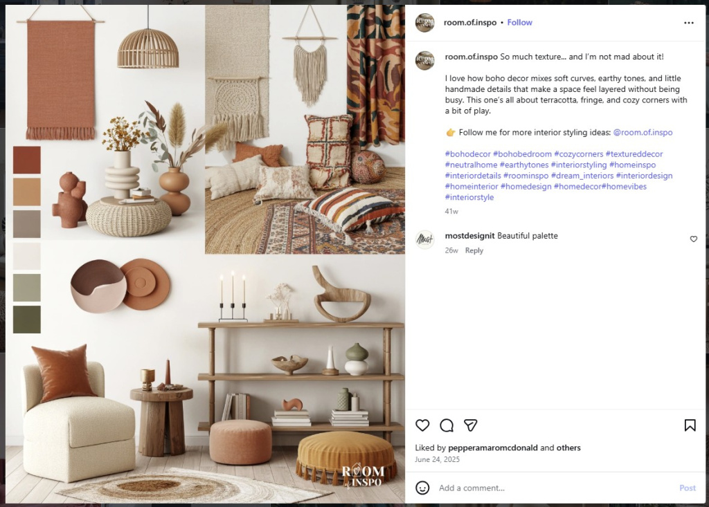
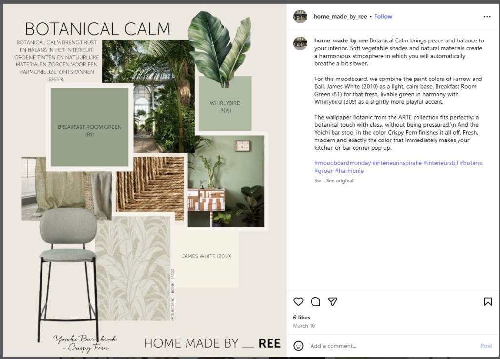
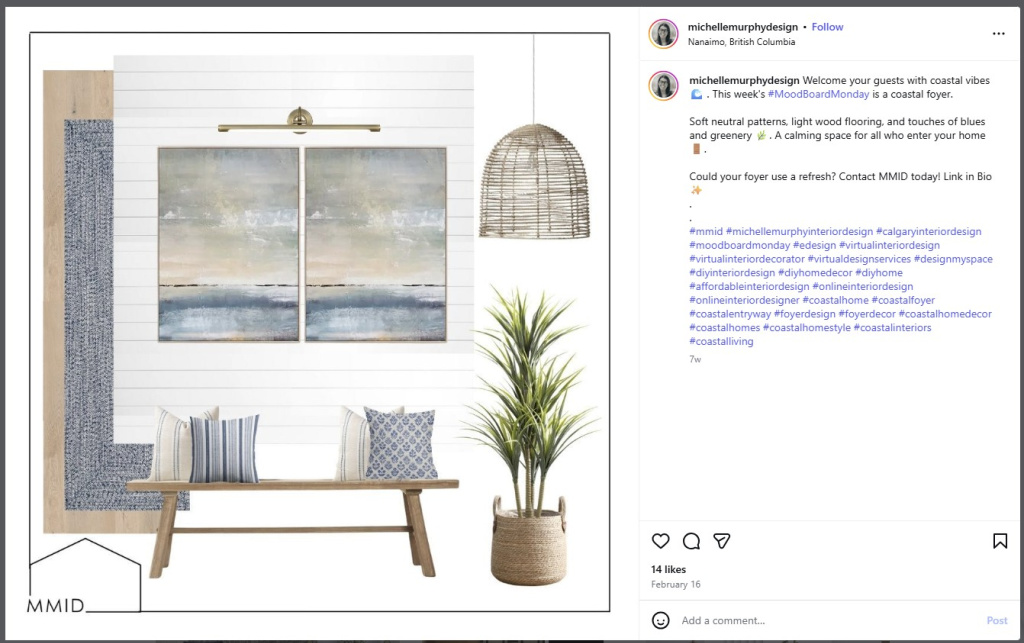
At some point in the decorating process, it’s helpful to start organizing and arranging design elements into a mood board. A mood board is a collage of images and materials, either digital or physical, arranged to help visualize the imagined style, atmosphere and aesthetic for a project.
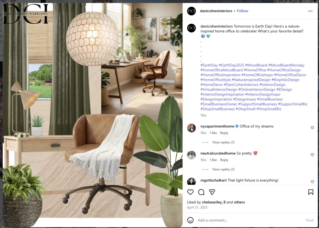
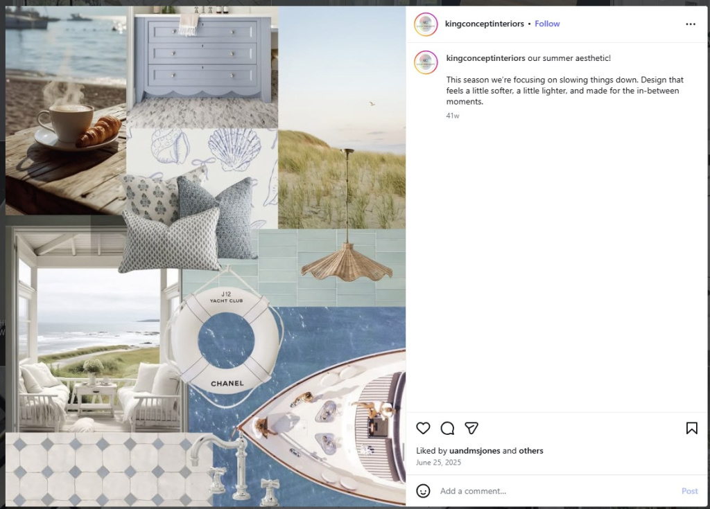
Shown below are a few interesting mood boards I found on Instagram.
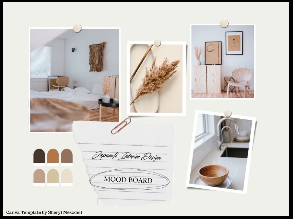
There are a variety of tools and apps which can be used to build mood boards. One of them is a popular, online graphic design platform called Canva. I’ve been using Canva for the blog for years– it’s a great tool for creating graphics like this.

So, I was really pleased to learn Canva also supports the creation of mood boards. Being familiar with the application, it took no time to find some useful templates. Here’s an example.
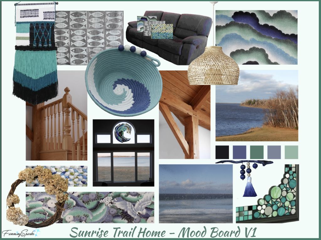
Shown below is my first attempt at a mood board for our Sunrise Trail home. I tried to incorporate as much expert advice as possible while defining the aesthetic direction and creating this mood board. Personal style/mood preferences, functionality, architecture, location, landscape colours and existing finishes were all factored in. I also tried to consider all the design elements, including line, shape, form, colour, texture, pattern, and space.
In addition, I incorporated two aspects which I didn’t find mentioned in any of the expert advice I reviewed ― 1) leveraging significant items we already own (eg furniture and special décor items) and 2) envisioning how one-of-a-kind, hand-crafted artwork could be showcased in the space (eg stained glass window panel and custom printed fabric).
Armed with the advice of various experts and my newly created mood board, I’m off to a nice, “slow decorating” start!
More Info
Previous blog posts mentioned in this blog post include:
. Wrapping Up the Storage Bin Mini Gallery Project
. Hello Sunrise Trail Nova Scotia!
The following interior designers and decorators are mentioned in this blog post:
. Reynard Lowell – see more on Instagram
. Blessed Little Bungalow – see more on Instagram
. Emily Henderson – see more on Instagram
. Life of Houses – see more on Instagram
. Sarah Richardson Design – see more on Instagram
. Lucas Eilers Design – see more on Instagram
. Maria Killam – see more on Instagram
. Room of Inspo – see more on Instagram
. Home Made by Ree – see more on Instagram
. Michelle Murphy Design – see more on Instagram
. Dani Cohen Interiors – see more on Instagram
. King Concept Interiors – see more on Instagram.
The following books and articles were consulted in the writing of this blog post:
. When it Comes to Decorating, Skip the Colour Theory: Try This Instead article by Maria Killam
. Sarah Richardson’s Top Three Tips for Pattern Choice article by The Canadian Press
. Best Tools for Creating a Mood Board: Canva vs Pinterest vs Adobe Express article by Daniel Harris
. How To Design A Room: The 8 Steps You Need To Know To Create Your Dream Space article by Emily Henderson.
. How to Master Mixing Patterns and Fabrics in Your Home article by Tracy Garcia about Reynard Lowell’s approach
. How I Use the Elements of Design to Create Beautiful Interiors article by Tami Faulkner.
The online tools mentioned in this blog post include:
. Pinterest is a popular visual discovery engine and social media platform used to find, save, and organize ideas. Check out the FanningSparks Pinterest boards here.
. Canva is a popular graphic design platform which allows users to create social media graphics, presentations, videos, documents, mood boards and other visual content.
. Adobe Color is a colour palette generator which allows users to extract a beautiful gradient from their own images.
Today’s Takeaways
1. “Great design takes time. Allow your space to evolve naturally as you collect items that you truly love.” Reynard Lowell
2. A mood board is a collage of images and materials, either digital or physical, arranged to help visualize the imagined style, atmosphere and aesthetic for a project.
3. “Design elements are the basic components such as line, shape, form, color, texture, pattern, and space. These are the raw materials from which a design is created.” Tami Faulkner


Comments are closed.