When it comes to decorating my home, one of the steps I enjoy the most is selecting textiles.  There are numerous surfaces that allow me to incorporate color, pattern and texture with fabric and other textiles.  Some examples are upholstery, pillows, seat covers, bedding, blankets, quilts, shades, curtains, tablecloths, runners, towels, rugs and mats.  The best part is the countless options from which to choose.  Whether I shop for ready-made or create my own, this is the perfect opportunity to add personality to our home.

In my previous post, Color Palette by Mother Nature, I shared the idea of looking to nature for color inspiration.  Today, I’d like to take a similar approach with patterns.  We’ll look at several different types of patterns including animal prints, stripes, floral, foliage, geometric and abstracts… all courtesy of Mother Nature.  A pattern is defined as a discernible regularity where elements repeat in a predictable manner.  In the world of interior design and decorating, pattern is used to foster cohesiveness and add interest.  Typically, patterns work closely with color and shape to add continuity to a living space.

Let’s begin with the popular pattern category of animal prints.  I’ll share a few of my all-time favorite photos taken while on safari in South Africa to illustrate these splendid patterns.  This beautiful leopard had the perfect lookout perch.  There’s much to say about this photo (see More Info below) but we’ll just admire those gorgeous leopard spots for today.

Beautiful Leopard on the Lookout. Sighted during African Safari. @FanningSparks

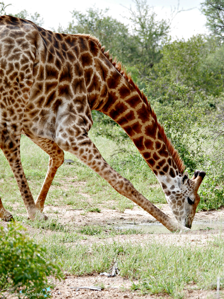
Watching the elegant giraffe lean over to drink is an unforgettable experience.  The giraffe’s spots are another outstanding example of an animal pattern.

Elegant Giraffe Drinking. Sighted during African Safari. @FanningSparks

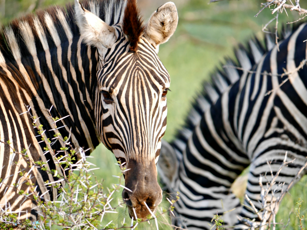
Stripes are a classic pattern.  The zebra’s distinctive black and white stripes are the perfect illustration.

Distinctive Zebra Checks Us Out. Sighted during African Safari. @FanningSparks

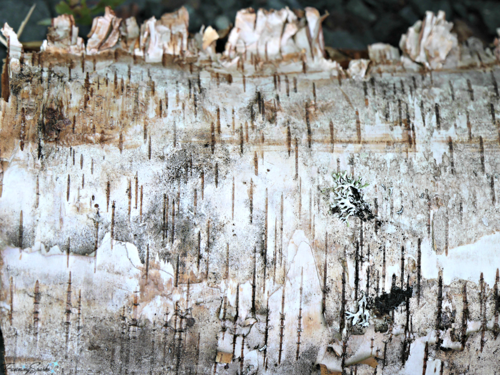
While not nearly as dramatic, this birch bark is another example of the beauty of stripes.

Interesting Birch Bark Patterns. @FanningSparks

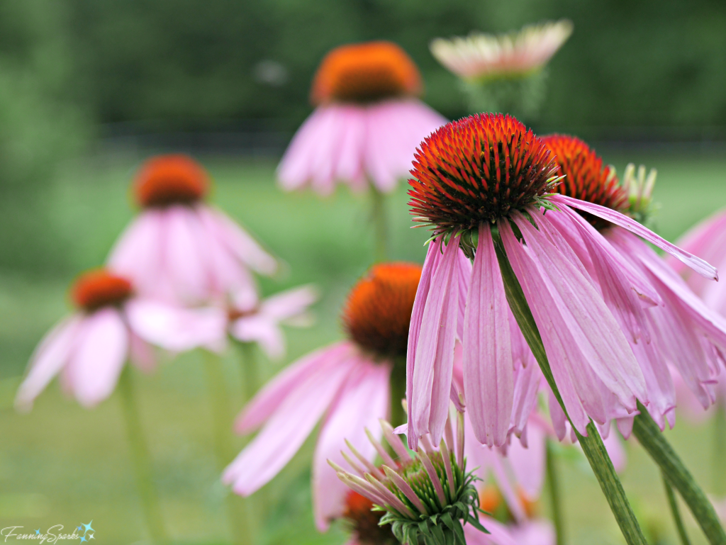
Florals are beloved patterns in surface design.  These purple coneflowers repeat to create a lovely floral pattern.

Grouping of Purple Coneflowers. @FanningSparks

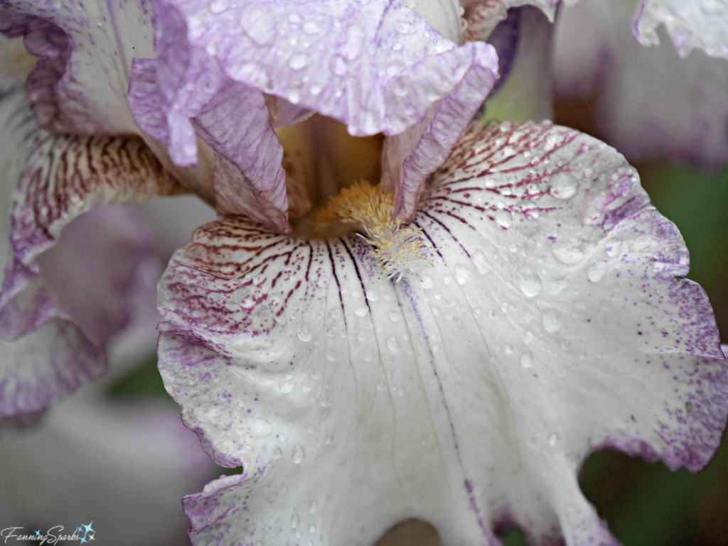
Here a single bearded iris bloom showcases a subtle mix of branching patterns.

Bearded Iris called Autumn Tryst. @FanningSparks

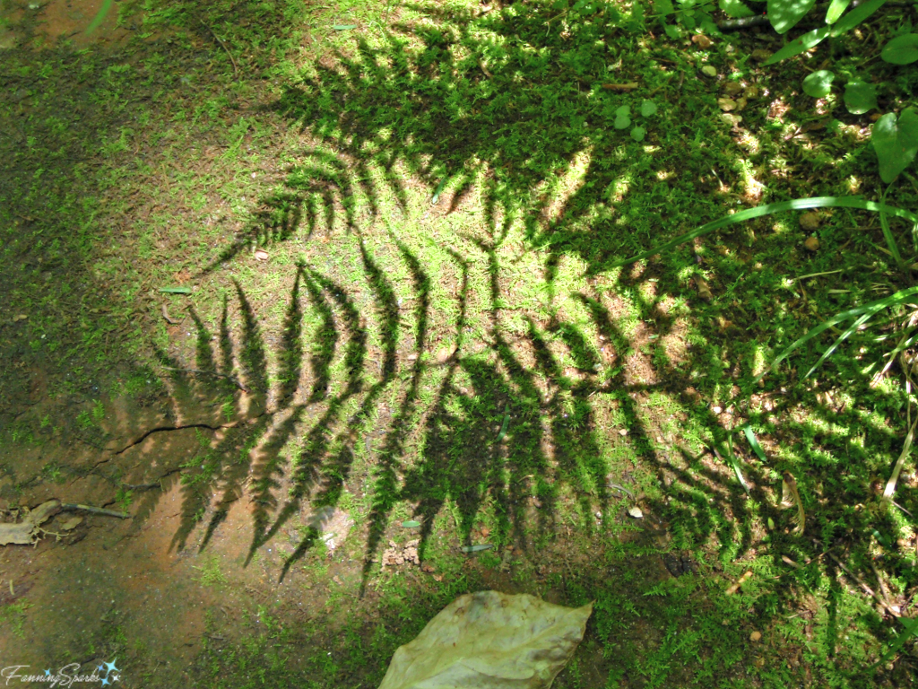
Foliage inspires another category of patterns.  Ferns and succulents, in particular, are very much in vogue.  Here a graceful fern casts intriguing shadows on the moss covered ground.

Ferns Cast Shadows on Moss. @FanningSparks

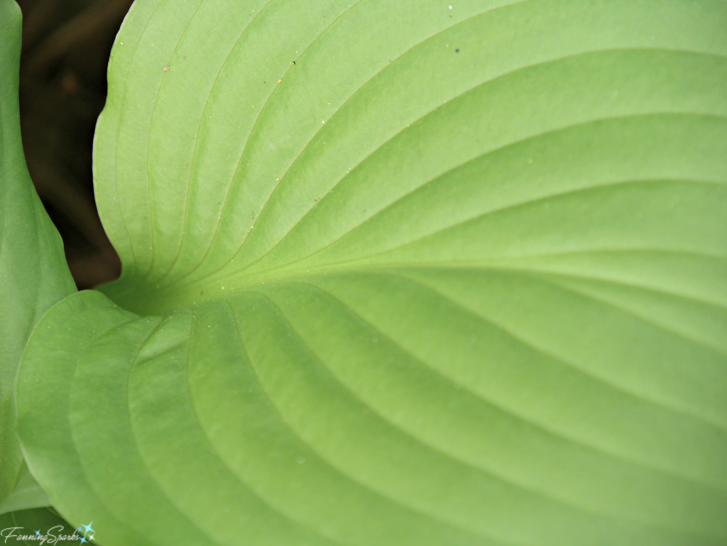
In this close-up, the veins of a hosta leaf illustrate a pleasing branching pattern.

Veins in Hosta Leaf. @FanningSparks

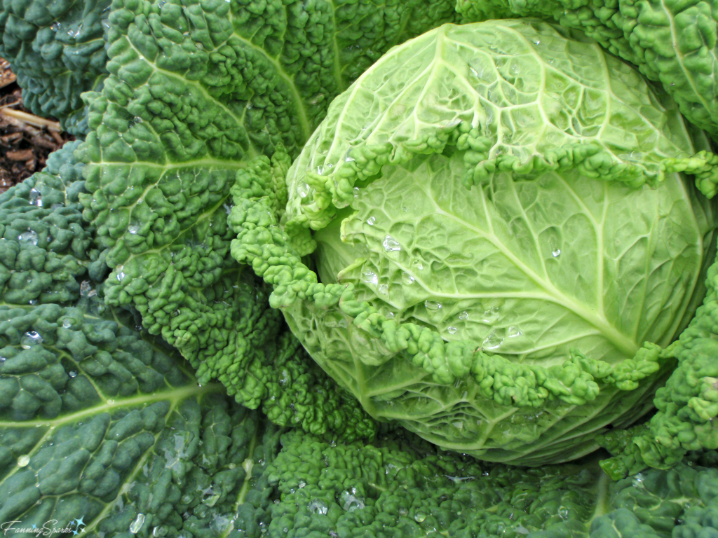
Here’s another example of a foliage pattern.  The distinctive branching pattern, repetition of the curly edging and the bumpy leaf structure all combine to transform the lowly cabbage into a thing of beauty.

Beautiful Patterns in Cabbage. @FanningHead

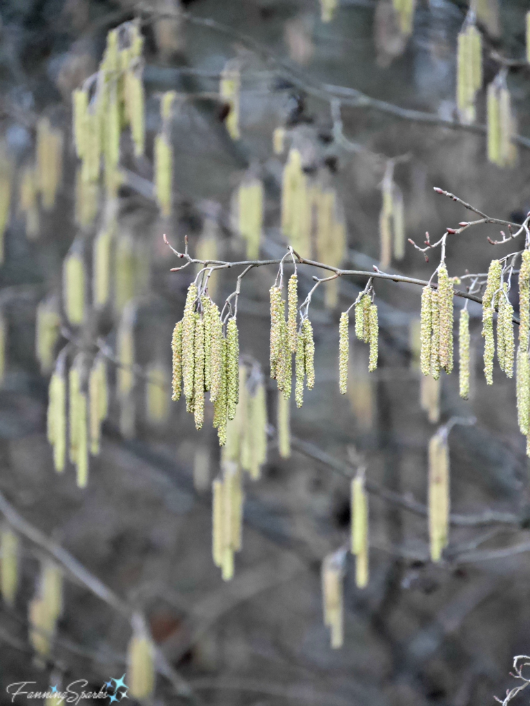
Often the repetition of a simple shape forms a pattern.  These shapes can be geometric or organic.  Here the simple oblong shape of a catkin repeats to form a handsome geometric pattern.

Early Spring Catkins Create Lovely Pattern. @FanningSparks

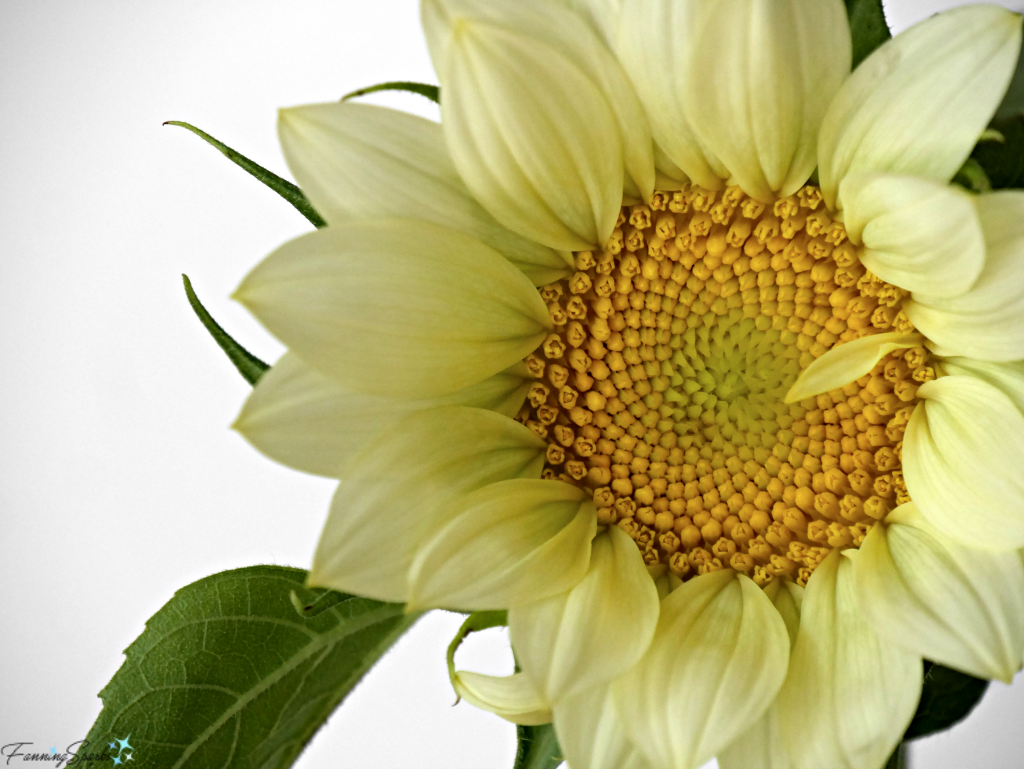
The disk florets in the center of this sunflower create an intricate geometric pattern.  The repetition of the flower petals (more correctly the ray florets) provide another lovely pattern.  I love how that one little wayward petal disrupts the pattern and shakes things up!

Closeup of Soft Yellow Sunflower. @FanningSparks

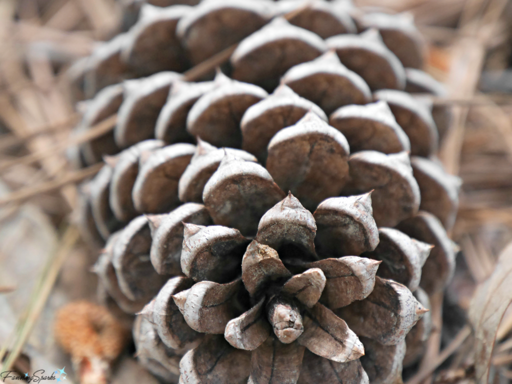
The triangular scales on this pine cone form a familiar geometric pattern.

Closeup Showing Geometric Pattern of Pine Cone. @FannngSparks

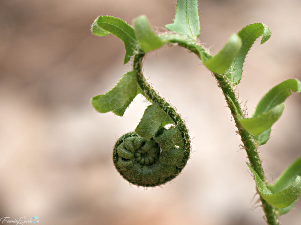
The delicate spiral shape of this fern frond provides another example of a repeating pattern.

Spiral Frond of the Christmas Fern. @FanningSparks

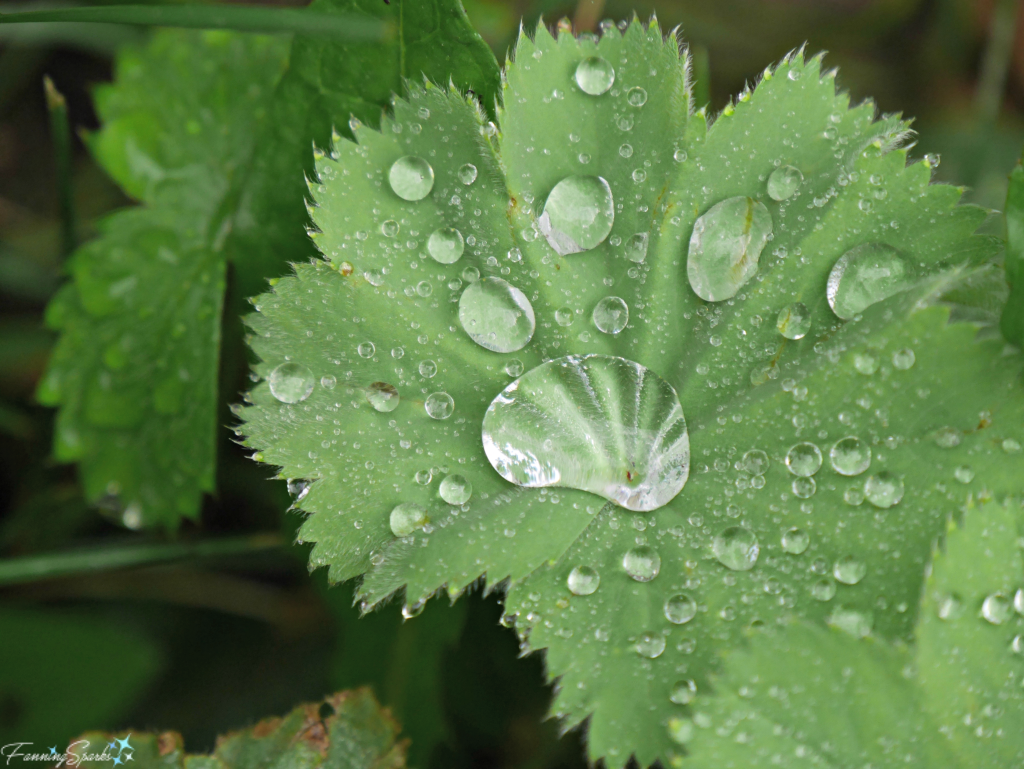
The raindrops on this Lady’s Mantle leaf form an interesting, circular pattern.

Raindrops on Lady's Mantle Leaf. @FanningSparks

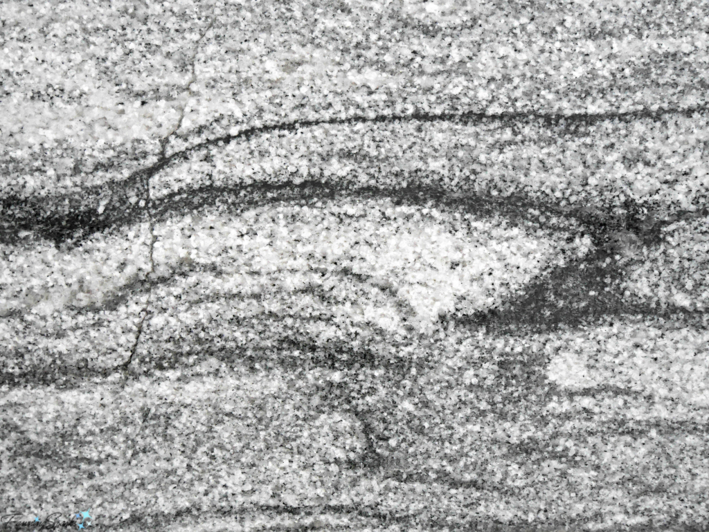
The final pattern category I’d like to include is abstracts.  By definition, abstract is non-representational and does not depict a person, place, or thing in the natural world.  So it would be difficult to draw upon Mother Nature for examples.  But given that we’re simply looking at types of patterns for interior design, I’ll use a looser definition and take the liberty to include these two examples.  The below photo is polished granite with the look of movement.  This is actually our new kitchen countertop in Viscount White.

Granite with Movement on Kitchen Countertop. @FanningSparks

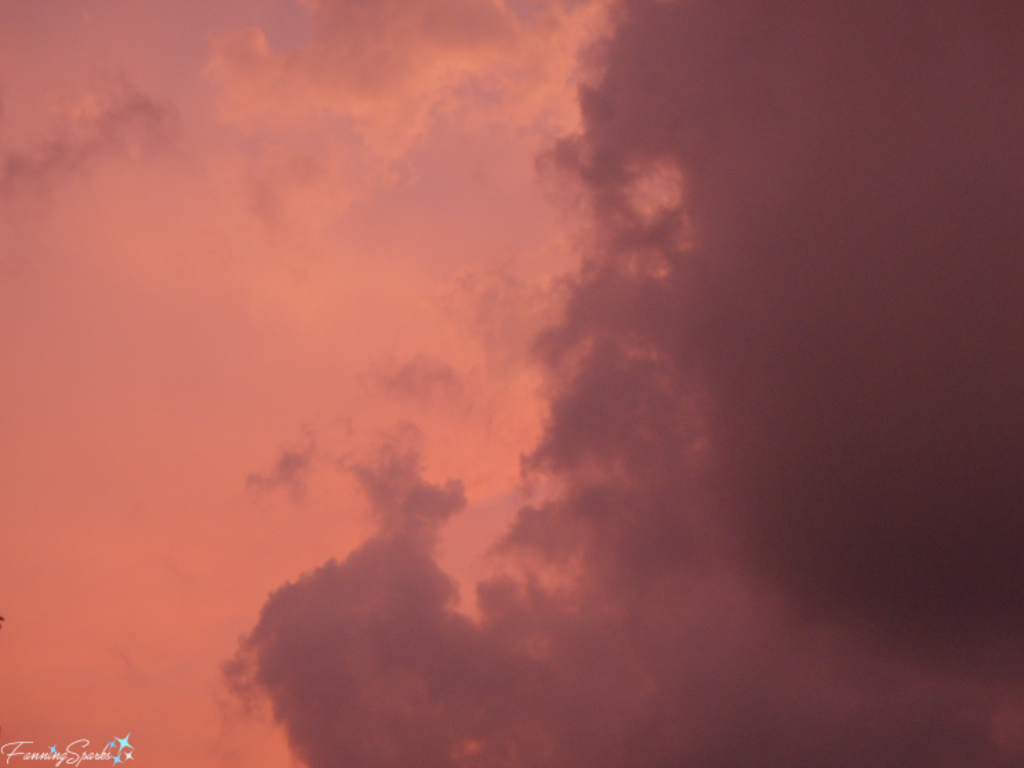
Our final photo is another example of an abstract pattern.  It’s actually clouds at sunset but resembles a watercolor.

Cloudy Sky At Sunset. @FanningSparks

More Info

Color and pattern work together to add life to a room.  See the post, Color Palette by Mother Nature, for more information about inspiring color palettes.
Jan 22, 2019 Update: Check out Texture by Mother Nature for even more decorating inspiration from nature.
May 19, 2020 Update: Form by Mother Nature is the latest post in this series.

In addition to color and pattern, there are 5 more interior design elements.  They are space, line, forms, light and texture.  The Interior Design Academy explains the 7 elements of design must work in harmony to create an aesthetically pleasing interior.

To see more photos and learn about my African safari, see my post on Majestic Lovable Elephants.

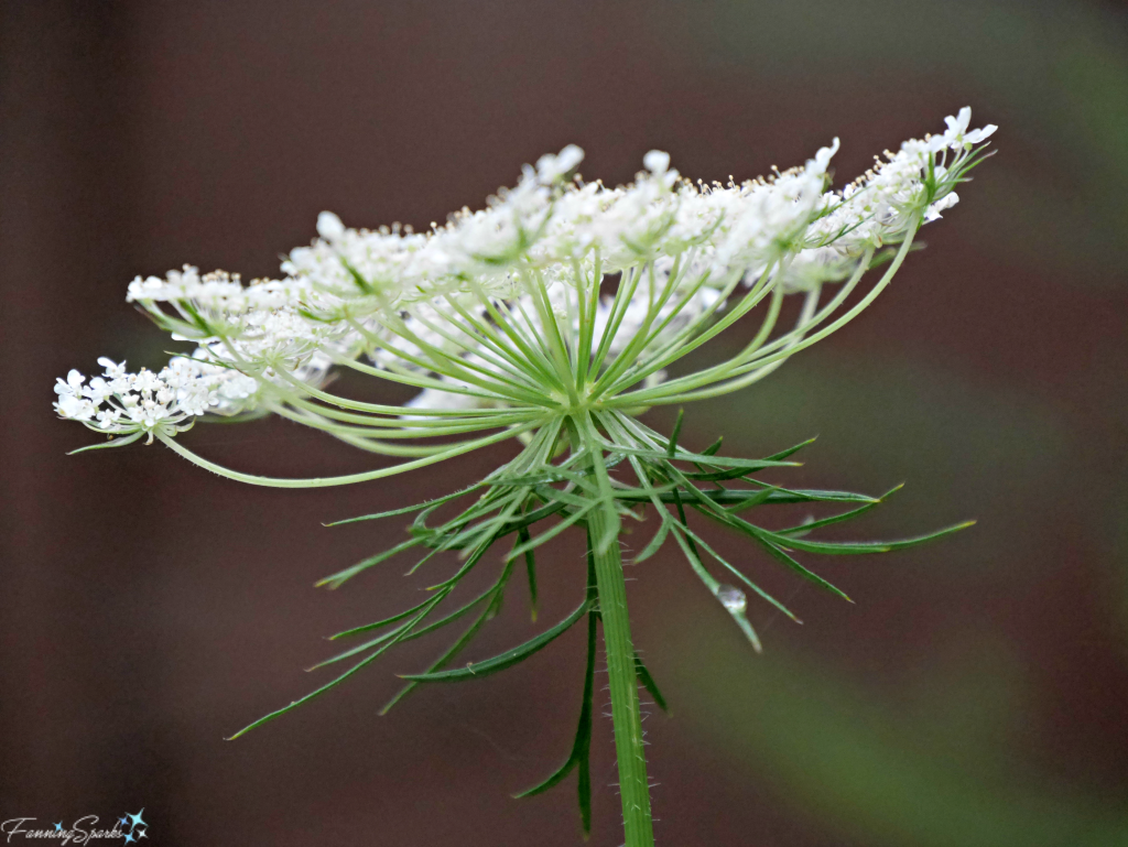
I learned an interesting fact about patterns in nature while researching this post.  Scientists have found that the endless variations seen in nature can actually be traced back to a few simple themes and rules. For instance, the familiar form of Queen Anne’s Lace, is referred to as a branching pattern with an explosion shape.   This pattern illustrates how nature has found the most efficient way to reach all points in a large area while moving the shortest distance.  The dense array of florets in the Queen Anne’s Lace flower head attracts the most insects possible.

Side View of Queen Anne's Lace. @FanningSparks

Today’s Takeaways

  1. Consider broadening your scope and looking at all options before narrowing down to a selection.
  2. Consult Mother Nature for pattern inspiration. Take time to observe the variety of patterns in nature.
  3. Use pattern in your surroundings to foster cohesiveness and add interest.

Peg - FanningSparks Author

There’s something magical about the time between first light and sunrise.  The sky shifts from darkness to light as the world slowly wakes up.  Light is soft and diffused.  Skies turn pink and gold.  The pace is measured and unfolds slowly.  It’s peaceful and calm.  Everything is quiet and still in anticipation.

In the world of film and video production, this time period is called the “magic hour” because of the way the natural light is diffused.  Since the sun hasn’t yet risen, there are no shadows and subjects can be beautifully lit with soft light.  Magic hour is followed by the “golden hour” which occurs directly after the sun rises.  During golden hour the light is rich and warm and the world has a soft glow.  Golden hour is a favorite time for photographers shooting in natural light.  The sequence is reversed in the evening when the sun sets.  To be 100% accurate about it, neither period is exactly an hour long since the timing varies from location to location and season to season.

When traveling around the world, I often make an effort to view my surroundings during the early morning hours.  The below photo, one of my favorites, was taken before sunrise at the Notre-Damede la Garde in Marseille France.  I’ll never forget walking up the hill to the basilica in the bitter cold darkness of a January morning.  But the panoramic view of the city and port as the early morning sky slowly lit up were worth every bit of discomfort.  It was glorious!

Cross at Notre-Dame de la Garde in Marseille France during first light. @FanningSparks

More recently, I had the pleasure of watching the world shift from darkness to light at Peggy’s Cove in Nova Scotia, Canada.  Our visit took place in August so the weather was perfect but it did require a mighty early start.  We set out at 4:30 am to catch first light (special thanks to my sister, nieces and nephew for sharing the adventure!).
Peggy’s Cove, being on the coastline, is often foggy but it was beautifully clear that morning.   We found the perfect vantage point and settled in for Mother Nature’s performance.  She did not disappoint!  It was another glorious show!

Magic Hour at Peggy's Cove. @FanningSparks

Peggy’s Cove is known for its rugged beauty.  The quaint fishing village is surrounded by huge granite boulders facing the Atlantic Ocean.

Huge granite boulders surrounding Peggy's Cove viewed at first light. @FanningSparks

The classic red-and-white lighthouse, officially called Peggy’s Point Lighthouse, is an iconic Canadian image.  It’s a popular destination and the site is often crowded with visitors.  Avoiding those crowds is another advantage of visiting Peggy’s Cove in the early morning.  In fact, we had this beautiful place to ourselves.
You can see the difference between the magic hour and golden hour lighting in the two photos below.  The first photo was taken with first light during the magic hour. The second photo was taken after sunrise during the golden hour.

Magic hour, before sunrise, at Peggy's Cove. @FanningSparks

Golden hour, after sunrise, at Peggy's Cove. @FanningSparks

It appears building cairns, especially inuksuit, has become very popular at Peggy’s Cove.  An inukshuk, traditionally made by Inuit people, is a man-made structure of rough stones stacked in the form of a human figure.  An inukshuk is commonly thought to communicate “Now the people will know we were here”.

Peggy's Point Lighthouse and an inukshuk during golden hour. @FanningSparks

Inukshuk during magic hour at Peggy's Cove. @FanningSparks

Inukshuk on the granite boulders of Peggy's Cove during magic hour. @FanningSparks

Cairn at Peggy's Cove during golden hour. @FanningSparks

More Info

Peggy’s Cove is renowned for its rugged beauty and is a popular destination.  As a native Nova Scotian, I’ve visited the area many times and can honestly say it never disappoints.  If you ever have a chance to visit Nova Scotia, I highly recommend you stop by Peggy’s Cove.  For more info see the Peggy’s Cove Coastal Region website.

Magic Hour, an app by elfinda apps, calculates the time of sunrise and sunset and the adjacent magic/golden hour by location and date.  As you can see in the below screenshot from the Magic Hour About page, magic/golden hour is typically when the sun is between 6 degrees below the horizon to 6 degrees above.

How We Find Magic Hour - Magic Hour App About page screenshot.   @FanningSparks


Today’s Takeaways

  1. Consider visiting popular destinations during the early morning hours.
  2. Make time to experience Mother Nature’s performance between first light and sunrise.  Research the best times for your location and season.
  3. Consider taking photos during the magic or golden hour for beautiful diffused light.

Peg - FanningSparks Author

Today, I’d like to take you on a virtual tour of our new casual lakefront home.  We’ve been busy moving, settling in and turning this new-to-us house into our home.  We’ve completed the first major projects but still have many updates and changes planned.  But before we get into all of the improvements I’d like to show you the house as it existed when we bought it.  This is the “before” of what I hope will be an ever-evolving “after”.

Let’s start with the setting since that was the biggest factor in our decision to buy this property.  The house is situated on a large treed lot on the shores of Lake Oconee in the state of Georgia, USA.  Well… technically we’re located on the shores of the Oconee River which feeds into Lake Oconee.  The wooded area we see across the water (shown in the photo below) is part of the Oconee National Forest.   It’s a lovely quiet area surrounded by nature.  We love it!

View of Lake Oconee from yard. @FanningSparks

The house itself is a Cape Cod style.  Here’s the front of the house. The pretty front porch runs across the front of the house.  There are lots of opportunities for landscaping and flower gardening.  The garage is accessed at the basement level on the right.

View of Heidi Trail house from street side. @FanningSparks

The house has a simple, casual feel.  It was previously used part time as a vacation home.  The first thing we noticed when we entered the house was the view of the lake.  The below wall of windows is in the living room directly opposite the front door.  There are hardwood floors and a rustic fieldstone fireplace.

Living room showing window wall. @FanningSparks

The kitchen, while a little dated, is spacious and has a convenient L-shaped layout.

Kitchen showing cabinets. @FanningSparks

The lakeside porch is spacious and a wonderful place to relax.

View of lakeside porch. @FanningSparks

Here’s that same porch (second floor) as you look at the house from the lakeside yard.

View of Heidi Trail house from lake side. @FanningSparks

Heading back inside, the roomy master bedroom also has a view of the lake.  It has a nice large bathroom with garden tub and separate shower.

Master bedroom showing window wall. @FanningSparks

The second floor is accessed from stairs off the living room.

Stairs off living room lead to second floor. @FanningSparks

There are two bedrooms and a bathroom on the second floor.  Both bedrooms have dormers and sloped ceilings as is typical of a Cape Cod style house.  We plan to use one of these rooms as our guest room/office and the other as my studio.

Upstairs bedroom showing dormer windows. @FanningSparks

The basement has one large finished (although unheated/uncooled) room with a walkout to the back yard.  The 2-car garage is on this same level.

Garage showing 2 bays, built in shelving and window wall. @FanningSparks

There’s a large dock a few steps away across the lakeside yard.   It faces east and provides the perfect place to watch the sun rise as I start my day.

Enjoying sunrise from the dock. @FanningSparks

I hope you’ve enjoyed this quick walk-through of our new casual lakefront home.  I’m eager to share some of the changes we’ve made and those we’re still dreaming about making.

More Info

Moving into a new house often involves painting interior house surfaces such as walls, trim and cabinets.  This has certainly been the case with our recent move.  We’ve painted the kitchen cabinets, painted the master bedroom, and painted walls and trim around new doors and windows.  In the post, Glide It On and 14 More Painting Tips, I share the top 15 things I learned during my recent painting marathon.
We recently made some minor improvements to increase the comfort and enhance the appearance of our small guest bathroom.  We switched to a curved shower rod and mounted it up high.  Then re-purposed an existing shower curtain to fit.  Nothing earth shattering… just a few small changes which had a big impact.  See the post, Small Change > Big Impact in Guest Bath, for the full story.
Update Nov 1, 2020:  We’ve made improvements gradually.  I’ve shared a few in the following posts:
. The post, Our Pony Wall and Banquette Combo, shows how we modified the entryway and kitchen areas.  In the post, Our New Architectural Jewelry, I share the new light fixtures we added.
. I’ve had fun making mosaic mirrors for the bathrooms.  You can see the results in the posts: Pair of Mosaic Mirrors Completed and My Mandala-Inspired Oval Design.
. Our garage workshop underwent a facelift.  Check it out in 10 Tips from our Gussied Up Workshop.
. Considerable effort has gone into enhancing our outdoor spaces.  Check out Zinnias Rock! And More Cutting Garden Tips and Our Garden Prepares to Leap.

Today’s Takeaways

  1. Searching for a new house can be daunting especially if you have a long list of “must have” criteria.  Be sure to prioritize and force yourself to identify the critical few.
  2. Don’t rush house hunting.  Keep an open mind and be willing to consider alternatives.
  3. Once you’ve found the “one”, you may wish to create a set of before photos for a visual record of your home’s progression.

Peg - FanningSparks Author

Our small guest bathroom has been seeing a lot of action while we renovate the master bathroom at our new home.  Making major changes to this bathroom is not in the cards just now.  But we decided making minor improvements to increase the comfort and enhance the appearance were worthwhile.  The first change was to switch to a curved shower rod.  It’s surprising how much roomier the shower area feels with one of these.  The second change was to install the shower rod up high and close to the ceiling to give the illusion of more space in this very small room.  Of course, as is typical with these types of small projects, one thing leads to another!

Mounting the new shower rod higher meant an extra-long shower curtain was needed.  I already had a standard size fabric shower curtain which I liked.  I’d spent a considerable amount of time finding just the right one when I decorated our previous bathroom and I wasn’t keen to go through that search again.  It’s a pretty pattern by Cynthia Rowley in a medley of aqua, teal and white.  Re-purposing the existing shower curtain seemed like the best option.   The challenge would be to insert a piece fabric without it being obvious.  I’d like to share how I made this simple, but impactful, change.

Below are the before and after photos to set the stage.  The before photo shows the small guest bathroom as it existed when we moved in.  I’m grateful to the previous owners for leaving the plastic shower curtain in place; it was the perfect temporary solution. The after photo shows the bathroom with the new shower rod and the re-purposed shower curtain.  Nothing earth shattering here!  Just an example of how a few simple changes can make a noticeable improvement.

Before and after of guest bath showing small improvements. @FanningSparks

Here’s how I lengthened the shower curtain.  My starting point was a standard 72” (length) by 71” (width) purchased shower curtain made of a geometric printed fabric (shown in after photo above).  The first step was to come up with a new design.  I determined that the new shower curtain should be about 84” long… an additional 12”.   It would have been easy to simply add a 12” strip of fabric to the bottom of the existing shower curtain but I thought that would look too obvious.  A simple sketch helped me determine the proportions and placement of the additional fabric.  Graph paper helped with the scale.  I divided the length into 4 equal sections (ie 4 21-inch sections).  The sketch, as you can see below, is very rough.

Rough sketch for lengthening shower curtain. @FanningSparks

Originally, I thought I’d simply replace the third strip (section E) with new fabric.  But the sketch helped me determine that inserting more than one stripe (sections B, D and F) would appear more intentional.   I decided to go with stripes in two different heights which I dubbed as short and tall stripes.  I also decided to use two coordinating fabrics; a plain white and a coordinating color print.  My design called for one tall stripe in the new coordinating color print and 3 short stripes of the plain white for a nice balanced look.  This exercise helped me visualize the final outcome.  At this point, I was pleased with the design… at least, it looked good on paper!

The next step was to purchase fabric.  Using trusty old Excel, I factored in ¼” seam allowances, locked in the exact measurements and determined the yardage I would need.  I decided to use the new fabric horizontally which meant two yards of printed fabric (2 x 36”) were needed.  Alternatively, I could have purchased only 1 yard and used it vertically but that would have required me to piece together the strips with a center seam.  I already had enough plain white cotton in my fabric stash so that was covered.  Only the coordinating print for the tall stripe had to be purchased.  In hindsight, it would have been better to buy an extra ¼ yard for the tall stripe; so 2 ¼ yards in total.  The extra 9” would have provided some wiggle room and made it easier to get everything lined up perfectly for the side hems.

Because the shower curtain is fabric and used with a plastic liner, any simple cotton will work for the new tall stripe.  It took a little effort but I found a coordinating print in the quilting cotton section at the local fabric store.  Of course, I was anxious to see if it actually looked as good as I envisioned.  I laid out the fabrics in the approximate proportions to get a preview. I also took some photos to view them on my computer screen.  I’ve found that I see things in a photo that I miss when I’m looking at it directly.  Viewing my planned design in these ways assured me I was on the right track.

Visual check of new fabric and design for lengthened shower curtain. @FanningSparks

The next step was to prepare the fabric.  I pressed it to remove wrinkles and creases.  Then measured and cut the various pieces to the width of the shower curtain including:

. Section A – Top of original curtain – 21 ¼”
. Section B – Short stripe of white fabric – 4”
. Section C – Tall stripe of original curtain – 18”
. Section D – Short stripe of white fabric – 4”
. Section E – Tall stripe of new coordinating print fabric – 18”
. Section F – Short stripe of white fabric – 4”
. Section G – Bottom of original curtain – 17 ¾”

I marked each of the pieces with the section letter taking care to position the tape marker consistently from piece to piece.

Marking the fabric pieces to ease assembly. @FanningSparks

Sewing the pieces together was the next step.  I simply sewed the fabric strips together with a series of straight overcast seams.  I ensured the sections were in the right sequence with all the right sides facing up.  Then I finished the side hems on the unfinished sections.  In hindsight, I shouldn’t have assumed the shower curtain was square.  It turned out to be wider in the middle than at the top and bottom.  It would have been easier to have corrected this, by trimming the middle section to match the top and bottom sections, before I sewed all the strips together.  A final pass with the iron flattened the seams and ensured a nice, smooth finish.

The last step was to install the new curved shower rod and hang my pretty, re-purposed shower curtain.

Today’s Takeaways

  1. Small decorating changes can be impactful.
  2. Consider repurposing an existing item instead of purchasing something new.
  3. Planning is a big part of a successful project design.  Consider sketching out your design to help visualize it.   Lay out the pieces to preview the final outcome.  Double check your progress with photos.

Peg - FanningSparks Author

Moving into a new house often involves painting interior house surfaces such as walls, trim and cabinets.  This has certainly been the case with our recent move.  We’ve painted the kitchen cabinets, painted the master bedroom, and painted walls and trim around new doors and windows.

Before taking on any new task, I like to do my homework to ensure I understand the best way to approach the work.  See the More Info section below for some of my go to painting resources.  There are lots of great posts and videos providing step by step instructions for just about any painting project so I won’t try to recreate that information here.  Instead I’d like to share the top 15 things I learned during my recent painting marathon.

1. Prepare properly.  Nearly every set of instructions and every reference on how to paint points out that preparation is key.  It’s necessary to clean, sand, cover, tape off and prime to ensure the surface is ready for paint.  Don’t underestimate how long this takes.  Don’t take shortcuts.  It’s incredibly tedious but it’s absolutely necessary to get a quality result.

2. Remove sanding dust.  Proper preparation requires sanding; in some cases multiple rounds of sanding are needed on the same surface.  Every round of sanding requires careful removal of sanding dust before moving on to the next step.  For walls, I found Swiffer Dusters to be very effective especially for drywall dust.  For cabinet doors, I found vacuuming with a soft brush on my shop vac and then wiping with tack cloths worked well.  Don’t get over zealous with the tack cloth though; wipe lightly to catch the dust without leaving sticky residue behind.

Removing sanding dust with Swiffer Duster or tack cloth. @FanningSparks

3. Prime the surface.  Primer is not just meant to hide the previous color or to provide an inexpensive starting point.  Primer sets the stage for the final coat.  If the primer is rough or patchy, the final coat will be rough or patchy.  With some effort and a lot of practice, I was able to get a near perfect surface with primer.

4. Be methodical.  Plan the steps needed to complete the work and the supplies needed for each step.  It’s probably just the professional project manager in me, but the first time I painted kitchen cabinets I found it really helpful to create an actual workplan with all the steps mapped out in the correct sequence.  Adopt an assembly line mind set and take a thoughtful approach.  Whether painting the walls of a room or an entire set of kitchen cabinets, break down the work into sections and repeat the same steps over and over again.  I found that sticking with the same sequence helped me ensure I didn’t repeat steps in one place or miss steps in another. Here’s a section of the workplan I created for painting my kitchen cabinets.
Workplan outlining steps and materials to paint kitchen cabinets. @FanningSparks

5. Prepare cabinet doors.  Painting kitchen cabinet doors requires some additional preparation.

  • Hide grain.  If the wood grain is obvious (as it is with oak for instance), additional steps are needed to cover the grain.  I used Timbermate Wood Filler and would highly recommend it.  It’s not cheap and it has a terrible smell but it works great.  I mixed the Timbermate powder with water, then painted it on the surface and allowed it to dry.  Once dry, I sanded it smooth and level resulting in the Timbermate remaining in only the low areas of the grain.
  • Fill holes.  If the cabinet handles and pulls are being replaced, it may be necessary to fill the old holes.  A great technique is to use a piece of wooden dowel to fill the hole.  This provides a solid core which can then be smoothed over with filler.

Using Wood Dowel and OneTime Filler to fill cabinet handle holes. @FanningSparks

  • Number the pieces.  Number the cabinet doors and drawers so it’s easy to put them back in the right place.  I numbered mine on a photo and then used painter’s tape to mark the corresponding number inside the door hinge holes and inside the drawers.

Numbering the cabinet doors and drawers to keep track of placement. @FanningSparks

6. Sand primer; don’t sand paint.  There will be exceptions, such as drips or foreign objects that need to be removed, but for the most part when dealing with cabinets and walls it’s best to leave the painted surface alone.

7. Invest in materials and tools that are high quality and fit for purpose.

  • Select paint carefully.  There are a multitude of choices when it comes to paint and there are a multitude of opinions to match.  After checking the opinions of the bloggers I trust, I selected Benjamin Moore Advance Waterborne Interior Alkyd in Satin for the kitchen cabinets and I’m really glad I did.  For the walls, I simply matched what had been used previously, which was Sherwin-Williams Promar 200 Interior Waterbased Acrylic-Alkyd, and had great results.
  • Stock up on filler.  Good quality caulking and filler are mandatory.  I just learned about Red Devil OneTime and would highly recommend it.
  • Gather your tools.  High quality brushes and rollers in the most appropriate width are mandatory.  Don’t forget to choose the appropriate nap for the roller cover.  I tried a couple of new tools for ease and convenience and would highly recommend them both.  The Shur-line Edger is ideal for creating a straight line where the ceiling and wall meet.  The HANDy Paint Cup is comfortable to hold and saves countless trips back and forth to the paint can.  One other, rather surprising, item that has become my go-to tool for sanding concave surfaces, like the grooves around cabinet doors, is a short piece of Tube Pipe Insulation.   This foam tube was a perfect fit for my cabinet doors.  I simply wrapped a piece of sandpaper around the tube and slid it up and down the groove.

My favorite painting supplies and tools. @FanningSparks

8. Use good quality sandpaper.  There actually is a big difference between good and poor quality sandpaper.  The grit rubs off of poor quality sandpaper in no time.  Worse still, poor quality sandpaper will clog with the material being removed.  Then the clogged material will get stuck on the very surface that’s being sanded.  Ask me how I know!  I had much better success when I switched to 3M Pro Grade Precision Advanced Sanding Sheets.  When it comes to sanding, every stroke counts so it’s worth investing in good quality sandpaper.

Poor quality sandpaper results in lost grit and clogging. @FanningSparks

9. Lay off the wall.  After painting a section of a wall, take one final pass called “laying off”.  Without refilling the roller, carefully start the roller at the top of the wall and roll it all the way down to the bottom in one slow, continuous movement.  Align the roller with a slight overlap to the first pass and roll again.  Repeat until the entire section has been laid off.  Laying off ensures the wet paint is distributed in a nice even layer.  I just started using this technique and was pleasantly surprised by how much it improved the final finish.

10. Glide it on.  The whole idea behind painting is to lay down a nice smooth coat.  Paint manufacturers intend for their paint to be applied at a certain thickness called the “Recommended Film Thickness”.  According to the Technical Data Sheet on their website, the recommended film thickness for the Benjamin Moore Advance paint I used was 3.6 mils Wet and 1.35 mils Dry.  As a point of reference, the thickness of a standard credit card is 30 mil.  I certainly did n.o.t check my paint thickness against a credit card but I did remind myself not to overwork it and to lay down a generous, even coat.  This has been my most significant learning and has resulted in the biggest improvement in my painting.  Glide it on!

Remember to Glide It On for a generous even coat. @FanningSparks

11. Let the paint level itself.  After laying down a nice smooth coat, step away.  Don’t overwork it.  Don’t keep going back to touch up here and there.  Let the paint work its magic.

12. Give it time.  Read the paint can label and follow the instructions regarding drying and recoat times.  Keep in mind, the paint isn’t ready for action until it’s fully cured so treat it gently until that time. This is especially important with kitchen cabinet doors which have to be finished on both the front and back.  Paint the backs first and “baby them” while working on the fronts.  I cushioned my doors with cotton rags to prevent marking the backs while painting the fronts.

Use an assembly line approach to work efficiently. @FanningSparks

13. Remove painter’s tape slowly.   Using painter’s tape to mask off areas is common practice.  Removing the tape, however, can be a little tricky especially if it has been in place for multiple coats of paint.  I’ve found the best way to remove the tape is to pull very slowly and carefully at a 45 degree angle.  But sometimes the tape will tear where the paint has sealed.  I learned the hard way that I need to stop pulling the tape immediately and use a utility knife and a straight edge, like a putty knife, to cut along the edge and break the paint seal.  Every time I optimistically continued to pull the tape, I damaged the newly painted surface.

14. Delay clean up.  While cleaning up after a paint job is inevitable, cleaning brushes and rollers between coats can be delayed by storing them in the refrigerator.   Wrap the brush/roller in a plastic or zip lock bag, label it and put it in the fridge until the next time.  Allow it to come back to room temperature before using again.

15. Label for reference.  Be sure to label the paint cans while it’s top of mind.  I simply use painters tape with black marker to indicate the color and where it was used.  I also like to keep a set of labelled paint stir sticks for future reference.

Paint and label paint sticks to use for color references. @FanningSparks

Did you find these painting tips helpful?  If so, you may want to save the below image to Pinterest for future reference.  Do you have tips you’d like to share?  Please feel free to comment below.


Glide It On and 14 More Tips for Painting Walls and Cabinets Pin @FanningSparks

More Info

Both Benjamin Moore and Sherwin-Williams have great how to resources on their websites.
Three of my favorite blogs, InMyOwnStyle, Addicted2Decorating and TheDIYPlaybook, share helpful painting advice on their blogs.  Just look for “painting” in their site searches.

Today’s Takeaways

  1. Consider leveraging online resources to educate yourself before tackling a new painting task or technique.
  2. Once you understand the outcome and the approach, consider creating an actual workplan to think through the steps.
  3. Painting interior walls and cabinets can be a great DIY home improvement project.

Peg - FanningSparks Author