We’ve all come to expect impressive design and decor ideas from high end hotels. But, while you may have to look a little harder, you can also find inspiration during a stay at a standard chain hotel. Regardless of the source, it’s worth the effort to look for these details when staying away from home. Obviously, when you spot design and décor ideas in person, you can touch and examine them in detail. But you can also live with them for a short time and put them to the test. For instance, is the lamp that caught your eye during daylight as impressive at night when it’s lit? Or what about that ottoman, is it as convenient as it looks when you actually use it? Or what about that wild wallpaper, could you really live with it all day every day? Best of all, for the ideas you really like, you can snap lots of photos, take measurements, check for sources, and even note construction details. So what kind of design and décor ideas might you expect to find? Let’s look at some examples, taken from a range of hotels, from my travels far and near.
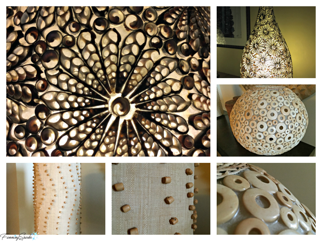
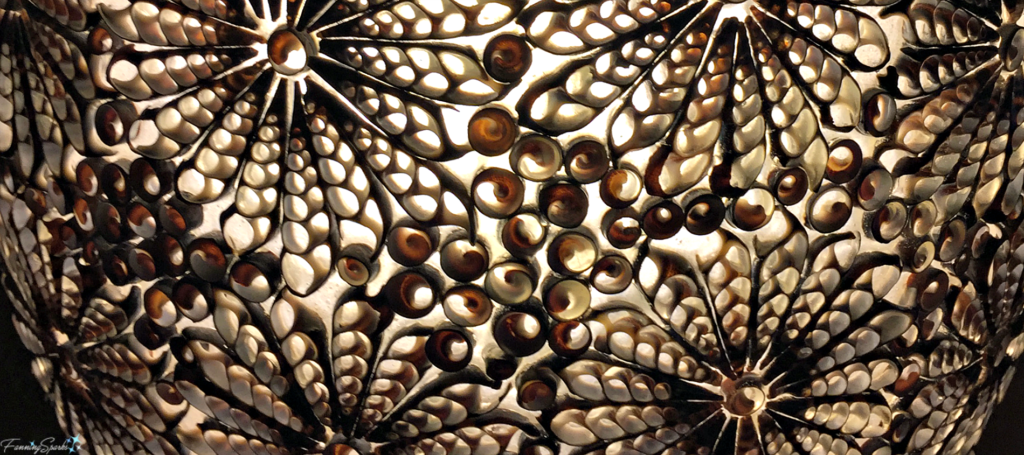
First up, 3 amazing lamps from the Intercontinental in San Jose, Costa Rica. I love these lamps because of the unusual materials, their pleasing shapes, and the amazing texture they bring into the room. They’re also beautiful both when turned off during the day and when turned on at night.
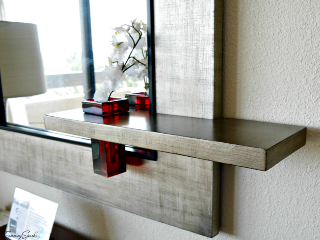
Next I’d like to share an idea from the Grand Bohemian Hotel Mountain Brook in Birmingham, Alabama. This boutique hotel, which exemplifies the boho style, is jam-packed with interesting and fun design and décor ideas. Not all of these ideas would translate well into my home but one item that really caught my eye was the below mirror. I love the unexpected detail of the integrated shelf and vase. So original!
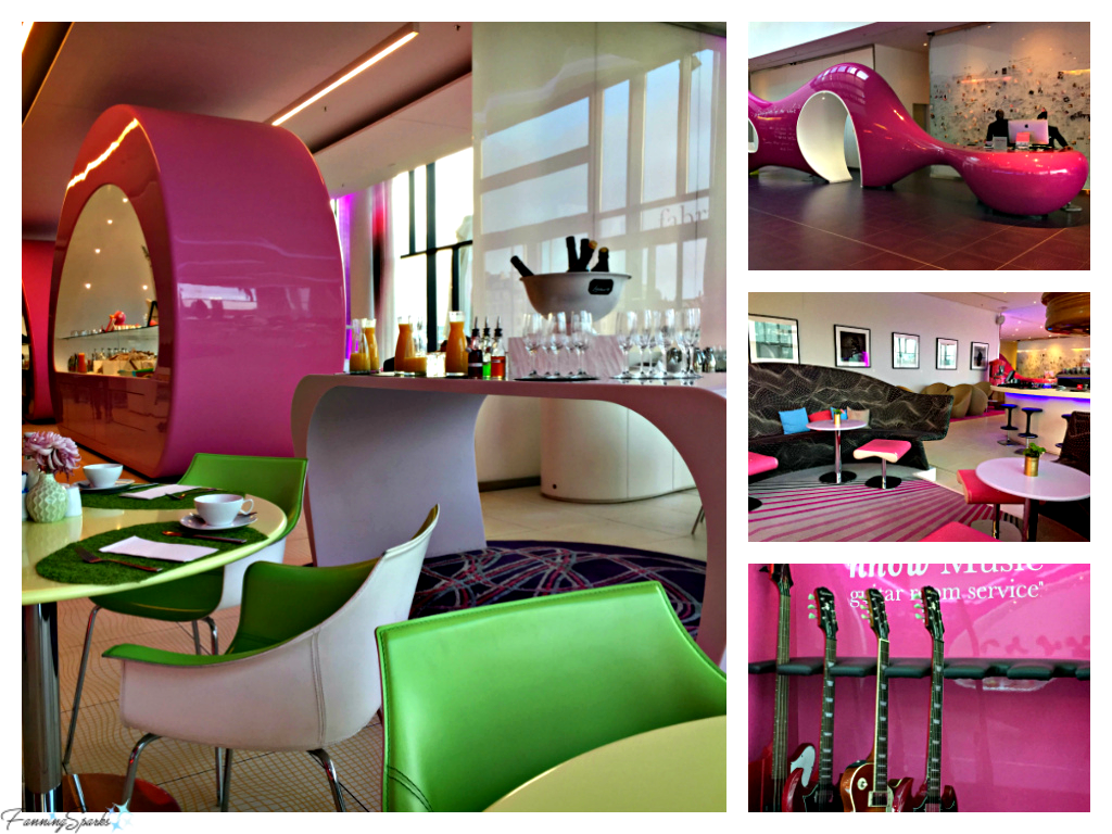
Speaking of decorating ideas that don’t easily translate into my home, I recently had the opportunity to stay at the Hotel nhow Berlin. This hotel is full of surprises. It’s unusual, modern and hip. With a bold pink color scheme and a strong music theme it’s not your run of the mill chain hotel! Here’s a look at the hotel lobby areas.
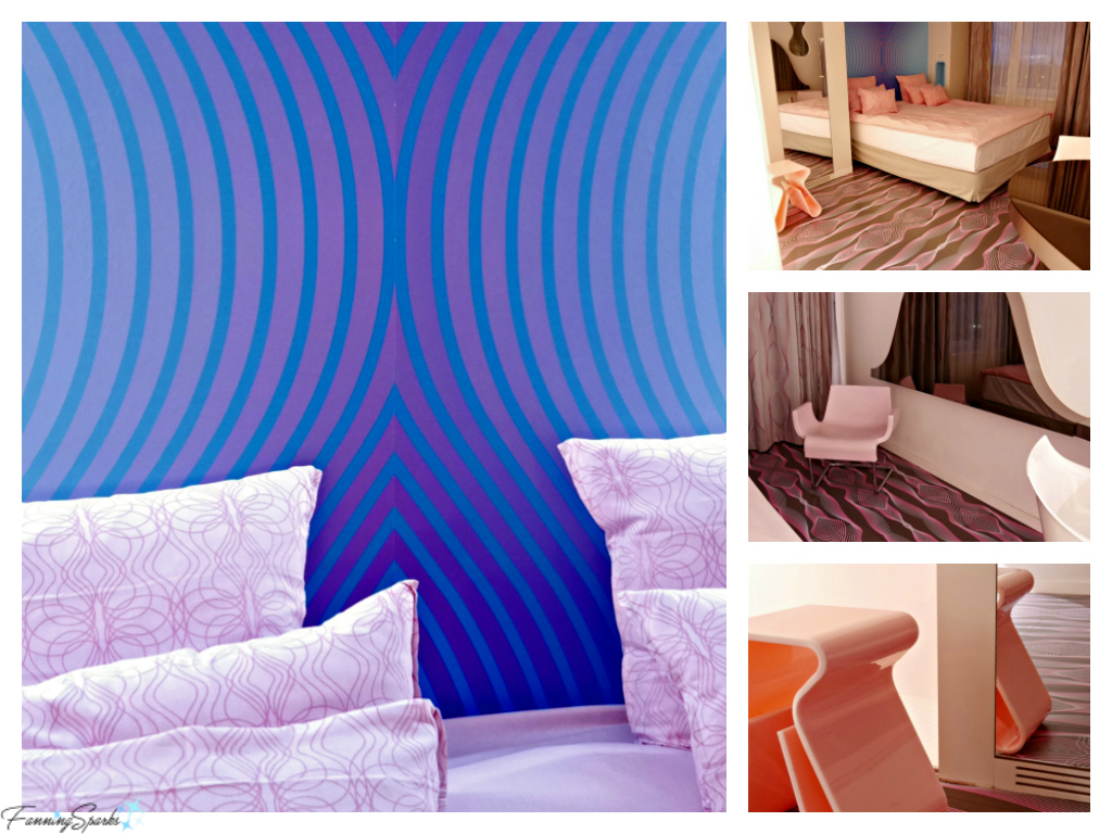
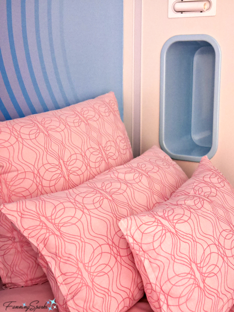
The guest rooms are equally unusual. The patterns are bold and the colors are super bright.
I think this design is a little too chaotic for my home but I did find some interesting details that might be worth considering. The below cubby hole, built right into the wall beside the bed, would be ideal in a small space. In fact, it’s rather similar to the shower niches that are currently so popular.
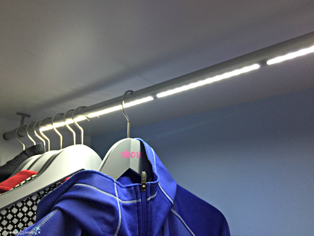
I love the below lighted closet rod. Lights that automatically turn on when the closet door opens are not unusual. But incorporating that same functionality into the actual closet rod? Genius! A quick internet search indicates these rods are readily available although rather pricey.
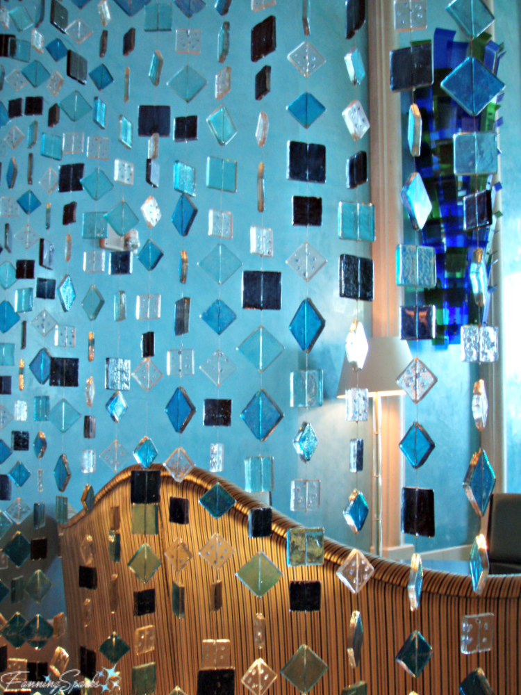
Hotel lobbies can also present some useful home design and décor ideas. A few years ago I had the opportunity to visit Dubai, UAE. To say Dubai hotels are over the top would be an understatement. While most of the amazing design and décor ideas wouldn’t translate well into my home, they certainly helped me think big and bold. The below fused glass curtain was used to divide the space in a hotel lobby bar area at Atlantis The Palm. When the light hits the various pieces of glass, the colors and facets took on a life of their own. As I was preparing this post, it occurred to me that a glass tile curtain like this would be perfect in the bathroom window in our new home. The window is above a garden tub in the master bathroom and it’s currently just a large bare pane of frosted glass. Done on a much smaller scale, of course, the below glass curtain could be just the thing to liven up this space.
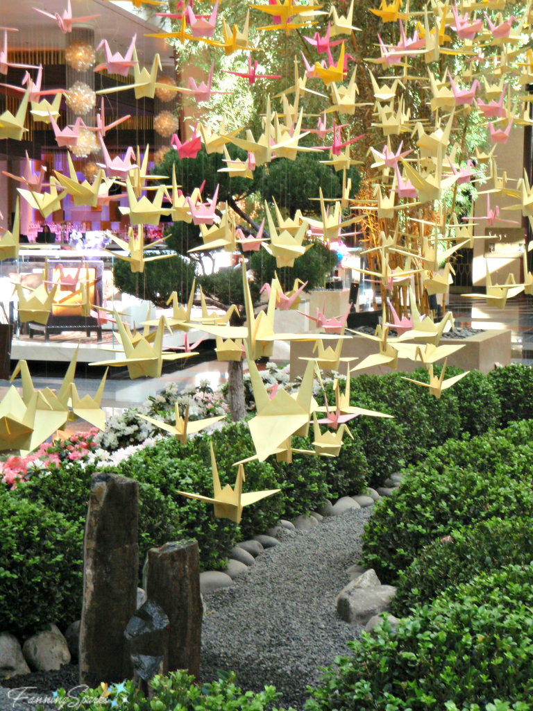
Here’s another detail from a hotel lobby that caught my eye. It’s from the Aria Hotel in Las Vegas, Nevada. Isn’t it beautiful? A mobile of origami cranes, done on a smaller scale in colors to match a room, could be just the right accessory.
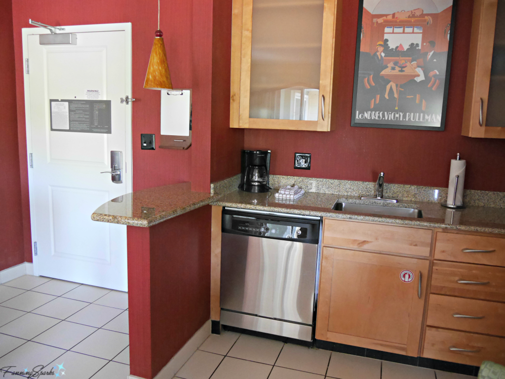
Now let’s scale it back and look at something a little less grand. This room, at the Residence Inn in Florence Alabama, is an extended stay room so it has a lot of functionality squeezed into a small space. In the below photo, you can see how they’ve separated the kitchen from the entrance. The short pony wall cleverly provides both a visual and physical barrier between the two spaces. I recently applied this same concept at our new house.
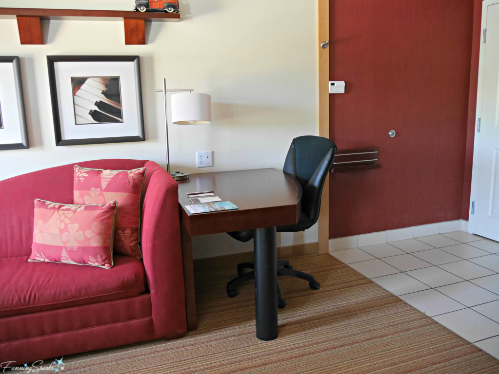
In the below photo, notice how a change in the wall treatments and floor coverings create a visual break and signal a change in room function. This is also a great technique to keep in mind.
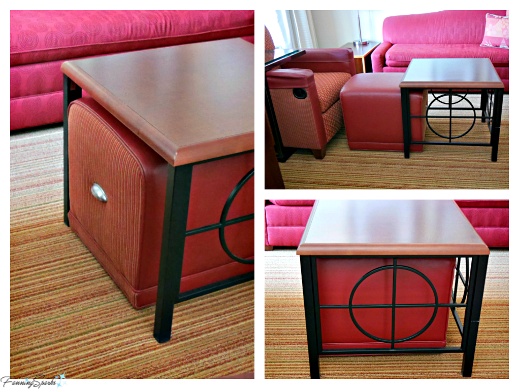
The final idea I’ll share is the below ottoman. It’s on casters and easily slides inside the coffee table when not in use. It’s a brilliant setup… the coffee table and ottoman are attractive independently but are even more handsome when combined. When the ottoman is inside the coffee table, the deep red covering highlights the design of the coffee table’s black metal design. Genius!
More Info
Here are the website links for the hotels mentioned in this post:
Intercontinental Costa Rica at Multiplaza Mall in San Jose, Costa Rica
Grand Bohemian Hotel Mountain Brook in Birmingham, Alabama, USA
Hotel nhow Berlin in Berlin, Germany
Atlantis The Palm in Dubai, UAE
Aria Hotel in Las Vegas, Nevada, USA
Residence Inn in Florence, Alabama, USA
Today’s Takeaways
- Be on the lookout for design and decorating ideas when staying away from home.
- Take advantage of the opportunity to “try out” ideas that catch your attention.
- Make notes, take photos and note measurements for ideas you may decide to adopt.




Comments are closed.