Looking for Color Inspiration?
Color! It’s a key ingredient, often the most obvious one, in artmaking and decorating. I’ve become braver with my color choices over the years. Yet when it comes to deciding which colors to put together into a pleasing color palette, I struggle. Therefore I’m always on the lookout for ways to increase my knowledge and boost my color confidence.
I attended a workshop on Color Strategies some time ago. It was very informative and a great deal of fun. I learned how to use a color wheel and since then I’ve always kept one posted near my crafting area. But merely knowing the mechanics of the color wheel didn’t instantly lead to inspired color choices.
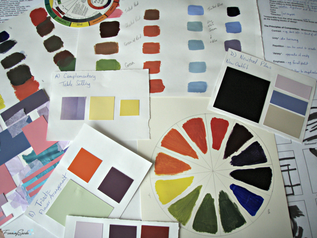
I’ve discovered I must train my eye to look for color… to study the details of pleasing color arrangements and take note of what contributes to the whole. This practice of studying details fits perfectly with one of my all-time favorite hobbies, photography. One of the many joys of taking photos is that it forces me to stop and take notice. To observe the little things like light and shadow, texture and form, patterns, focal points and color. This is particularly true when I’m taking photos in nature. Some of the most stunning color combinations I’ve seen have been courtesy of Mother Nature. Let’s look at some examples.
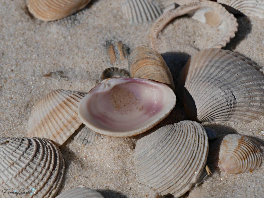
Recently, while walking along a beautiful beach in Bon Secour National Wildlife Refuge in Alabama, I was drawn to the below seashells along the water line. Shells have, of course, been treasured by beachcombers for eons. But it was the color of the seashells that caught my attention. A charming blend of neutrals in brown, beige, grey, black and white, provided the perfect stage for the vibrant rosy pink shell. Such a lovely color palette!
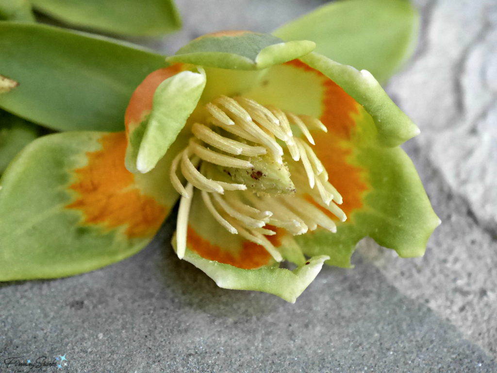
The below close-up is of a tulip tree blossom. The flowers are a lovely blend of greens and yellows. But then there’s a band of orange that really shakes things up. Isn’t it a splendid palette? You do have to use a little imagination here because this flower would normally be surrounded by deep green foliage. But it’s rare to see a tulip tree blossom in the actual tree because the trees are so tall (up to 90 feet) and the blossoms are typically in the uppermost branches. On the upside though, when the tulip tree drops its flowers, the ground is covered with these colorful works of art.
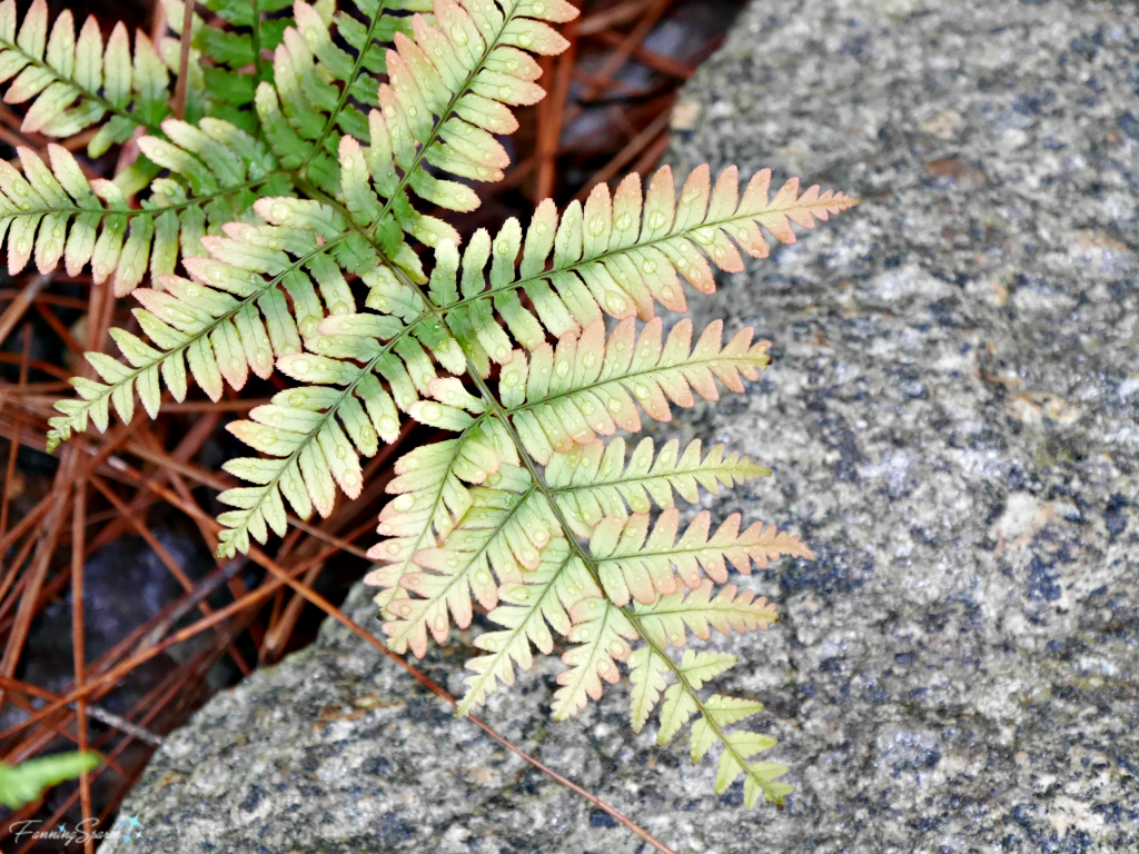
I captured the below scene in my flower garden last spring. The leaves on this autumn fern were just starting to fill in and the new growth provided an amazing progression of color. From deep green to light blush, the colors complement each other perfectly. The variation is subtle but, oh so, pretty. Again we see how the quiet shades of the background, pine straw and rocks, allow the color of the fern tips to pop.
In addition to training myself to notice and study Mother Nature’s artwork, there’s an online resource I love. If you’re not already familiar with Design Seeds, you’ll want to give yourself some time to fully appreciate this site. The magic of Design Seeds is that they can take a lovely photo and break it down into the actual color contributions. They even provide the actual HEX codes so you can find the perfect match.
UPDATE Feb 11, 2026:
Here are some example color palettes from Design Seeds including the jumping off point for the FanningSparks brand colors. 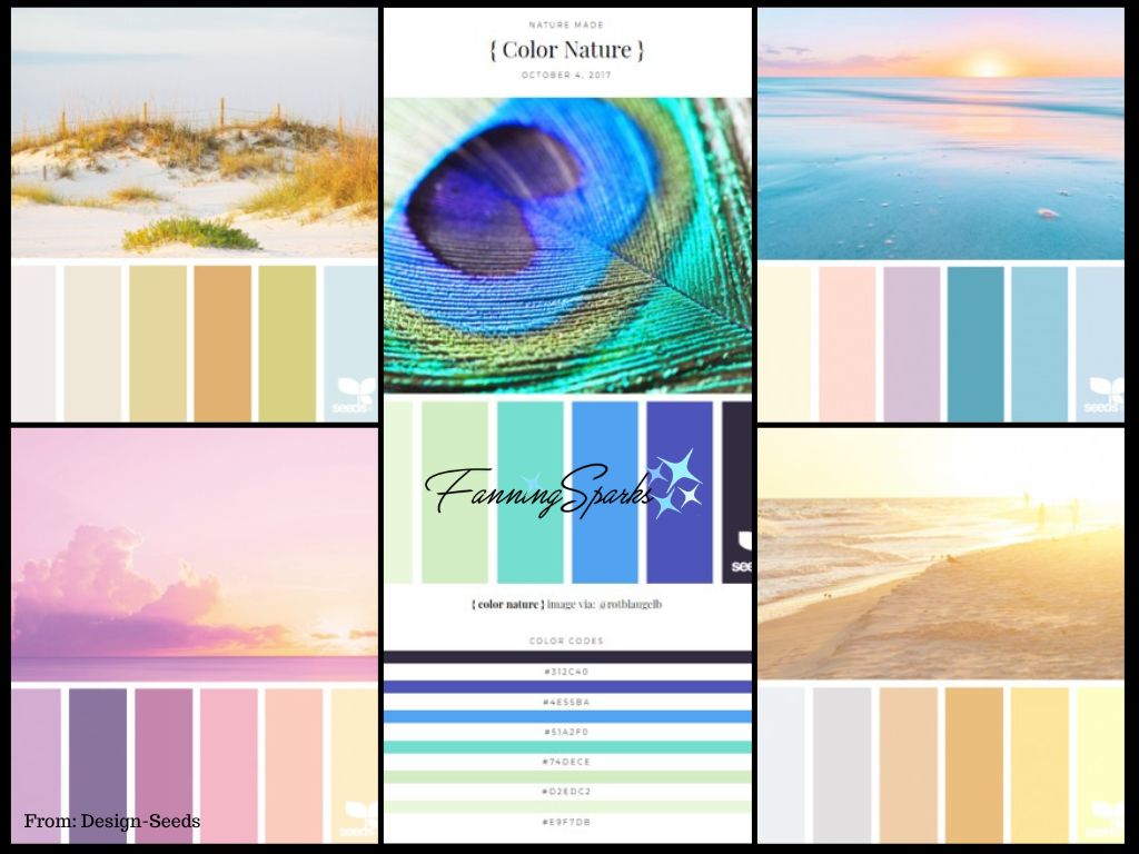 Design Seeds, the original color inspiration website, is no longer active. However, according to its talented creator Jessica Colaluca “As of August of 2025, all new color and inspiration content will be solely found on the consolidated site – HI HUES at hihues.com”. The Design-Seeds archive is available here.
More Info
Color wheels are readily available in art and craft stores and departments. Alternatively, you can access an interactive color wheel on TheVirtualInstructor site.
As mentioned, Design Seeds is a great resource for color inspiration. If you do find a color palette you like, you can use the handy conversion tool on EasyRGB to convert the HEX codes into paint colors. Don’t expect to find an exact match for every single code. I had excellent results for 5 of the 6 codes I converted recently; the sixth code required a little trial and error at the paint counter.
UPDATE Jan 22, 2019: Check out Patterns by Mother Nature and Texture by Mother Nature for more decorating inspiration from nature.
UPDATE May 19, 2020: Form by Mother Nature is the latest in this series.
Today’s Takeaways
Next time you’re looking for color inspiration, you may want to consider these suggestions:
1. Become familiar with the color wheel.
2. Consult Mother Nature for color scheme inspiration. Take time to observe the interplay of color in nature.
3. Check out Design Seeds for online inspiration of beautiful color palettes.
Cheers,



2 Comments
Hi Kathy, Thanks for taking time to visit the blog today. I’m glad you found the tips useful. Cheers!
This is seriously cool!!! I love the way it is organized. The stories, photos, and the tips! I am going use the ones on color soon. Great work and look forward to more😁