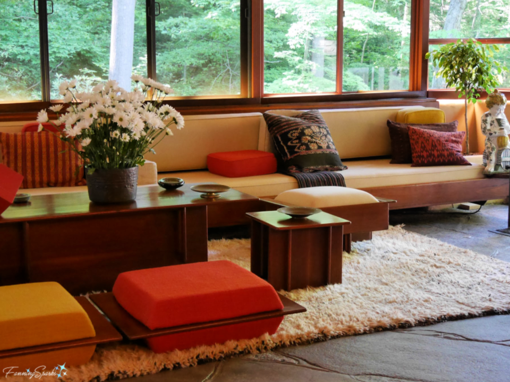
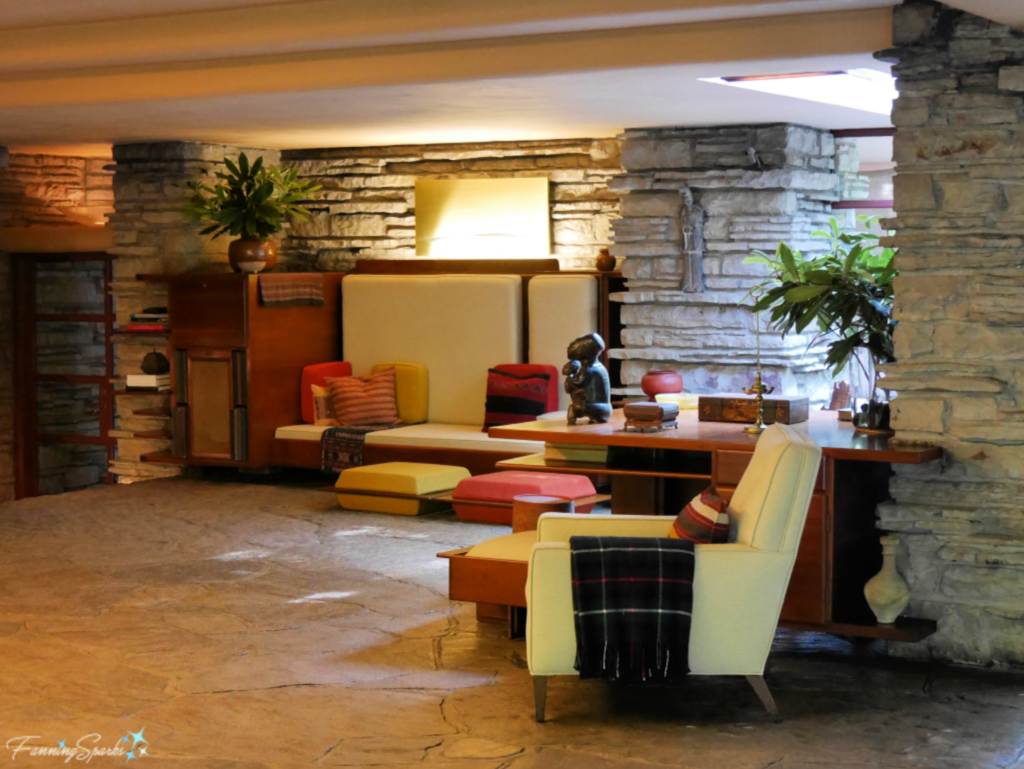
In my previous post, Then Came FallingWater, I shared photos from this Frank Lloyd Wright architectural masterpiece along with some recurring themes from his work. Blurred lines, nature inspiration, horizontal planes, natural materials, cantilever construction, natural light, art glass, and geometric shapes‒these are all recurring themes I’ve observed while visiting homes designed by Wright. In that post, I shared several illustrative examples of Wright’s building exteriors. Wright is well-known for his architectural genius but he was also a talented designer of interiors. This is the living room at FallingWater.
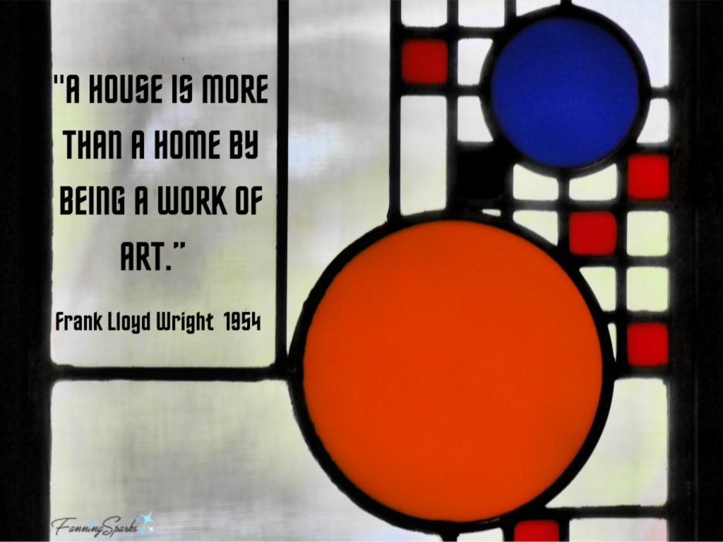
According to Meegan M. Thompson author of Frank Lloyd Wright: 21 Surprising Stories, Wright “not only designed the structures, but what furniture would go inside, what colors and patterns would make up the decor, and, in the cases of some of his homes, even what dress the hostess would wear while entertaining. Napkins, dining room chairs, and end tables were all to be found among his designs, alongside light fixtures, area rugs, and sofa pillows. Essentially all of Wright’s designs included these interior details…. the pieces were intended to be viewed as part of a greater whole. Every corner of every room was carefully plotted so that it would look exactly how Wright envisioned it. Thus, his buildings were not just buildings–not in his eyes, anyway. He seemed to think of them as art installations in themselves.” Given this context, Wright’s bold statement that “A house is more than a home by being a work of art” makes sense.
FallingWater is reported to be the only Wright house that still has its original furnishings and artwork. It’s also the only Wright property I’ve visited where photos were allowed inside the house (Note: only on the 2-hour In Depth Tour). Let’s take another look at those recurring themes.
Blurred Lines
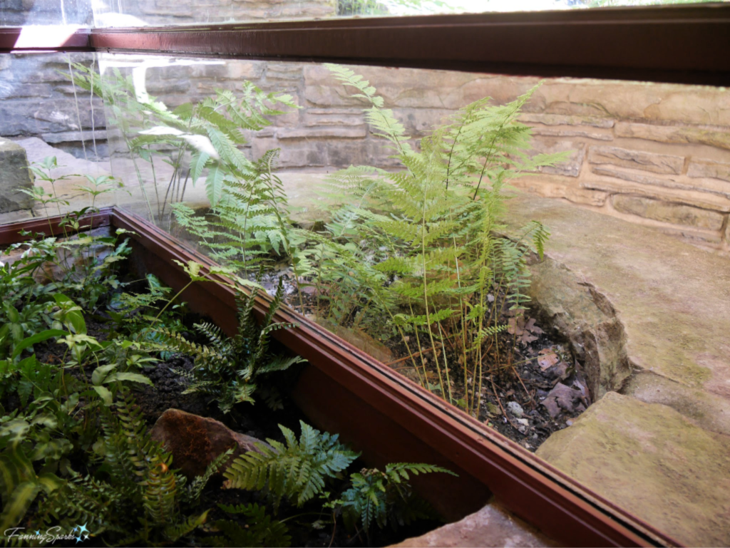
Wright liked to “blur interior and exterior space, where the interior decor and furnishings would complement the lines of the exterior”. This unusual window and flower bed combination is the epitome of blurring the lines. The photo is taken indoors with frame running from right to left. The short ferns are indoors and the tall ferns are outdoors. The Tour Guide told us the the window glass is actually embedded into the earth of the flower bed.
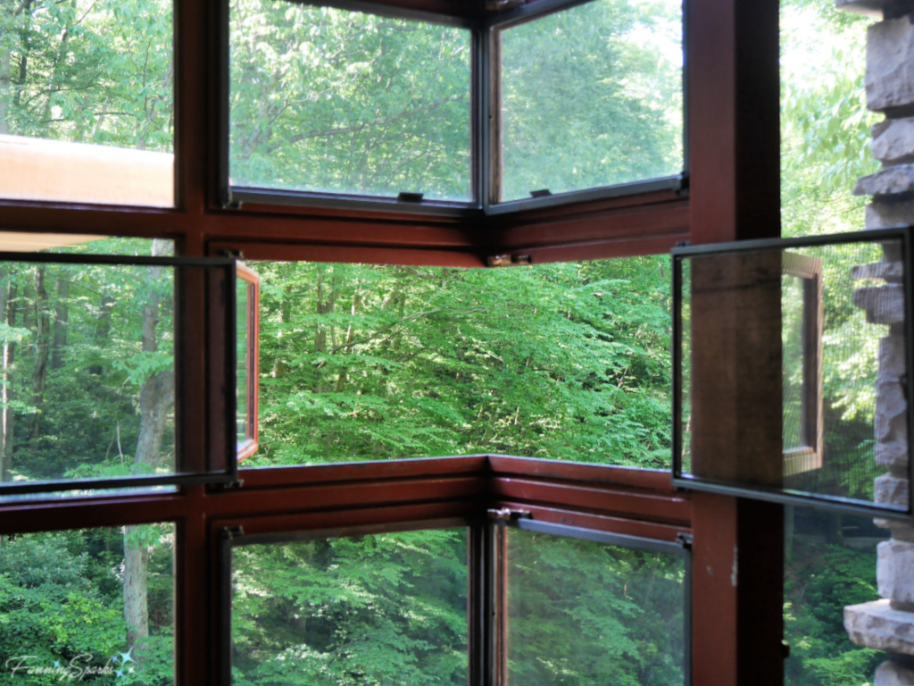
 Nature Inspiration
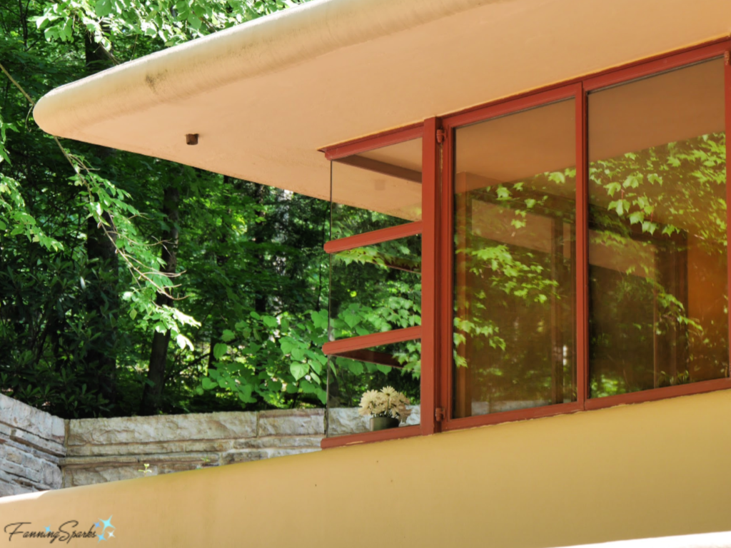
Wright often included large walls of windows to bring the outdoors inside. This is one of Wright’s unique corner windows.
 Horizontal Planes
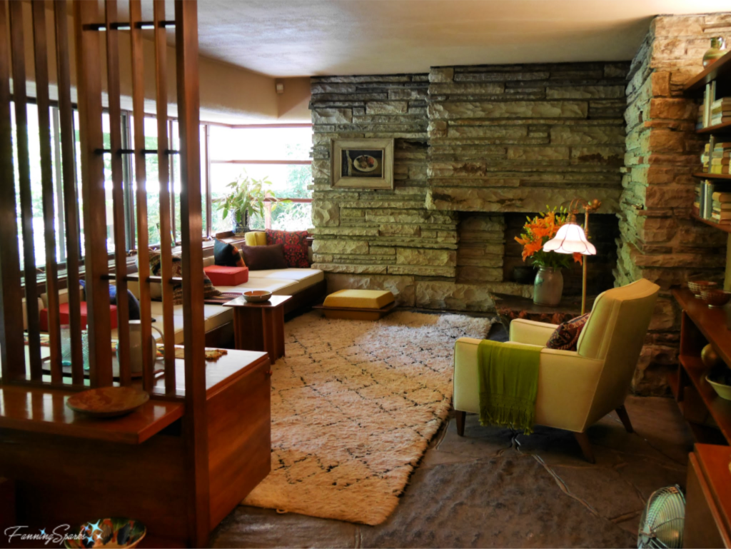
Wright designed for his own height which was 5’ 8”. He kept ceilings low and deliberately placed furnishings close to the ground. This strategy is evident in the FallingWater living room.
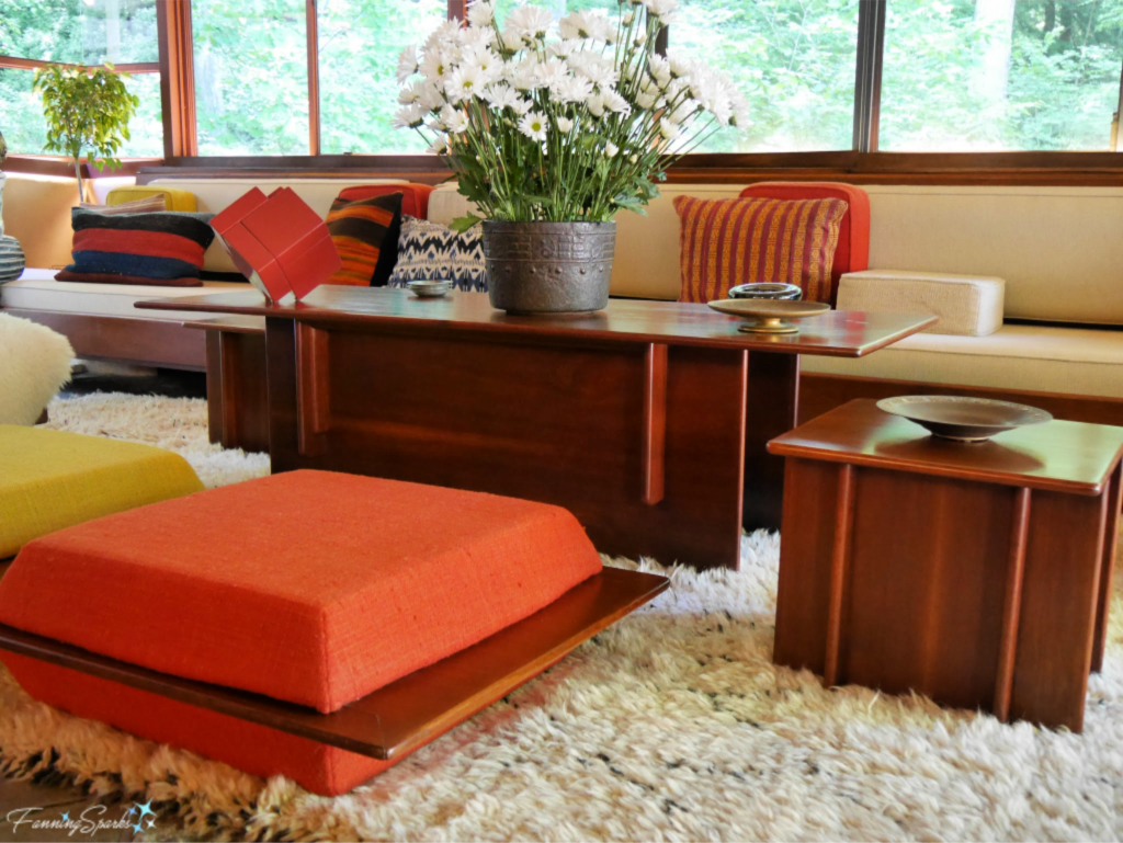
 Japanese style floor cushions, called “zabutons”, were designed by Wright and placed throughout the living room.
 Natural Materials
As with the exteriors of his buildings, Wright preferred to use local building materials to create a harmonious connection with the home’s surroundings. Local sandstone and black walnut were used throughout FallingWater as seen in this guest bedroom.
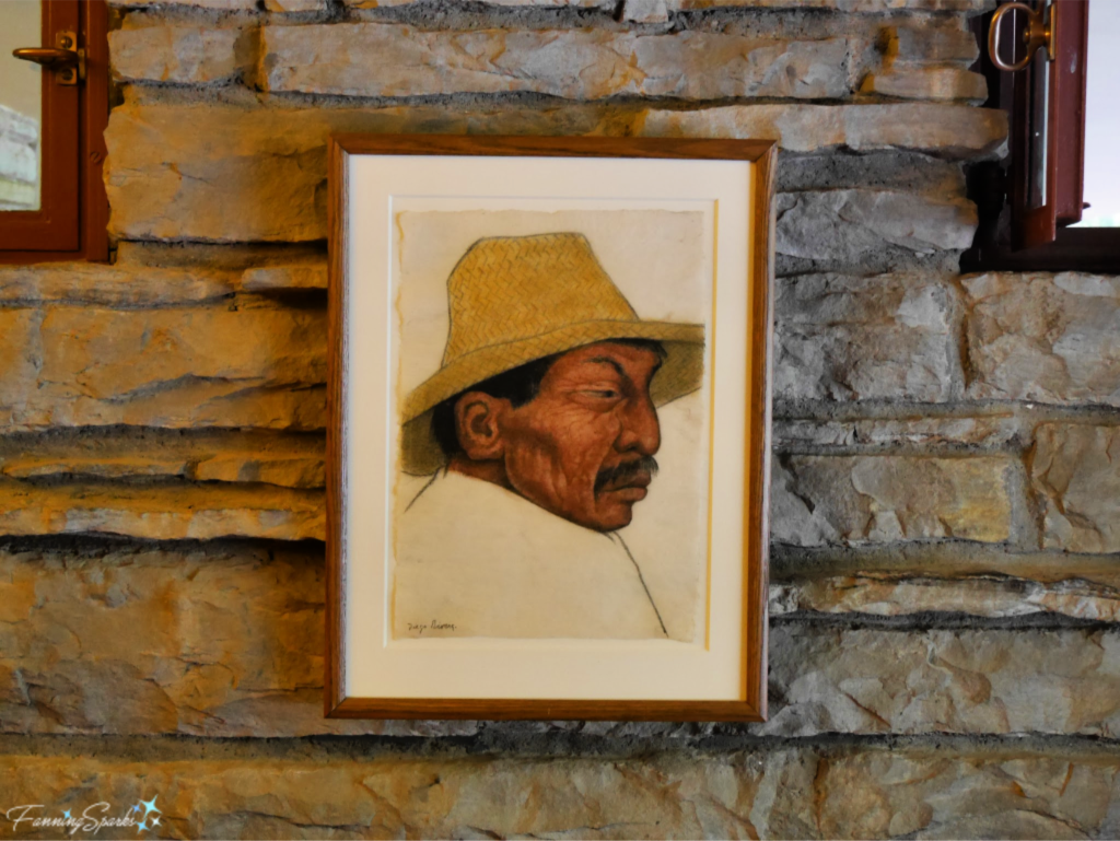
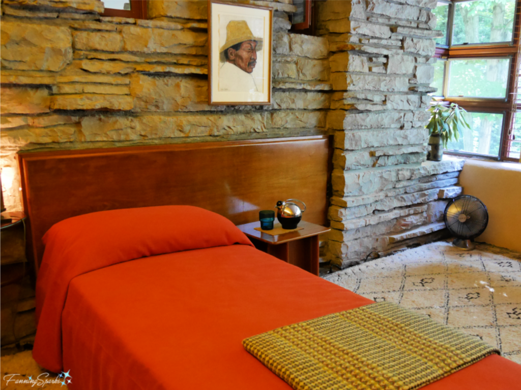 And, yes, that’s an original work (Portrait of a Man ca 1930s) by Diego Rivera who was a prominent Mexican painter. Rivera, a favored artist of the Kaufmann family, visited FallingWater as a guest.
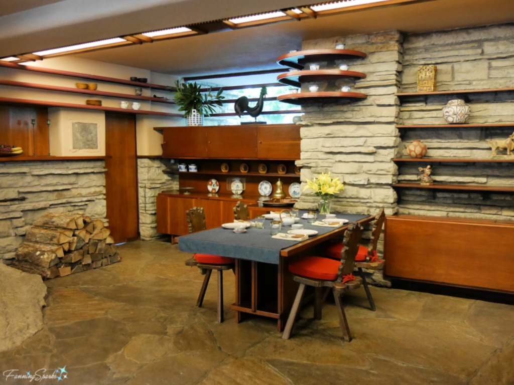
 Natural materials – stone and wood – are also prevalent in the dining area.
 In the below photo, the unusual construction of the fireplace is visible. Wright had the fireplace built on top of the natural rock from Bear Run falls.
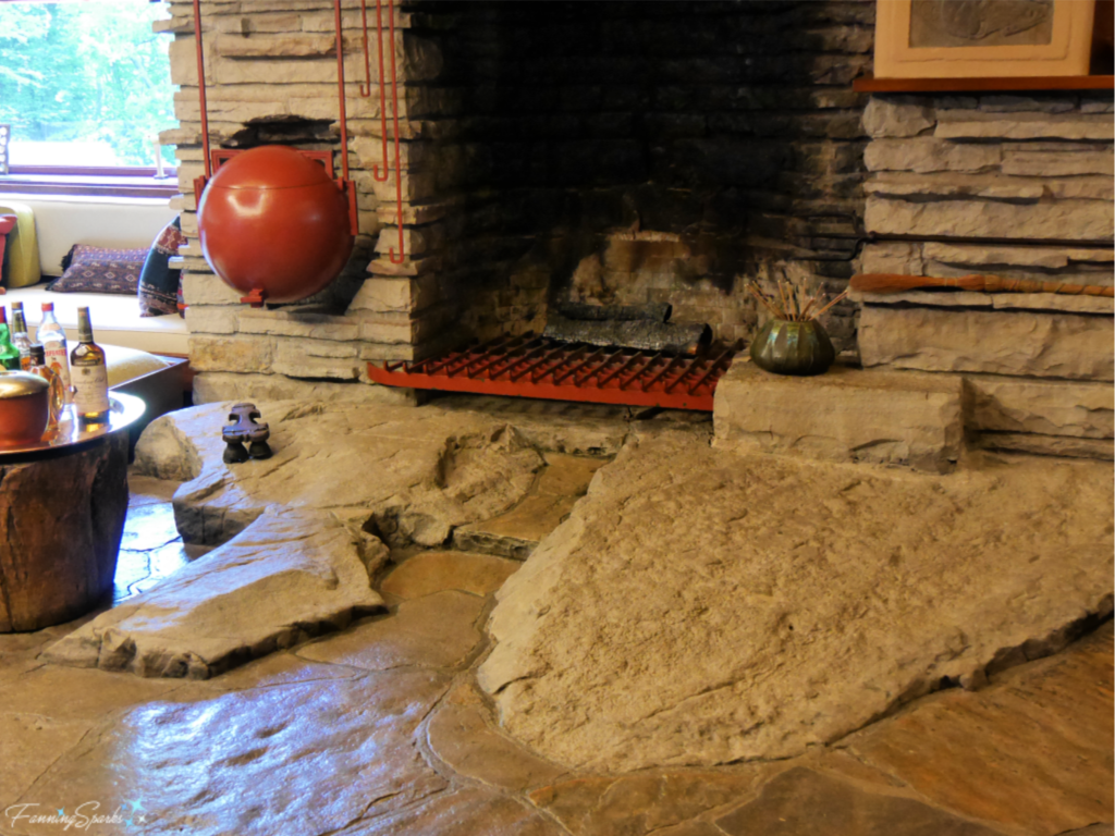 That big red ball to the left of the fireplace? It’s a Wright original meant to be used for heating water. Apparently, the home owners used it only once because it took much too long.
Natural Light
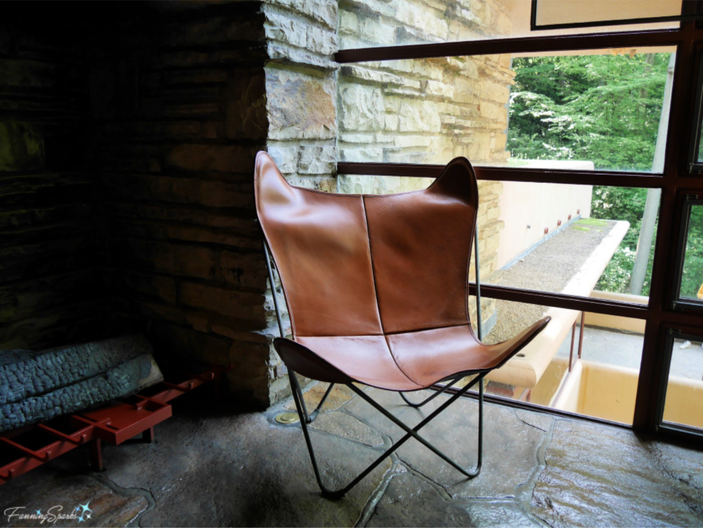
The below leather butterfly chair is perfectly positioned to take advantage of the natural light in the study. Not all of the furniture and artwork at FallingWater was designed or selected by Wright. This chair, the “B.F.K chair”, was purchased by the Kaufmanns from its Argentine architects around 1940. Our Tour Guide told us it is 1 of only 2 remaining original butterfly chairs. This design was highly popular in the 1950s when an estimated 5 million were sold.
Geometric Shapes
Rectangular shapes dominate FallingWater’s interiors. The sitting area of the guest quarters, shown below, illustrates this point with the built-in rectangular seating and the vertically slatted room divider.
 Art Glass
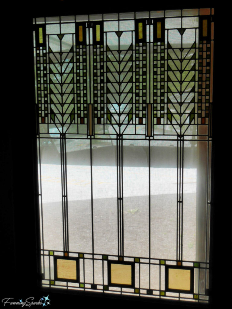
I didn’t notice any art glass at FallingWater but I was able to admire a few of Wright’s designs at the Corning Glass Museum in Corning, New York recently. This window design is known as The Tree of Life. Wright designed it for the Martin House in Buffalo, New York. According to the exhibit, “In this window, Wright reduced the tree to its most elemental, geometric form – with a square for the roots, simple straight lines for the trunk, and chevrons for the branches. Leaves are indicated by pieces of gold, red and green glass.” It’s a brilliant design!
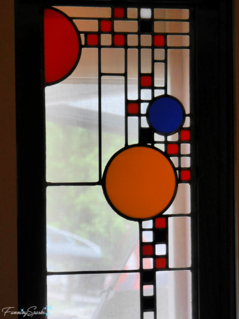
The distinctive brightly-colored circles in the Coonley Playhouse windows are probably one of Wright’s most recognizable designs. According to the exhibit, “Wright once said that these windows were inspired by parades, and indeed, images of balloons, confetti and waving flags come to mind.”
And with that, the recurring themes identified in Wright’s building designs‒blurred lines, nature inspiration, horizontal planes, natural materials, natural light, art glass, and geometric shapes‒have all been found in his interior designs as well. Cantilever construction being the only exception. After this careful examination of the masterpiece that is FallingWater, it becomes more obvious what Wright meant when he said “A house is more than a home by being a work of art”.
More Info
You can read more about Frank Lloyd Wright and FallingWater in my previous post, Then Came FallingWater.
To learn more about Frank Lloyd Wright or FallingWater check out their websites.
Today’s Takeaways
1. When viewing the work of artists and experts, take note of the elements of design such as color, shape, texture and space
2. Look for recurring themes to find inspiration.
3. Consider Wright’s statement‒Is a house more than a home by being a work of art?


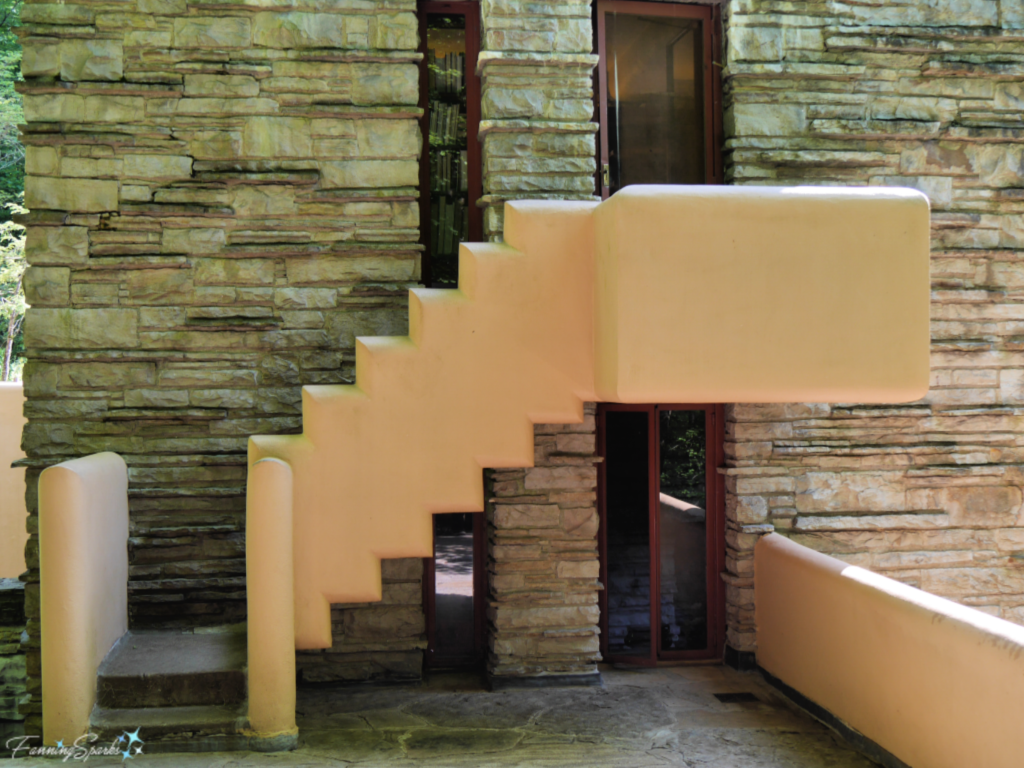
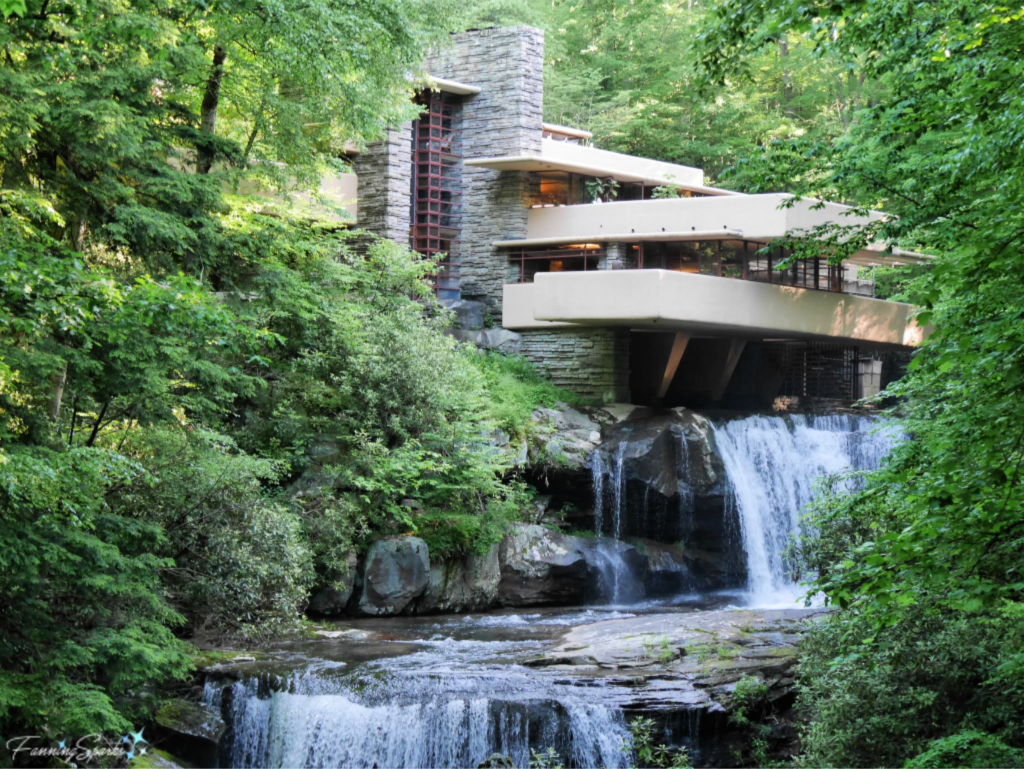 Blurred Lines
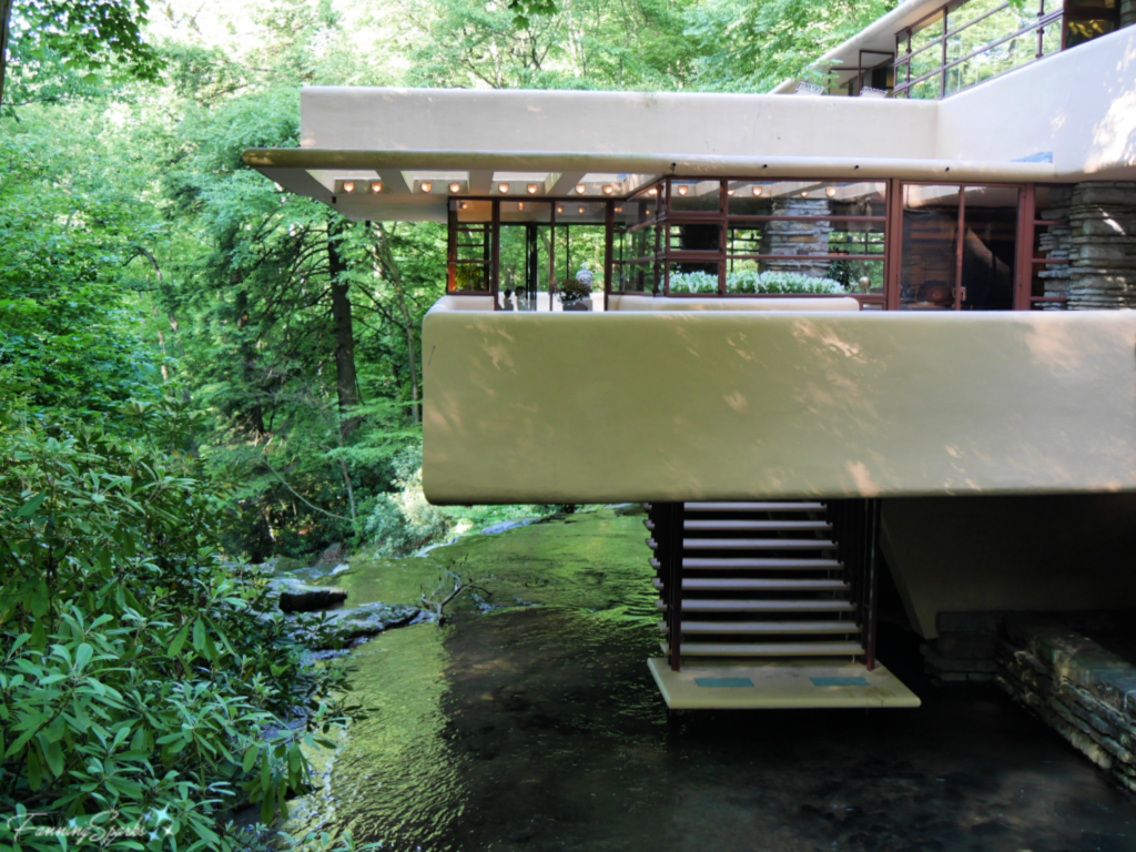 And those stairs that you see coming down to the stream, they are accessed from this glass-enclosed stairwell or hatchway in the living room.
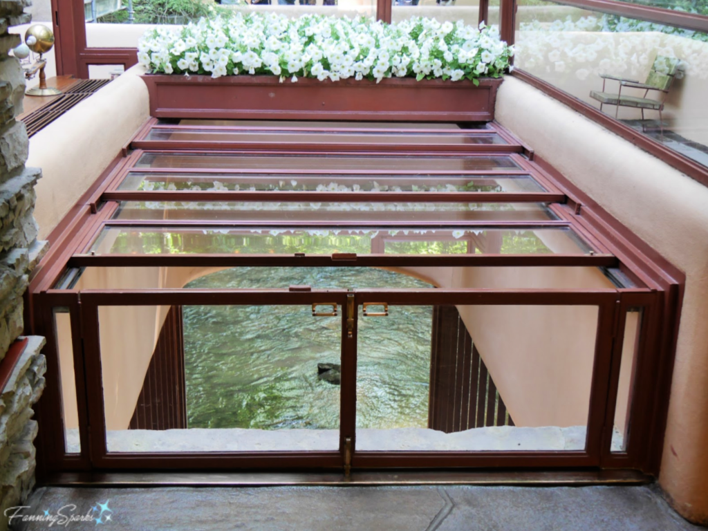 This is a great illustration of one of Wright’s philosophies. He liked to blur interior and exterior space by making the interior decor complement the exterior. The idea of “bringing the outside in” is still popular today. It’s fascinating to see how Wright accomplished this nearly a hundred years ago.
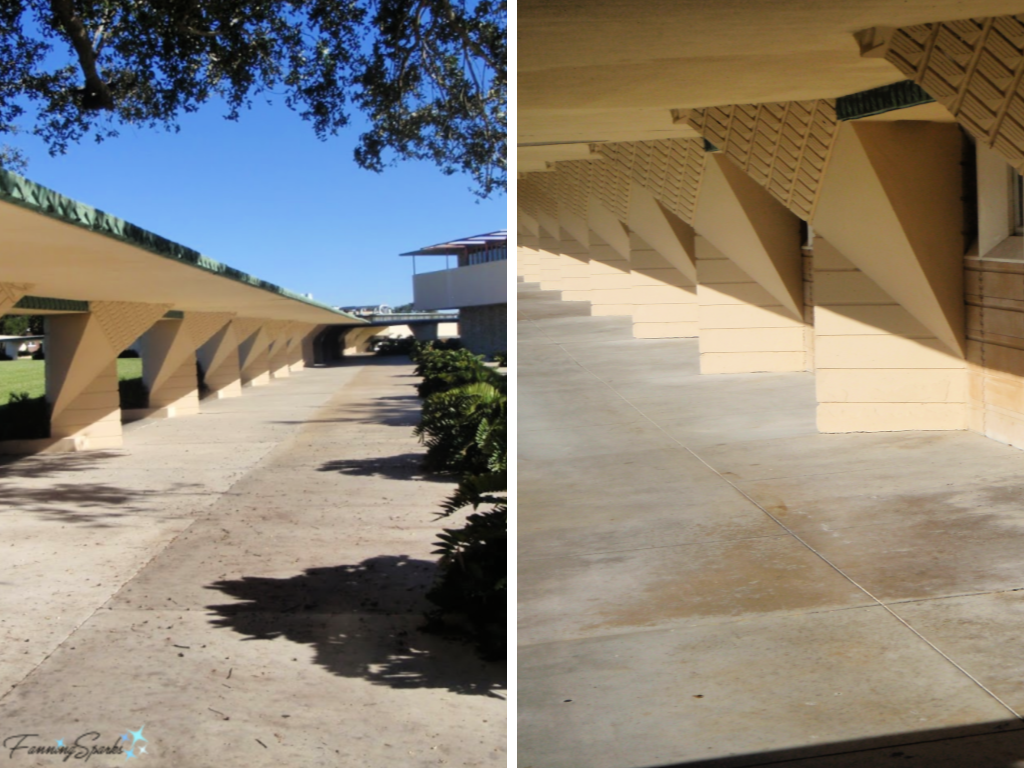
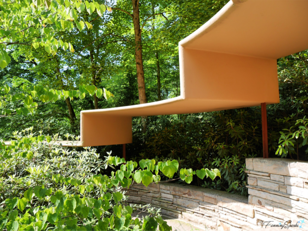
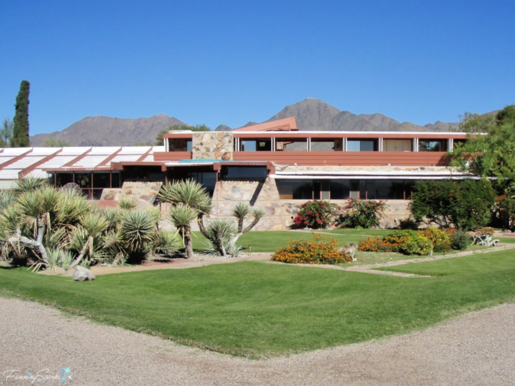 These same horizontal planes are a strong design element in Robie House in Chicago. Robie House is considered the finest example of the “Prairie Style” of architecture which Wright created in the early 1900s.
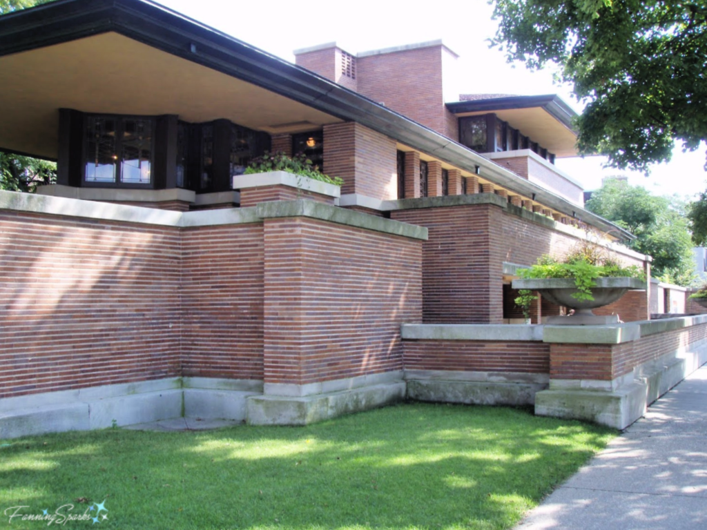 Rosenbaum House in Florence, Alabama continues with horizontal planes and rectangular shapes. Rosenbaum is an example of Wright’s Usonian style. His Usonian vision was to make home ownership affordable for the American middle class. To accomplish this, he simplified his design (eg by eliminating attics and basements) and reduced construction costs (eg by eliminating the need for specialized labor).
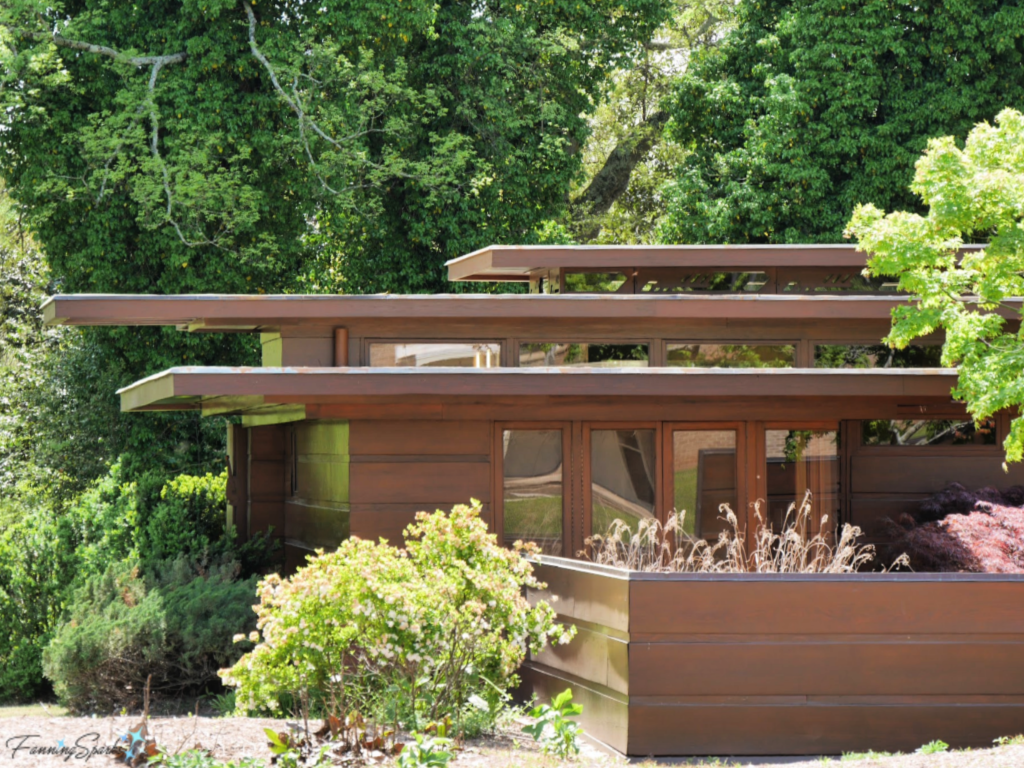 Natural Materials
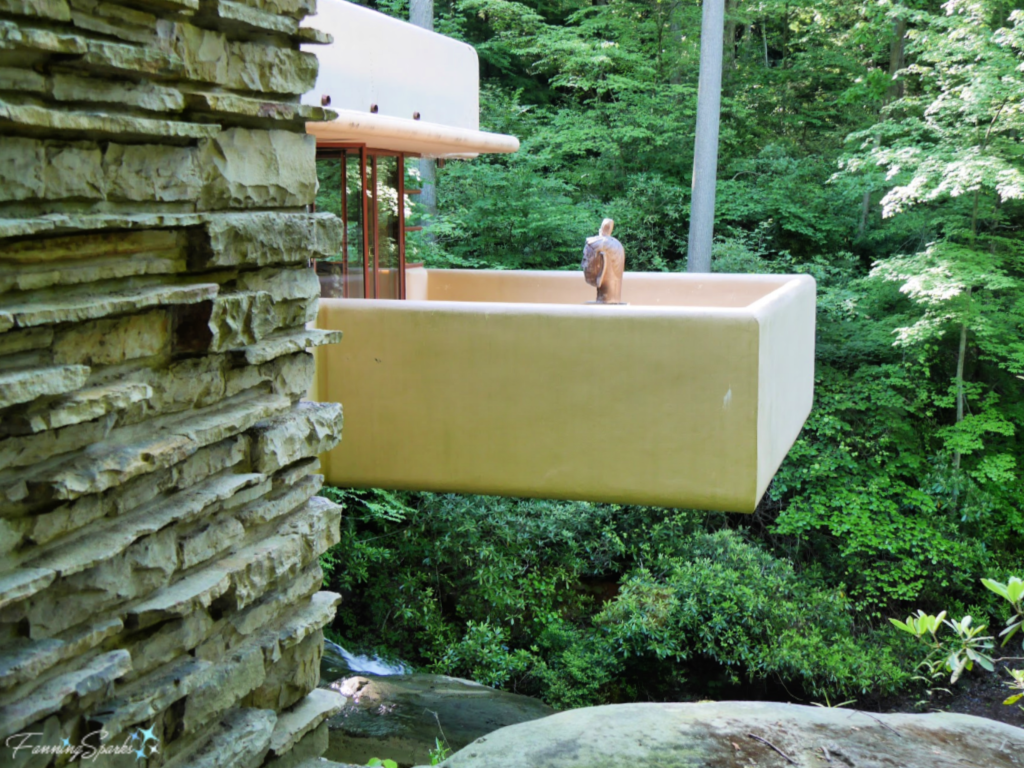 He used a similar approach at Taliesin in Spring Green, Wisconsin where he chose local yellow limestone and river sand to construct the walls. Taliesin is of particular interest because it was Wright’s home, studio, and garden sanctuary for over 30 years. He used Taliesin as a laboratory for architecture and design and started his school of architecture there. This was the first Frank Lloyd Wright home I had the opportunity to visit.
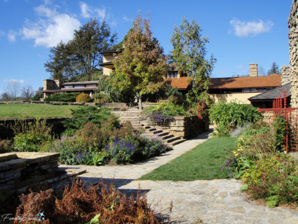 Cantilever Construction
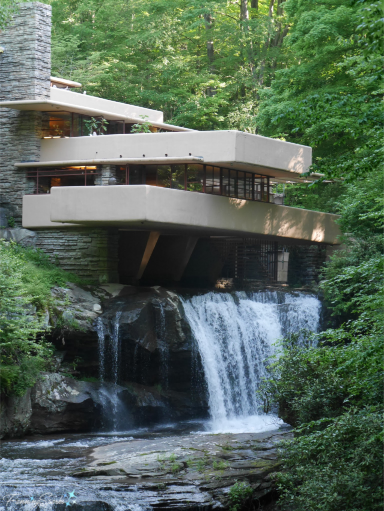 Natural Light
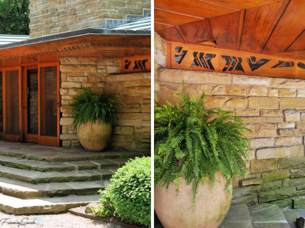
 Art Glass
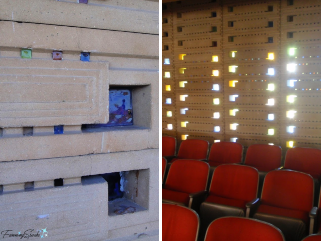 Meanwhile, the front of the chapel has this stunning display of light and color.
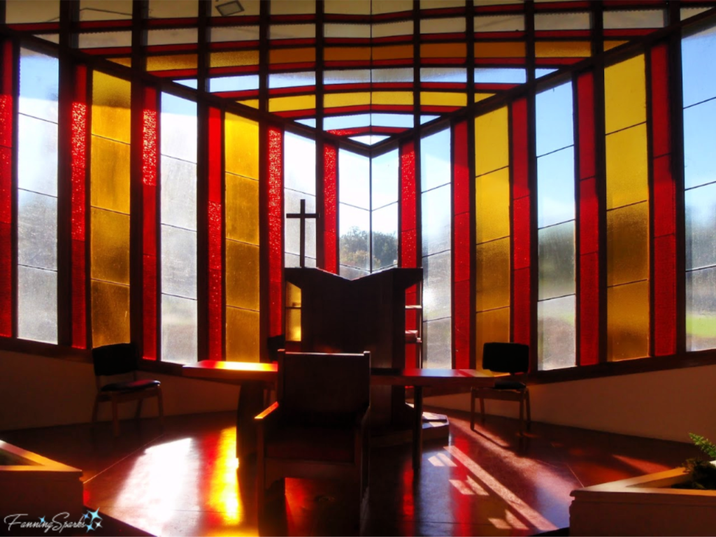 Geometric Shapes
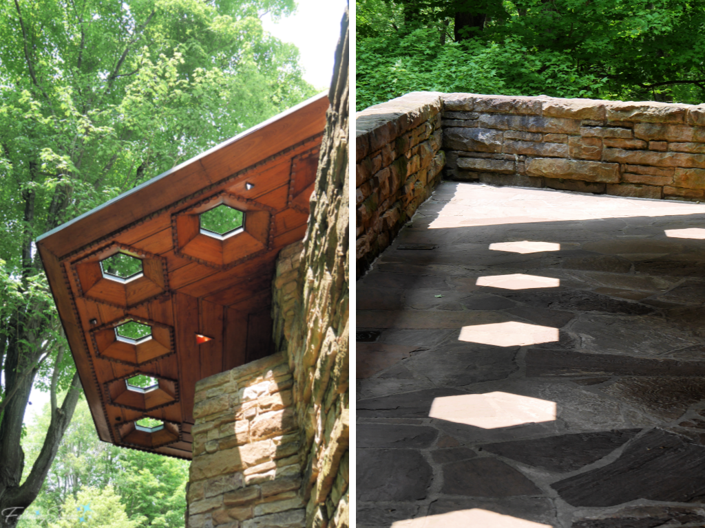 Circles and semi-circles are prominent in Wright’s design for The Annunciation Greek Orthodox Church in Milwaukee, Wisconsin.
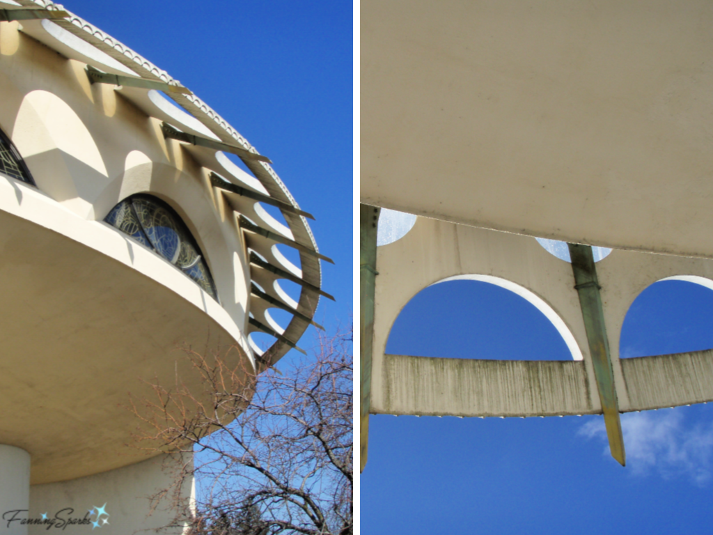


 While it looks easy when a pro like Tony does it, it’s not! Glass flamework takes exceptional coordination and lots of practice. My own meager attempt to blow a round Christmas ornament turned into an odd shape more like a vegetable. Yet, I’m insanely proud of my pepper-like ornament!