
A surefire way to boost the textural interest of a room is to weave in textiles. In interior decorating terms, textile-based goods are called “soft furnishings” and they are available in an endless variety of forms, colors and patterns. Think upholstery, window treatments, floor coverings, bedding, table linens, decorative pillows, and fiber wall hangings. Textiles can add dimension, depth, interest, sensory richness and visual weight.
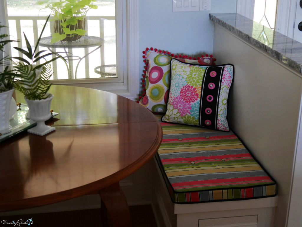
Textiles, in the form of seat cushions and decorative pillows, went a long way to softening the hard surfaces ―both literally and visually ― in the kitchen eating area of our previous home (see Our Pony Wall and Banquette Combo).
Technically speaking, the term “textiles” is used very broadly to describe a variety of fiber-based materials in various stages from yarns to upholsteries. Textiles begin as fibers ― either natural like wool and cotton or manmade like polyester. The fibers are crafted and manipulated into finished materials such as woven cloth, knitwear, knotted macrame and hooked surfaces. Then the finished materials are turned into final goods such as soft furnishings and apparel.
A brief Instagram search revealed a variety of great examples. First up, is this splendid living room designed by Corinne Victoria Design and posted by Seams Sew Right who fabricated the Roman shades and pillows. Textiles rule in this traditional style room!
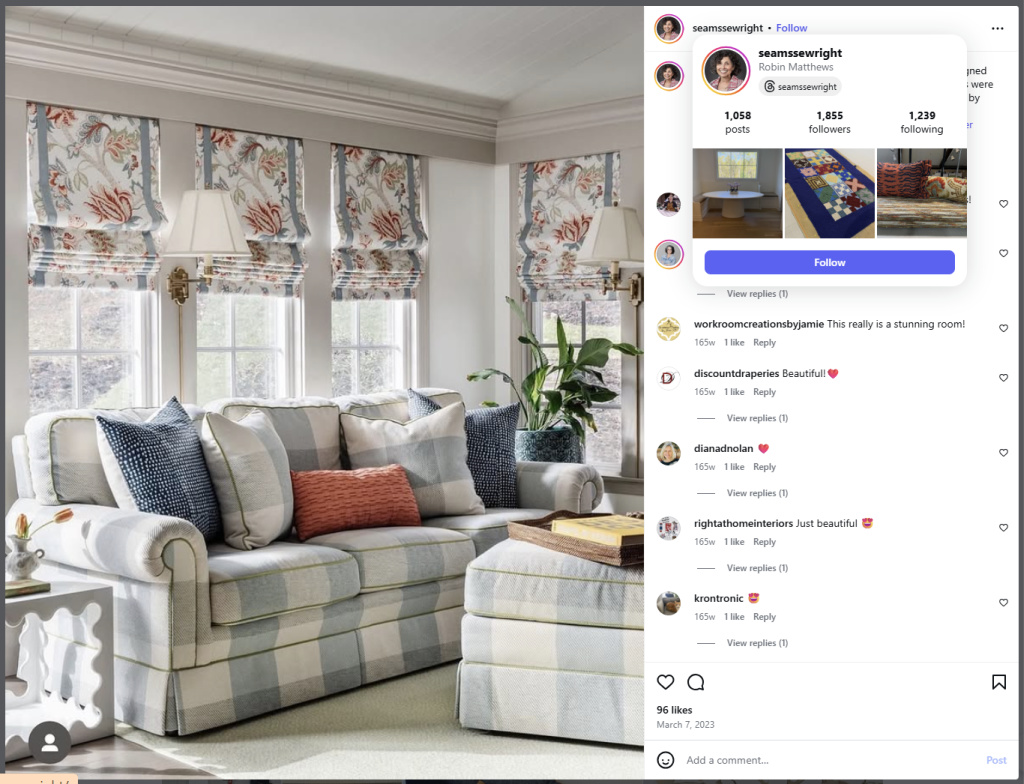
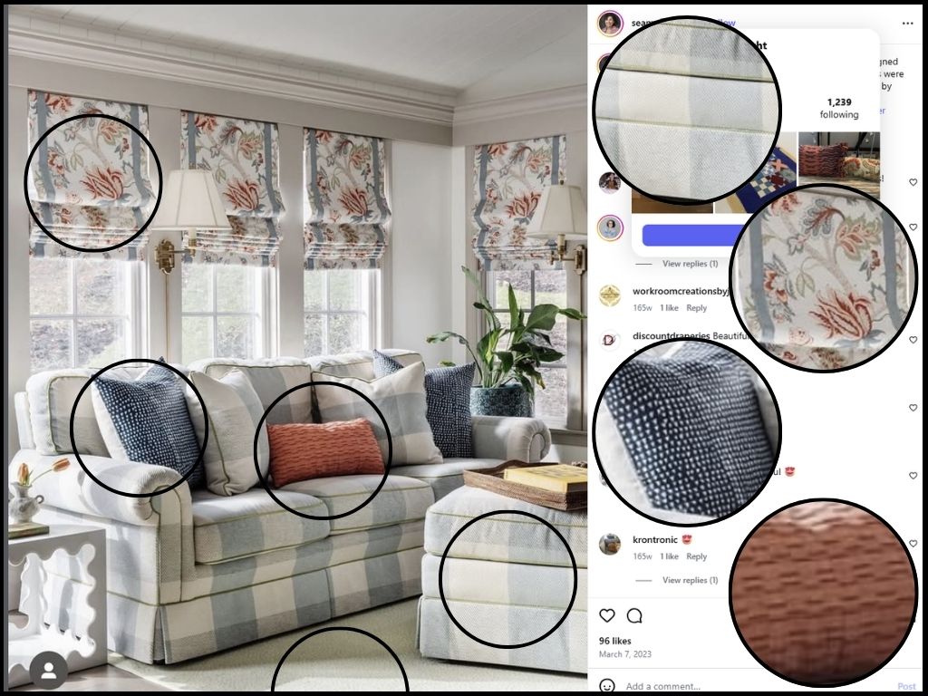
Not only does this room demonstrate a generous use of textiles, it also showcases a carefully chosen palette of colours and patterns in those textiles. To illustrate this point, I tried to deconstruct the room and pull out the various textiles for a closer look.
I’d guess the design started with the soft blue/grey and creamy white, buffalo checked fabric on the sofa and ottoman. The bold floral fabric used for the Roman shades is a perfect complement to the upholstery ― it pulls in a gorgeous burnt orange or terracotta hue while staying anchored in the blue/grey and cream color scheme. The two pillows covered in the dark blue, small-scale geometric print provide an unexpected contrast while the terracotta-colored lumber pillow is the perfect accent. A creamy white rug anchors the entire room.
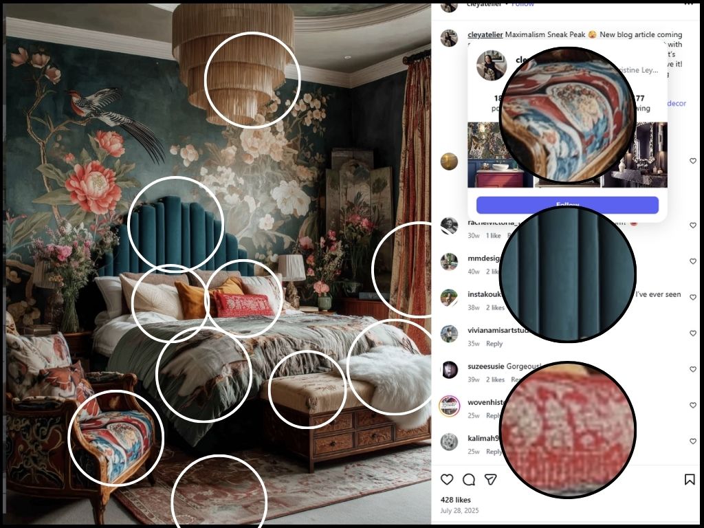
This next example is a very different style ―boho maximalism. Christine Ley of Cley Atelier, who designed this stunning bedroom, describes it as “luxe, romantic and tactile”. The jaw-dropping wallpaper is the star of the show with various textiles playing supporting roles.
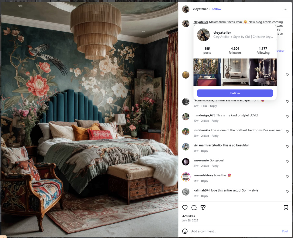
Now, for a closer look. In true maximalist style, an abundance of textiles ― all carefully curated to play off the splendid moody, floral wallpaper ― are layered into this luscious space. Textiles are used for the lively chair upholstery, the “lush velvet upholstery” on the headboard, the “layered embroidered pillows, kantha throws, … silk or linen bedding”, the colorful rug, the floor-to-ceiling drapes and a long-haired sheepskin throw. It’s all topped off with a dramatic, oversized, tiered, bohemian chandelier draped in natural fiber fringe.
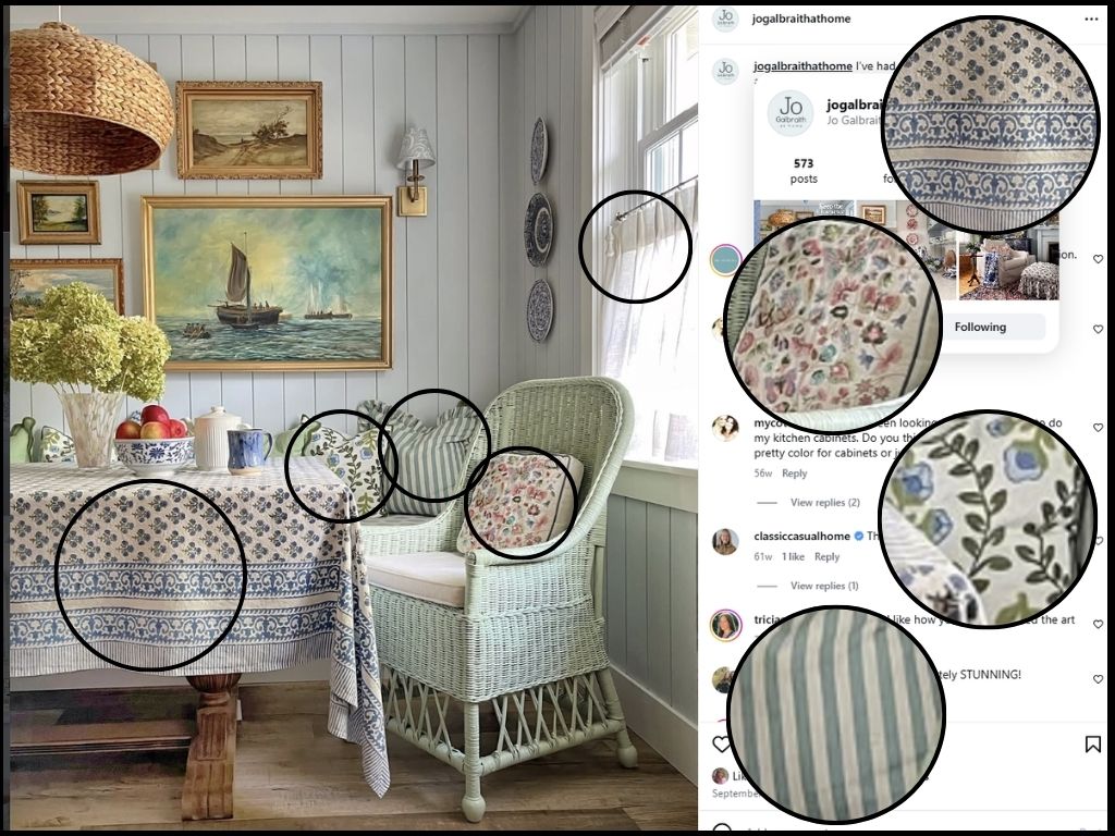
This next example showcases a cheerful, modern cottage style, dining area in the home of Jo Galbraith. I can see why her caption read “I smile when I walk through this happy colorful space”. Her generous use of textiles obviously contributes to the “happy, colorful” mood. Interestingly, Galbraith’s beautiful home was recently featured on the cover of the Spring 2026 issue of Country Home Magazine.
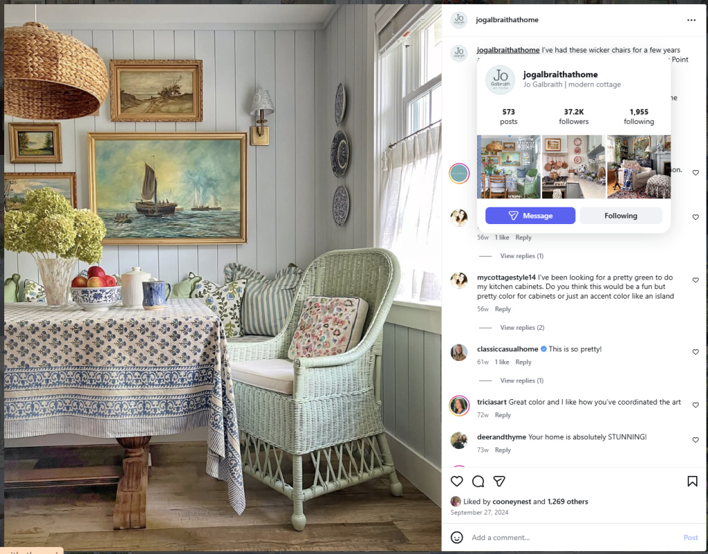
This space has obviously been decorated with great care ― it is layered, intentional and so inviting! The textiles are beautifully complementary in color and style but not overly matched. The pretty, block-print, French Provencal style tablecloth sets the mood with its crisp, cream and blue, geometric pattern. A selection of cushions ― in florals and stripes ― dresses the seating while the airy, barely-there, café curtains blend into the background.
Reverse-engineering a successful interior design isn’t a new idea but it’s a good one. In fact, well-known designers, like Reynard Lowell, Sarah Richardson and Emily Henderson, all recommend studying the work of professionals as a way to learn more about successful design. The idea is not to copy ― rather to inform. It’s about broadening options, identifying what works and considering how these findings might impact one’s own choices.
I’m in the midst of selecting textiles for my own home so my focus has been on successful textile palettes. What specific selections did the designers make? What colours did they choose? What patterns? What textures? How many different textiles did they select? How did the designers use the selected textiles? Where did they apply them? In what proportions? Were they repeated? What did they emphasize?
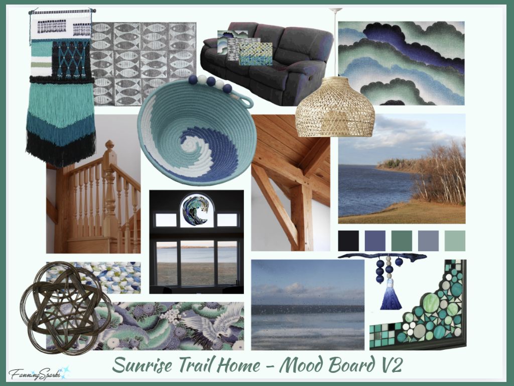
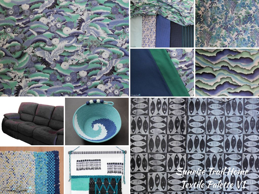
Shown below is the mood board I created for our Sunrise Trail home (see previous blog post In the Mood for Mood Boards). Several of the textiles I’ve already selected are shown including the dark grey upholstered sofa and the Japanese-style, blue/green print I’ll be using as my main fabric.
“When done right, patterns and colors work hand-in-hand to create interiors that feel lived-in and loved, not chaotic” write the Oliver James authors of the article, 9 Rules of Pattern Mixing and Color Palettes—and How They Relate. They go on to explain “Every successful room begins with a clear vision, and more often than not, that starts with your color palette. You might be inspired by a dreamy fabric that instantly feels like the heart of the space—we call that a ‘hero fabric.’ It’s usually the boldest pattern in the room, the one that sets the tone for everything else. From there, your palette unfolds.”
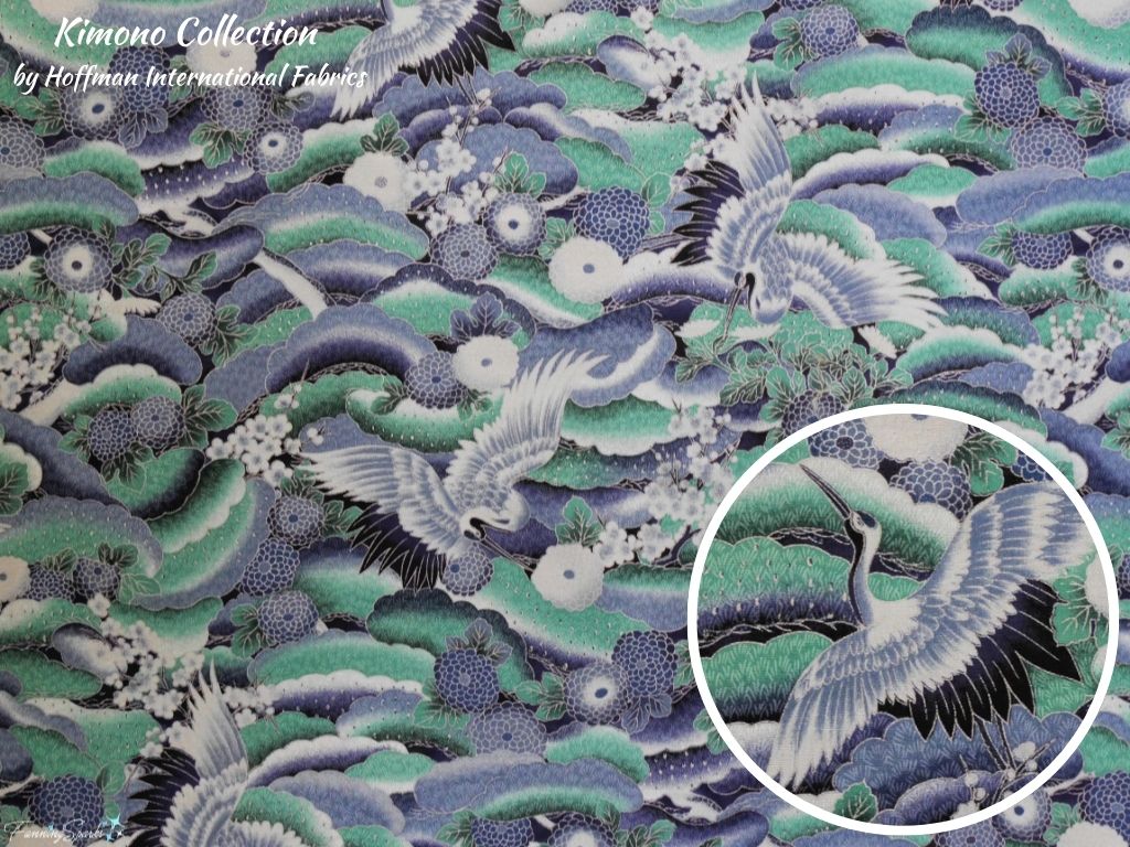
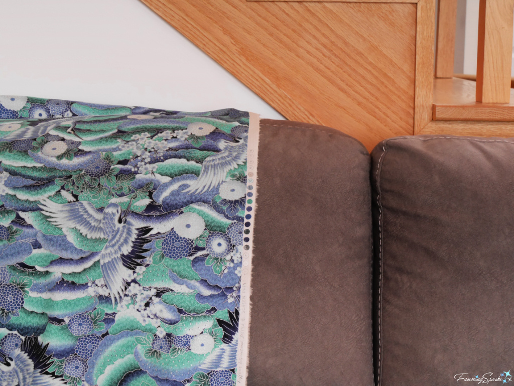
Shown below is my hero fabric. It’s a medium-weight, cotton fabric from the Kimono Collection by Hoffman International Fabrics. I purchased significant yardage several years ago and I’m happy to finally have found the perfect use for it.
The design is inspired by the dense, all-over patterns typical of formal Japanese kimono fabrics. It features majestic flying cranes, chrysanthemums, cherry blossoms and billowing clouds which are all symbolic in traditional Japanese culture. The color palette combines various blue and green hues, highlighted with white and silver, in a rich, cool harmony.
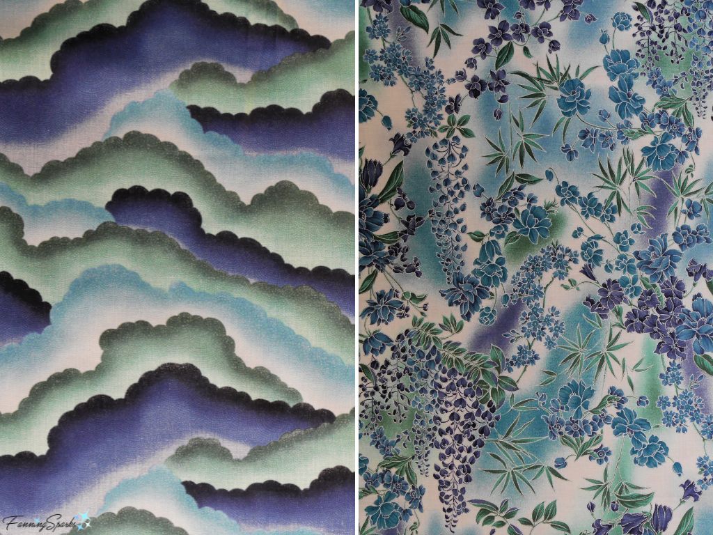
I purchased two other patterns from the Kimono Collection including a cool-tone indigo and teal stylized cloud print and a blue and purple floral print featuring wisteria blossoms.
Professionally designed fabric collections, like the Kimono Collection, are a great choice for home decorating because they offer a set of cohesive options which can be mixed and matched without guesswork.
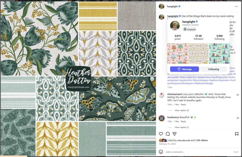
Shown below is another example. This is the Botanica Collection, created by one of my favorite surface designers ― Heather Dutton of HangTight. The collection includes 12 fabric choices in a beautiful variety of florals, geometrics, stripes, solids and small prints ― all executed in a perfectly-coordinated grey, green and gold colourway.
“Mastering the art of mixing and matching different fabrics, from florals to stripes and solids, can transform an interior space with depth, vibrancy, and character” write the authors of the Material Bank article, The Art of Mixing and Matching Fabrics in Interior Design. “Skillfully layered patterns create visual interest, adding personality without overwhelming the senses. Achieving this balance requires attention to scale, color, and contrast, allowing these elements to complement each other while adding richness to the overall design.” These considerations have already been factored into professionally designed fabric collections like HangTight’s Botanica Collection.
As I see it, I have the best of both worlds ― a textile palette anchored by a few professionally coordinated fabrics which I can build out with textiles I’ve created or found elsewhere. The result should be more personal and less predictable than adopting a single collection.
“When mixing patterns, it’s helpful to begin with a dominant fabric, often a larger, bolder print that sets the tone for the room” write the Material Bank article authors. “Once a dominant pattern is selected, a secondary print can be introduced, such as stripes or geometric shapes … with colors that echo tones from the main pattern [ensuring] cohesion, [and] creating a layered, intentional look”.
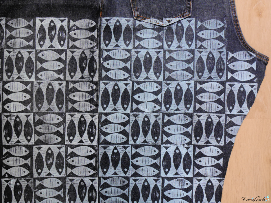
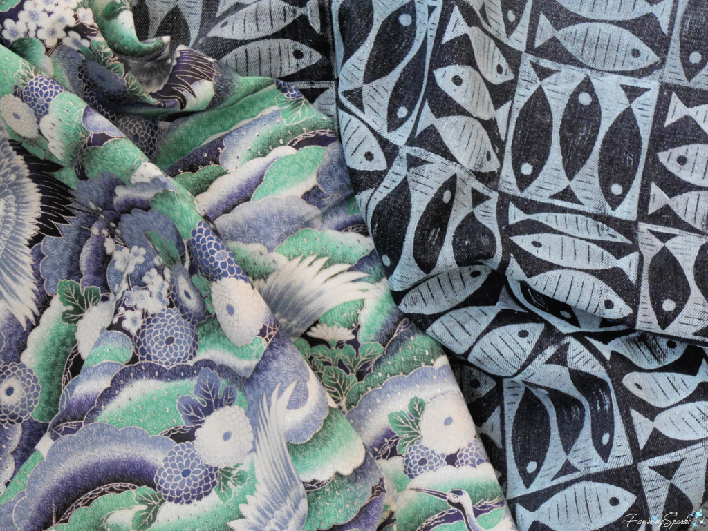
I’ve chosen to create my own secondary print. It features a simple fish motif hand-printed on repurposed denim ― more on that process in a minute. The fish are a nod to our coastal location.
To my eye, this fabric offers the perfect contrast to my hero fabric – the design is rudimentary and imperfect which provides an interesting juxtaposition to the sophisticated precision of the Kimono Collection print. They’re connected through the colourway but there’s a visual tension that makes both fabrics stand out more than they would on their own. There’s also a strong contrast tactilely ― the denim is firm and rough while the cotton is crisp and smooth.
The next step as defined in the Material Bank article is to add solids. “Solids are essential for grounding mixed patterns and avoiding visual clutter. Upholstered furniture pieces, such as sofas or armchairs, in neutral shades … provide a backdrop that allows patterns to shine. These solid elements also allow the eye to rest, adding harmony to the design.”
Our sofa and loveseat are upholstered in a medium-toned, cool grey fabric with a soft, matte finish. While I don’t love the flat, solid grey, it does provide an excellent neutral background.
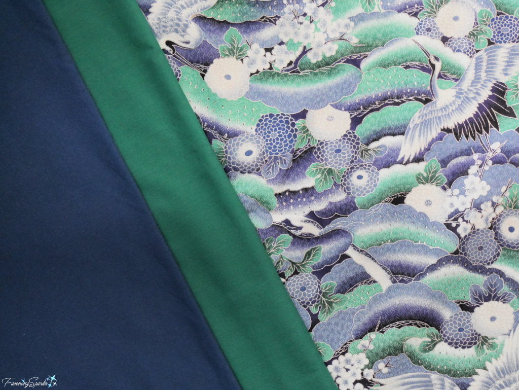
My textile palette also includes two solid-coloured cotton fabrics in hues pulled from the hero fabric ― one in deep navy/indigo and one in forest green.
Returning to the Oliver James article, 9 Rules of Pattern Mixing and Color Palettes, the authors write “Use one or two large-scale patterns to make a statement—perhaps a painterly floral or a wide stripe. Then add in smaller, more delicate motifs to bring in depth and contrast. The key is that all patterns should speak the same language, either through a shared color or tone. It’s less about being identical and more about feeling related.”
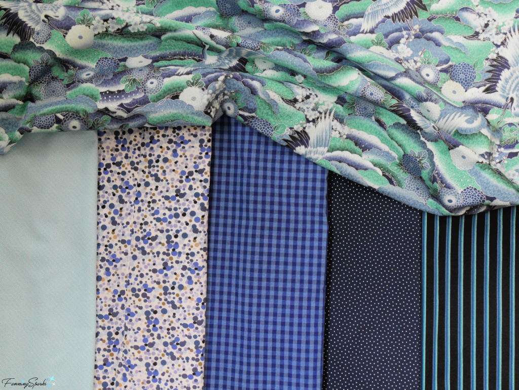
Shown below is a selection of cotton fabrics with small, delicate motifs in complementary colors which feel related to my hero fabric. I’ll be able to draw upon these fabrics for small items, accents and trims.
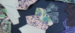
My textile palette is grounded in fabrics but it also includes other fiber-based textiles such as coiled cotton rope basketry, twined rag rugs and cotton cord/ yarn macraweaving. Shown below is a visual summary of my textile palette as it currently stands. I fully expect it will continue to evolve as I start to incorporate textiles into soft furnishings and decorative accessories in our home.
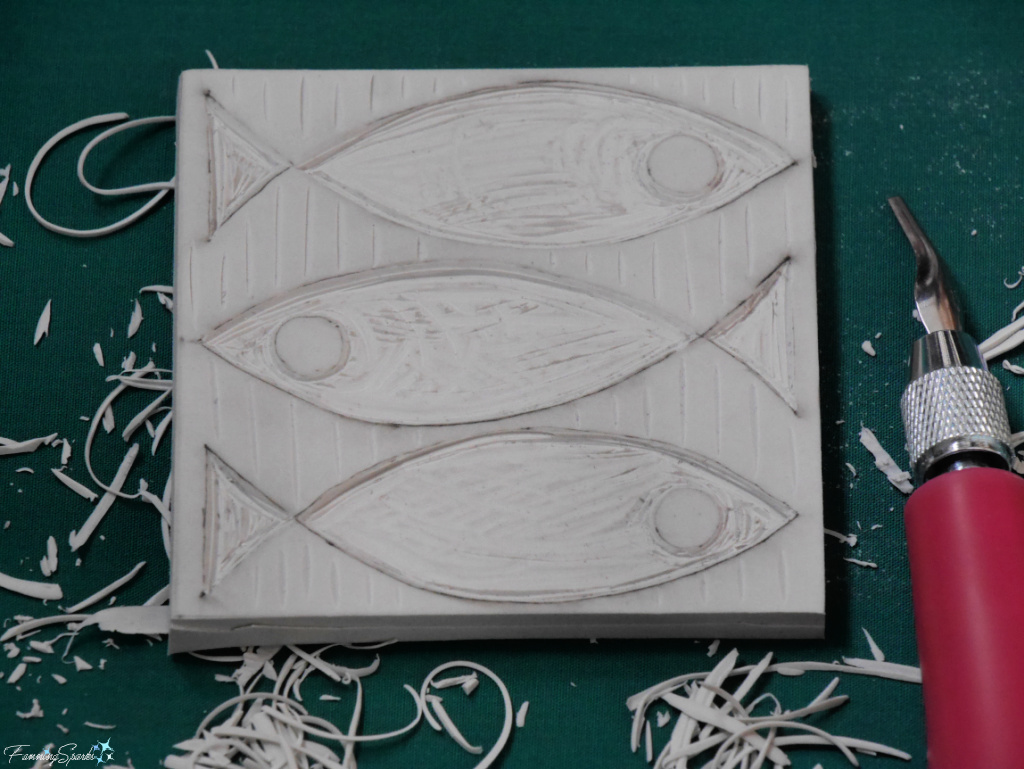
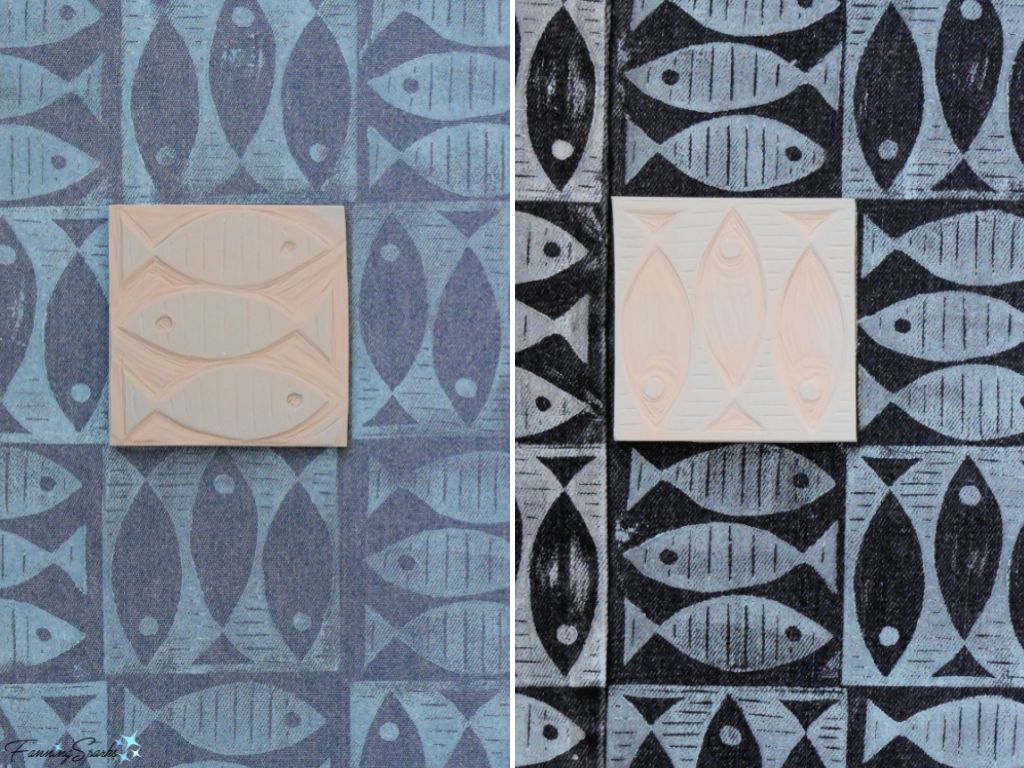
As promised, here’s the background on my new, custom, block-printed denim. I carved the design into linocut blocks then printed them on fabric using the techniques I learned at a workshop in Atlanta, Georgia. See Linocut Printing at the Atlanta Printmakers Studio and More Carving and Printing.
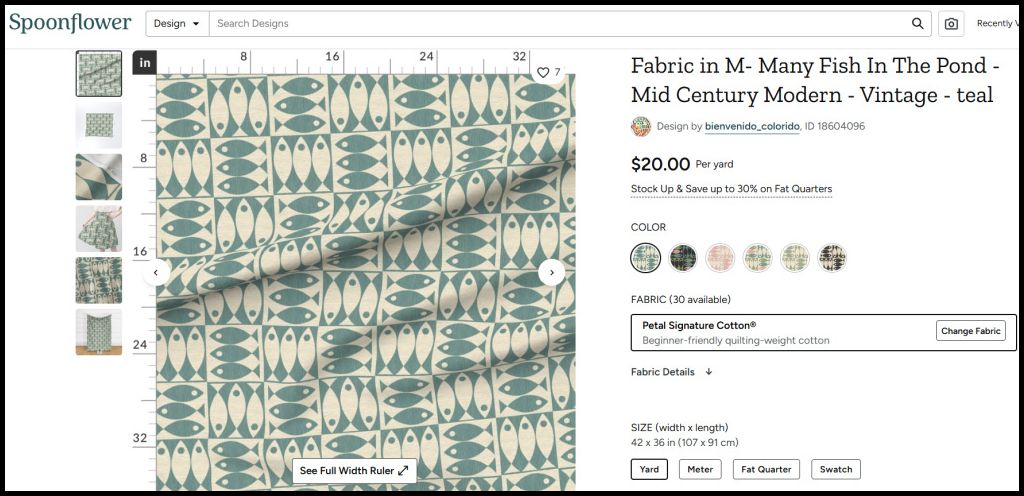
I haven’t had many occasions to apply this technique but when I came across the below design on Spoonflower, I decided to give it a try for our new home.
It’s a beautifully simple design featuring two blocks of basic fish shapes – one is positive and the other is negative. The design, called Many Fish in the Pond, was created by Nell Simboeck of Bienvenido Colorido. It won first place in Spoonflowers’s recent Mid-Century Modern Design Challenge. Congratulations on the win, Nell! And special thanks for agreeing to let me showcase it here on the blog.
I started by carving a stripped-down version of the design into a set of linocut blocks.
Then I repurposed some denim ― an old denim shirt and a pair of denim jeans ― in preparation for printing. Next, I mixed a soft blue color with my screen-printing inks and started printing.
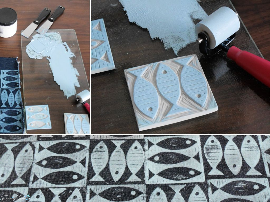
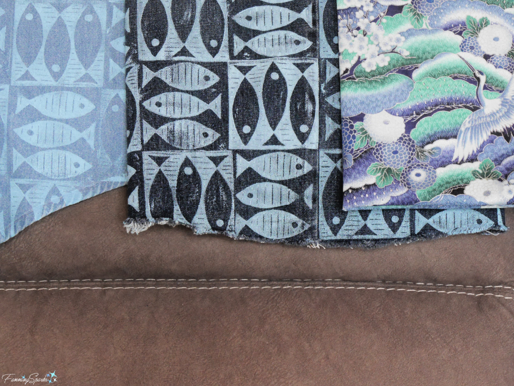
Block printing puts a new spin on Nell’s design by introducing the inconsistencies and imperfections which are inherent to this medium. There’s a lot of variation in the results because every block is printed individually. Despite my best efforts to keep everything consistent, the coverage and amount of ink varied from block to block. The color of the ink varied every time a new batch was mixed. The placement of the stamps and the pressure applied while printing varied with each impression. All of this variation makes the resulting fabric unique and special.
I also had significant variation between the two pieces of fabric ― the denim jeans were considerably darker than the denim shirt.
Here’s a photo of the two pieces of block-printed fabric shown with my hero fabric against the cool grey of our sofa upholstery.
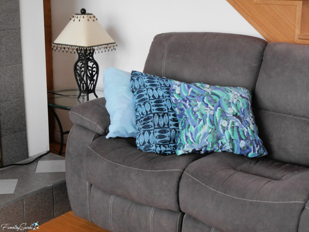
Predictably, I couldn’t wait to see how it would look in a more finished fashion so I simply wrapped fabric around my existing pillows to mockup this shot. Hmmm… not bad … I think this textile palette may actually work!
More Info
Previous blog posts mentioned in this blog post include:
. Our Pony Wall and Banquette Combo
. In the Mood for Mood Boards
. Linocut Printing at the Atlanta Printmakers Studio
. More Carving and Printing
The following resources were consulted in writing this blog post:
. 9 Rules of Pattern Mixing and Color Palettes—and How They Relate article; Published July 2025 on Oliver James Interiors website
. The Art of Mixing and Matching Fabrics in Interior Design article; Published December 2024 on Material Bank website.
As mentioned, my block-printed fish design was inspired by the work of Nell Simboeck of Bienvenido Colorido. Check out her Instagram page or Spoonflower shop for more design goodness. Thanks again, Nell, for agreeing to let me showcase your design.
The following talented designers, decorators and artists are also mentioned in this blog post:
. Corinne Victoria Design ― see more on Instagram
. Robin Matthews of Seams Sew Right― see more on Instagram
. Christine Ley of Cley Atelier ― see more on Instagram
. Jo Galbraith of Jo Galbraith at Home ― see more on Instagram
. Heather Dutton of HangTight ― see more on Instagram.
Today’s Takeaways
1. A surefire way to boost the textural interest of a room is to weave in textiles.
2. “When done right, patterns and colors work hand-in-hand to create interiors that feel lived-in and loved, not chaotic” Oliver James Interiors
3. “When mixing patterns, it’s helpful to begin with a dominant fabric … [then] a secondary print can be introduced … with colors that echo tones from the main pattern [ensuring] cohesion, [and] creating a layered, intentional look.” Material Bank

Comments are closed.