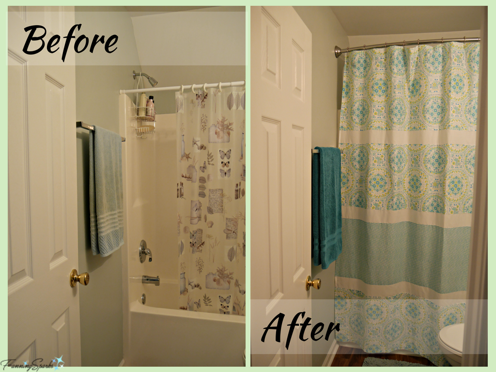
Our small guest bathroom has been seeing a lot of action while we renovate the master bathroom at our new home. Making major changes to this bathroom is not in the cards just now. But we decided making minor improvements to increase the comfort and enhance the appearance were worthwhile. The first change was to switch to a curved shower rod. It’s surprising how much roomier the shower area feels with one of these. The second change was to install the shower rod up high and close to the ceiling to give the illusion of more space in this very small room. Of course, as is typical with these types of small projects, one thing leads to another!
Mounting the new shower rod higher meant an extra-long shower curtain was needed. I already had a standard size fabric shower curtain which I liked. I’d spent a considerable amount of time finding just the right one when I decorated our previous bathroom and I wasn’t keen to go through that search again. It’s a pretty pattern by Cynthia Rowley in a medley of aqua, teal and white. Re-purposing the existing shower curtain seemed like the best option. The challenge would be to insert a piece fabric without it being obvious. I’d like to share how I made this simple, but impactful, change.
Below are the before and after photos to set the stage. The before photo shows the small guest bathroom as it existed when we moved in. I’m grateful to the previous owners for leaving the plastic shower curtain in place; it was the perfect temporary solution. The after photo shows the bathroom with the new shower rod and the re-purposed shower curtain. Nothing earth shattering here! Just an example of how a few simple changes can make a noticeable improvement.

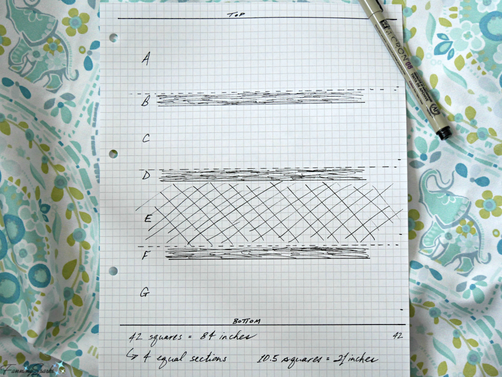
Here’s how I lengthened the shower curtain. My starting point was a standard 72” (length) by 71” (width) purchased shower curtain made of a geometric printed fabric (shown in after photo above). The first step was to come up with a new design. I determined that the new shower curtain should be about 84” long… an additional 12”. It would have been easy to simply add a 12” strip of fabric to the bottom of the existing shower curtain but I thought that would look too obvious. A simple sketch helped me determine the proportions and placement of the additional fabric. Graph paper helped with the scale. I divided the length into 4 equal sections (ie 4 21-inch sections). The sketch, as you can see below, is very rough.

Originally, I thought I’d simply replace the third strip (section E) with new fabric. But the sketch helped me determine that inserting more than one stripe (sections B, D and F) would appear more intentional. I decided to go with stripes in two different heights which I dubbed as short and tall stripes. I also decided to use two coordinating fabrics; a plain white and a coordinating color print. My design called for one tall stripe in the new coordinating color print and 3 short stripes of the plain white for a nice balanced look. This exercise helped me visualize the final outcome. At this point, I was pleased with the design… at least, it looked good on paper!
The next step was to purchase fabric. Using trusty old Excel, I factored in ¼” seam allowances, locked in the exact measurements and determined the yardage I would need. I decided to use the new fabric horizontally which meant two yards of printed fabric (2 x 36”) were needed. Alternatively, I could have purchased only 1 yard and used it vertically but that would have required me to piece together the strips with a center seam. I already had enough plain white cotton in my fabric stash so that was covered. Only the coordinating print for the tall stripe had to be purchased. In hindsight, it would have been better to buy an extra ¼ yard for the tall stripe; so 2 ¼ yards in total. The extra 9” would have provided some wiggle room and made it easier to get everything lined up perfectly for the side hems.
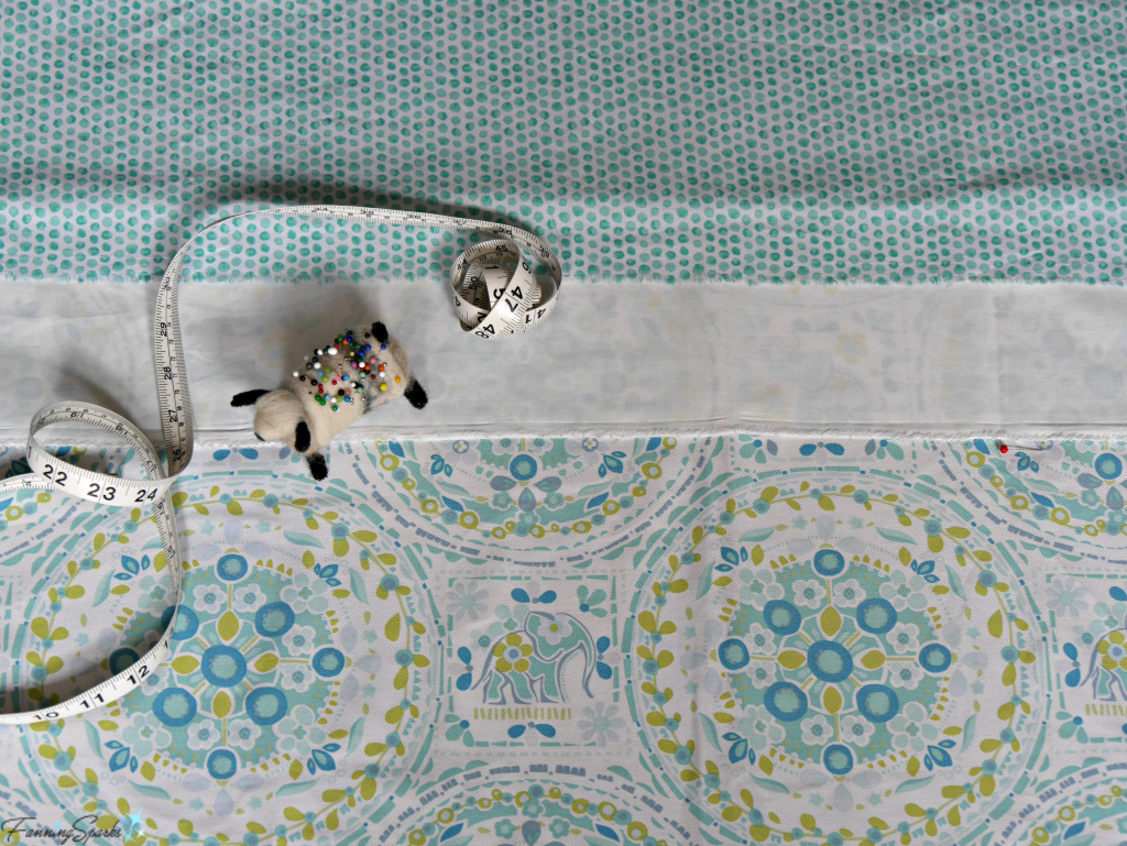
Because the shower curtain is fabric and used with a plastic liner, any simple cotton will work for the new tall stripe. It took a little effort but I found a coordinating print in the quilting cotton section at the local fabric store. Of course, I was anxious to see if it actually looked as good as I envisioned. I laid out the fabrics in the approximate proportions to get a preview. I also took some photos to view them on my computer screen. I’ve found that I see things in a photo that I miss when I’m looking at it directly. Viewing my planned design in these ways assured me I was on the right track.

The next step was to prepare the fabric. I pressed it to remove wrinkles and creases. Then measured and cut the various pieces to the width of the shower curtain including:
. Section A – Top of original curtain – 21 ¼”
. Section B – Short stripe of white fabric – 4”
. Section C – Tall stripe of original curtain – 18”
. Section D – Short stripe of white fabric – 4”
. Section E – Tall stripe of new coordinating print fabric – 18”
. Section F – Short stripe of white fabric – 4”
. Section G – Bottom of original curtain – 17 ¾”
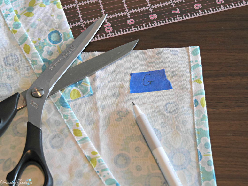
I marked each of the pieces with the section letter taking care to position the tape marker consistently from piece to piece.

Sewing the pieces together was the next step. I simply sewed the fabric strips together with a series of straight overcast seams. I ensured the sections were in the right sequence with all the right sides facing up. Then I finished the side hems on the unfinished sections. In hindsight, I shouldn’t have assumed the shower curtain was square. It turned out to be wider in the middle than at the top and bottom. It would have been easier to have corrected this, by trimming the middle section to match the top and bottom sections, before I sewed all the strips together. A final pass with the iron flattened the seams and ensured a nice, smooth finish.
The last step was to install the new curved shower rod and hang my pretty, re-purposed shower curtain.
Today’s Takeaways
- Small decorating changes can be impactful.
- Consider repurposing an existing item instead of purchasing something new.
- Planning is a big part of a successful project design. Consider sketching out your design to help visualize it. Lay out the pieces to preview the final outcome. Double check your progress with photos.


2 Comments
@Marian – I’m glad you like the idea… it really is a simple change with a big impact.
I love this idea. It did indeed make a big difference in your bathroom. I think I may try this in our small bathroom.