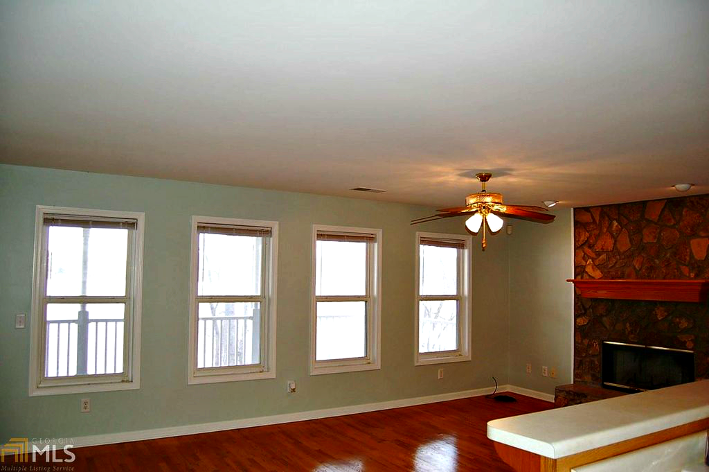
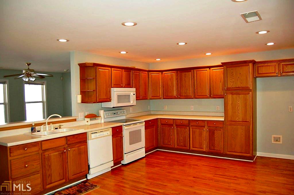
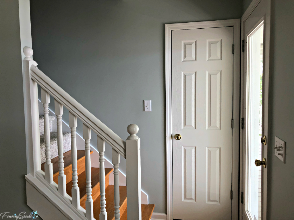
Moving into a new house often involves painting interior house surfaces such as walls, trim and cabinets. This has certainly been the case with our recent move. We’ve painted the kitchen cabinets, painted the master bedroom, and painted walls and trim around new doors and windows.
Before taking on any new task, I like to do my homework to ensure I understand the best way to approach the work. See the More Info section below for some of my go to painting resources. There are lots of great posts and videos providing step by step instructions for just about any painting project so I won’t try to recreate that information here. Instead I’d like to share the top 15 things I learned during my recent painting marathon.
1. Prepare properly. Nearly every set of instructions and every reference on how to paint points out that preparation is key. It’s necessary to clean, sand, cover, tape off and prime to ensure the surface is ready for paint. Don’t underestimate how long this takes. Don’t take shortcuts. It’s incredibly tedious but it’s absolutely necessary to get a quality result.
2. Remove sanding dust. Proper preparation requires sanding; in some cases multiple rounds of sanding are needed on the same surface. Every round of sanding requires careful removal of sanding dust before moving on to the next step. For walls, I found Swiffer Dusters to be very effective especially for drywall dust. For cabinet doors, I found vacuuming with a soft brush on my shop vac and then wiping with tack cloths worked well. Don’t get over zealous with the tack cloth though; wipe lightly to catch the dust without leaving sticky residue behind.
3. Prime the surface. Primer is not just meant to hide the previous color or to provide an inexpensive starting point. Primer sets the stage for the final coat. If the primer is rough or patchy, the final coat will be rough or patchy. With some effort and a lot of practice, I was able to get a near perfect surface with primer.
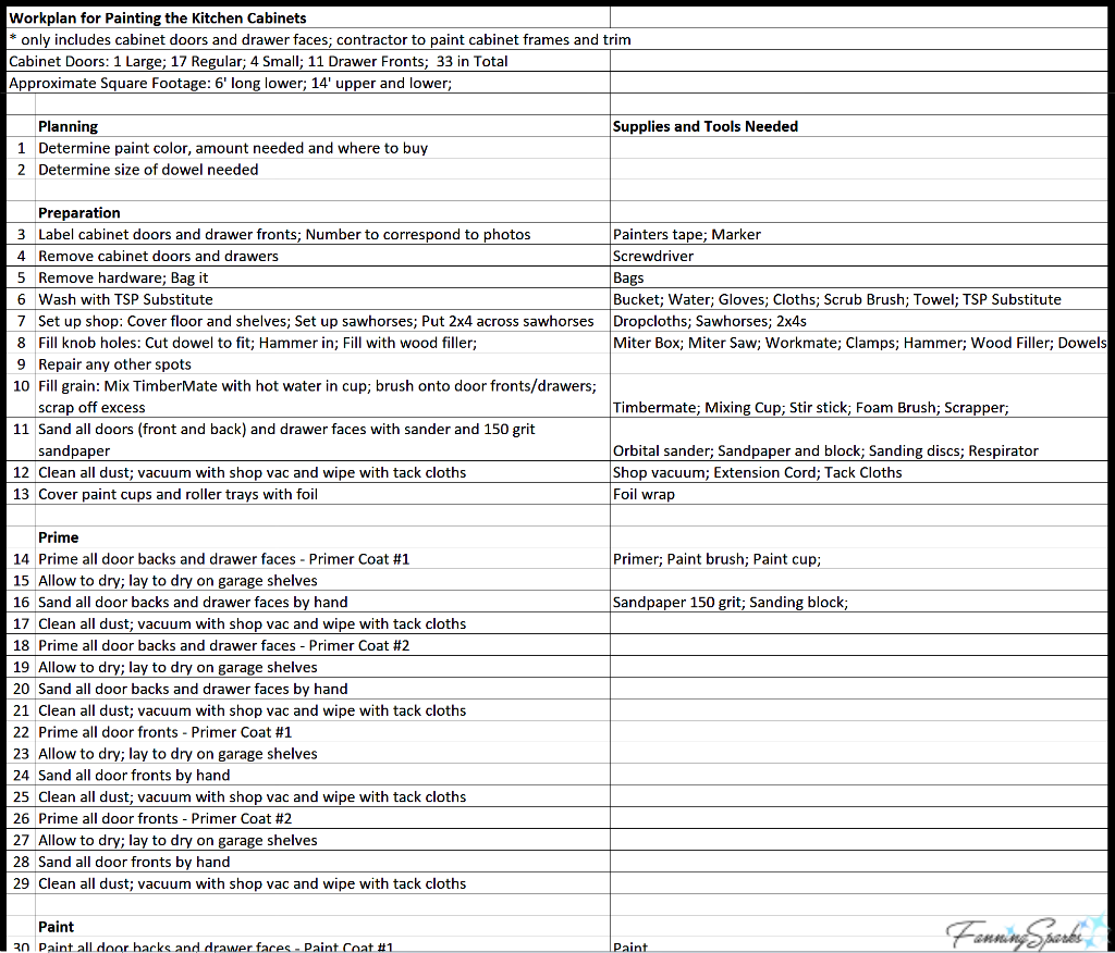
4. Be methodical. Plan the steps needed to complete the work and the supplies needed for each step. It’s probably just the professional project manager in me, but the first time I painted kitchen cabinets I found it really helpful to create an actual workplan with all the steps mapped out in the correct sequence. Adopt an assembly line mind set and take a thoughtful approach. Whether painting the walls of a room or an entire set of kitchen cabinets, break down the work into sections and repeat the same steps over and over again. I found that sticking with the same sequence helped me ensure I didn’t repeat steps in one place or miss steps in another. Here’s a section of the workplan I created for painting my kitchen cabinets.
5. Prepare cabinet doors. Painting kitchen cabinet doors requires some additional preparation.
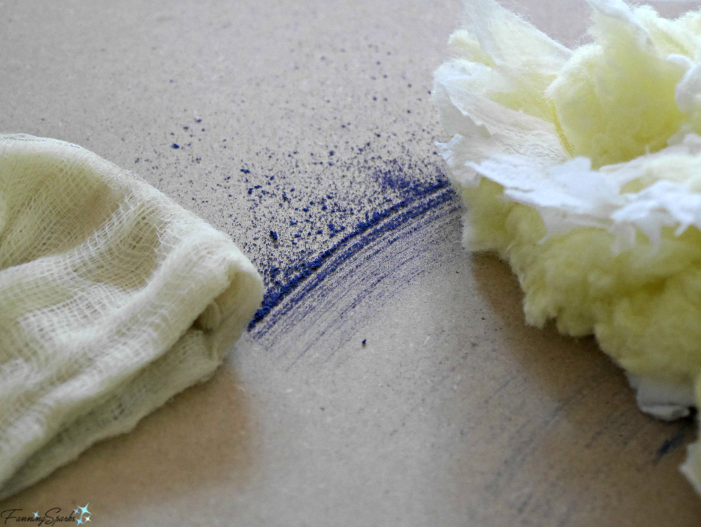
- Hide grain. If the wood grain is obvious (as it is with oak for instance), additional steps are needed to cover the grain. I used Timbermate Wood Filler and would highly recommend it. It’s not cheap and it has a terrible smell but it works great. I mixed the Timbermate powder with water, then painted it on the surface and allowed it to dry. Once dry, I sanded it smooth and level resulting in the Timbermate remaining in only the low areas of the grain.
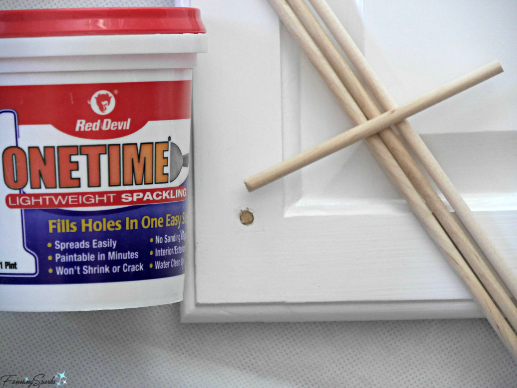
- Fill holes. If the cabinet handles and pulls are being replaced, it may be necessary to fill the old holes. A great technique is to use a piece of wooden dowel to fill the hole. This provides a solid core which can then be smoothed over with filler.
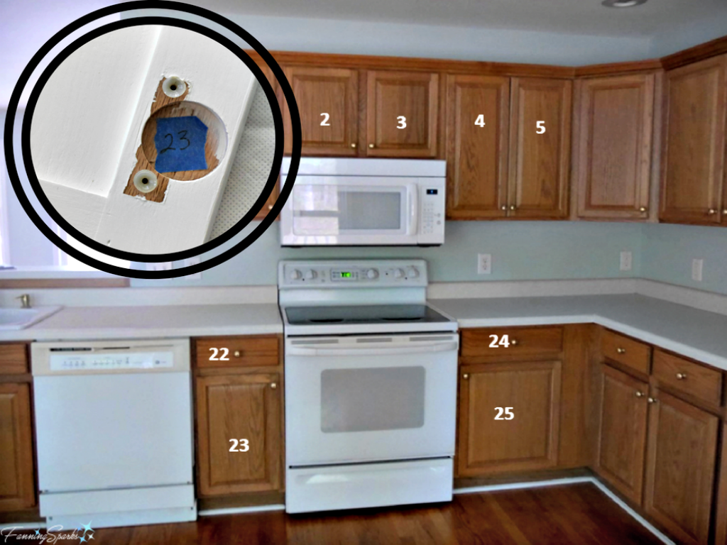
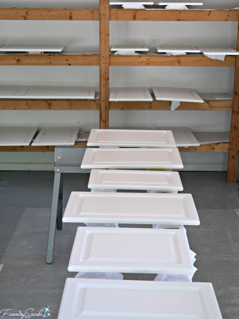
- Number the pieces. Number the cabinet doors and drawers so it’s easy to put them back in the right place. I numbered mine on a photo and then used painter’s tape to mark the corresponding number inside the door hinge holes and inside the drawers.
6. Sand primer; don’t sand paint. There will be exceptions, such as drips or foreign objects that need to be removed, but for the most part when dealing with cabinets and walls it’s best to leave the painted surface alone.
7. Invest in materials and tools that are high quality and fit for purpose.
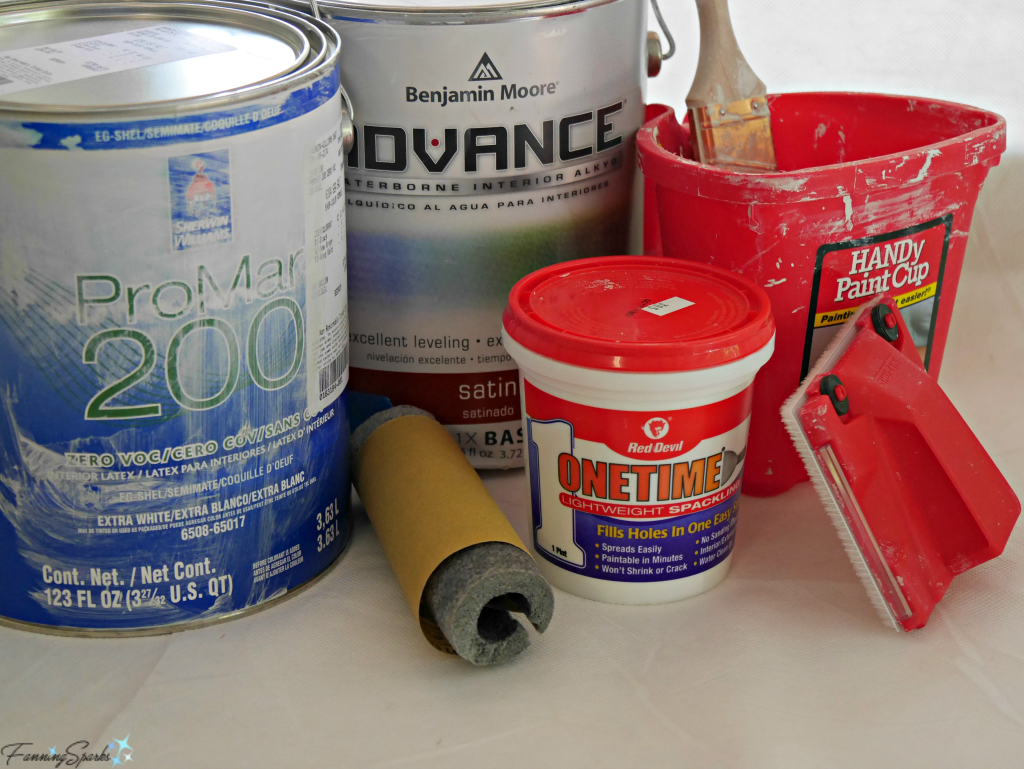
- Select paint carefully. There are a multitude of choices when it comes to paint and there are a multitude of opinions to match. After checking the opinions of the bloggers I trust, I selected Benjamin Moore Advance Waterborne Interior Alkyd in Satin for the kitchen cabinets and I’m really glad I did. For the walls, I simply matched what had been used previously, which was Sherwin-Williams Promar 200 Interior Waterbased Acrylic-Alkyd, and had great results.
- Stock up on filler. Good quality caulking and filler are mandatory. I just learned about Red Devil OneTime and would highly recommend it.
- Gather your tools. High quality brushes and rollers in the most appropriate width are mandatory. Don’t forget to choose the appropriate nap for the roller cover. I tried a couple of new tools for ease and convenience and would highly recommend them both. The Shur-line Edger is ideal for creating a straight line where the ceiling and wall meet. The HANDy Paint Cup is comfortable to hold and saves countless trips back and forth to the paint can. One other, rather surprising, item that has become my go-to tool for sanding concave surfaces, like the grooves around cabinet doors, is a short piece of Tube Pipe Insulation. This foam tube was a perfect fit for my cabinet doors. I simply wrapped a piece of sandpaper around the tube and slid it up and down the groove.
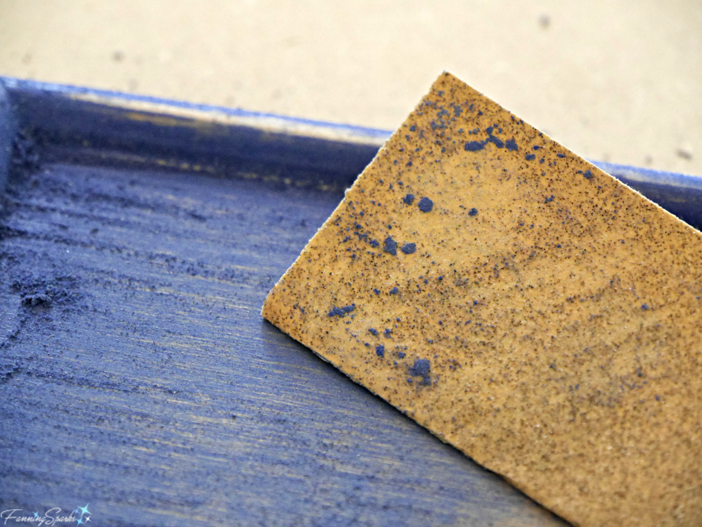
8. Use good quality sandpaper. There actually is a big difference between good and poor quality sandpaper. The grit rubs off of poor quality sandpaper in no time. Worse still, poor quality sandpaper will clog with the material being removed. Then the clogged material will get stuck on the very surface that’s being sanded. Ask me how I know! I had much better success when I switched to 3M Pro Grade Precision Advanced Sanding Sheets. When it comes to sanding, every stroke counts so it’s worth investing in good quality sandpaper.
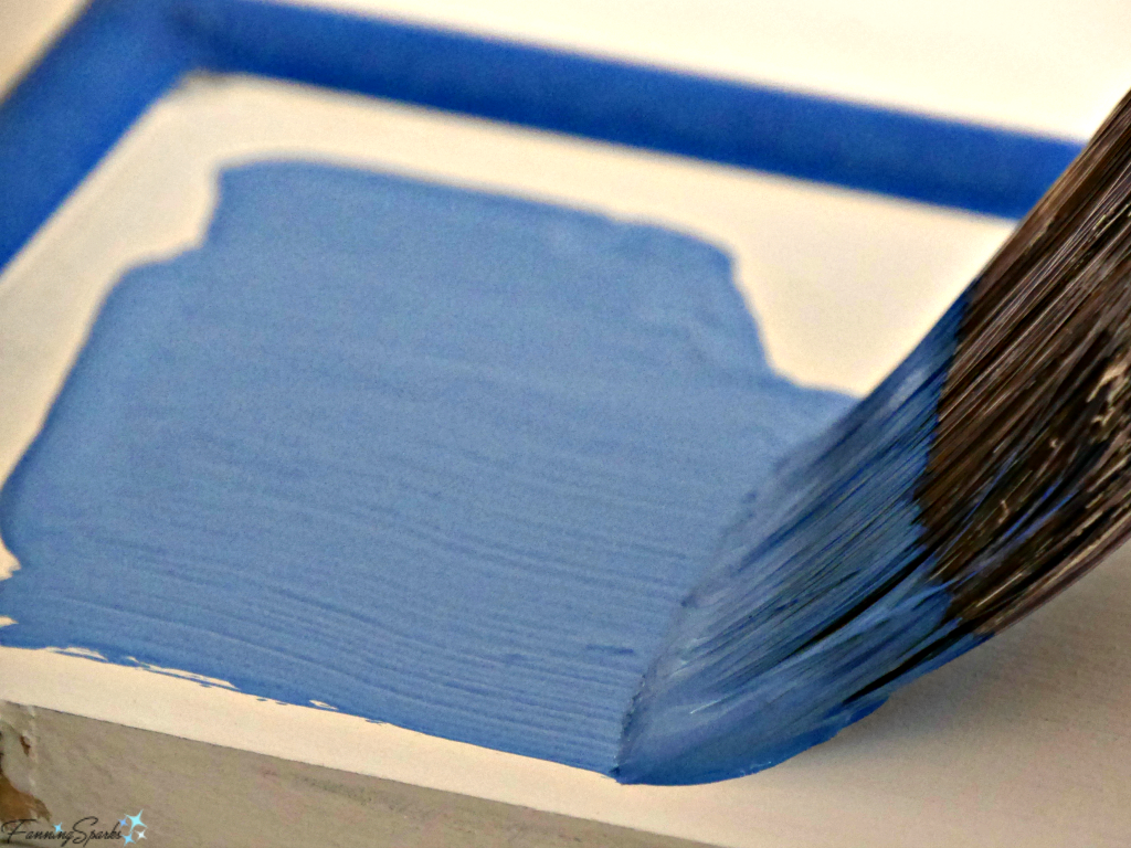
9. Lay off the wall. After painting a section of a wall, take one final pass called “laying off”. Without refilling the roller, carefully start the roller at the top of the wall and roll it all the way down to the bottom in one slow, continuous movement. Align the roller with a slight overlap to the first pass and roll again. Repeat until the entire section has been laid off. Laying off ensures the wet paint is distributed in a nice even layer. I just started using this technique and was pleasantly surprised by how much it improved the final finish.
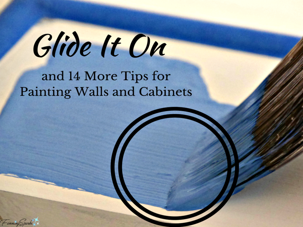
10. Glide it on. The whole idea behind painting is to lay down a nice smooth coat. Paint manufacturers intend for their paint to be applied at a certain thickness called the “Recommended Film Thickness”. According to the Technical Data Sheet on their website, the recommended film thickness for the Benjamin Moore Advance paint I used was 3.6 mils Wet and 1.35 mils Dry. As a point of reference, the thickness of a standard credit card is 30 mil. I certainly did n.o.t check my paint thickness against a credit card but I did remind myself not to overwork it and to lay down a generous, even coat. This has been my most significant learning and has resulted in the biggest improvement in my painting. Glide it on!
11. Let the paint level itself. After laying down a nice smooth coat, step away. Don’t overwork it. Don’t keep going back to touch up here and there. Let the paint work its magic.
12. Give it time. Read the paint can label and follow the instructions regarding drying and recoat times. Keep in mind, the paint isn’t ready for action until it’s fully cured so treat it gently until that time. This is especially important with kitchen cabinet doors which have to be finished on both the front and back. Paint the backs first and “baby them” while working on the fronts. I cushioned my doors with cotton rags to prevent marking the backs while painting the fronts.
13. Remove painter’s tape slowly. Using painter’s tape to mask off areas is common practice. Removing the tape, however, can be a little tricky especially if it has been in place for multiple coats of paint. I’ve found the best way to remove the tape is to pull very slowly and carefully at a 45 degree angle. But sometimes the tape will tear where the paint has sealed. I learned the hard way that I need to stop pulling the tape immediately and use a utility knife and a straight edge, like a putty knife, to cut along the edge and break the paint seal. Every time I optimistically continued to pull the tape, I damaged the newly painted surface.
14. Delay clean up. While cleaning up after a paint job is inevitable, cleaning brushes and rollers between coats can be delayed by storing them in the refrigerator. Wrap the brush/roller in a plastic or zip lock bag, label it and put it in the fridge until the next time. Allow it to come back to room temperature before using again.
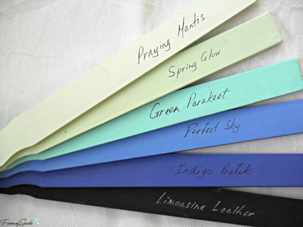
15. Label for reference. Be sure to label the paint cans while it’s top of mind. I simply use painters tape with black marker to indicate the color and where it was used. I also like to keep a set of labelled paint stir sticks for future reference.
Did you find these painting tips helpful? If so, you may want to save the below image to Pinterest for future reference. Do you have tips you’d like to share? Please feel free to comment below.
More Info
Both Benjamin Moore and Sherwin-Williams have great how to resources on their websites.
Three of my favorite blogs, InMyOwnStyle, Addicted2Decorating and TheDIYPlaybook, share helpful painting advice on their blogs. Just look for “painting” in their site searches.
Today’s Takeaways
- Consider leveraging online resources to educate yourself before tackling a new painting task or technique.
- Once you understand the outcome and the approach, consider creating an actual workplan to think through the steps.
- Painting interior walls and cabinets can be a great DIY home improvement project.