Earlier this month, I finally had the opportunity to visit FallingWater. I say “finally” because I’ve wanted to see this Frank Lloyd Wright architectural masterpiece ever since I became intrigued by the famous architect while living in Wisconsin over 5 years ago. Since then, I’ve had the pleasure of visiting nearly a dozen of his famous structures across a half dozen US states.
While few of us will ever live in a house like Fallingwater, there are lots of interesting lessons to be learned from Frank Lloyd Wright’s design philosophies and architectural creations. I’ve noticed a few recurring themes that I’d like to share with you in this post. In the interest of keeping this post to a manageable length though, I’ll focus only on exteriors today and hold interiors for a future post.
Update July 16, 2019: Check out the post, Step Inside with Frank Lloyd Wright.
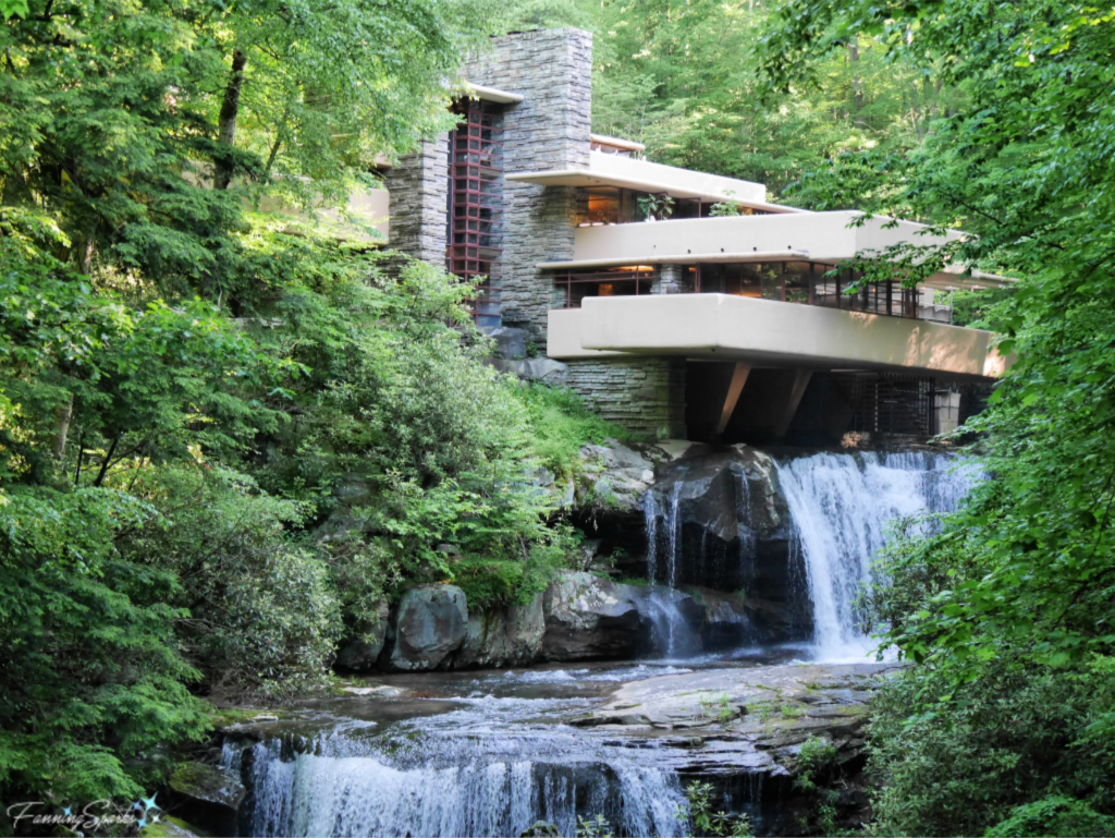 Blurred Lines
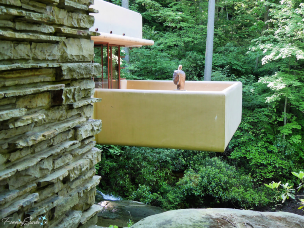
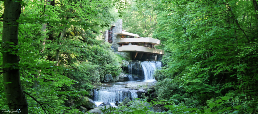
Probably the most remarkable thing about FallingWater is its placement‒it sits above a small waterfall on the Bear Run mountain stream. The Kaufmanns, who owned FallingWater, “were surprised to discover they would be living over the falls rather than across from them. Wright told the family he wanted them “to live with the waterfall, not just to look at it”. Now that’s thinking outside the box! You can see how the living room is suspended over the water of Bear Run in the below photo.
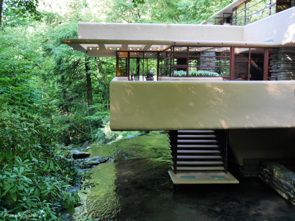 And those stairs that you see coming down to the stream, they are accessed from this glass-enclosed stairwell or hatchway in the living room.
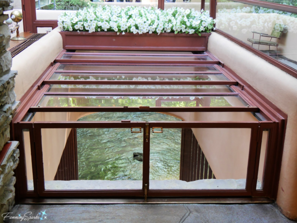 This is a great illustration of one of Wright’s philosophies. He liked to blur interior and exterior space by making the interior decor complement the exterior. The idea of “bringing the outside in” is still popular today. It’s fascinating to see how Wright accomplished this nearly a hundred years ago.
Nature Inspiration
Wright’s most inspirational force was nature. He advised students to “Study nature, love nature, stay close to nature”. Wright is considered the pioneer of “organic architecture” in which natural forms are translated into architectural shapes.
The Guggenheim Museum in New York City, Wright’s last major work, exemplifies the use of organic form. Having had the pleasure of experiencing the Guggenheim firsthand, I can attest the building design is extraordinary. You begin your visit on the top floor and then slowly descend on a spiraling ramp around a huge light-filled rotunda. According to the Guggenheim Museum, “it is thought that a nautilus shell inspired the spiral ramp and that the radial symmetry of a spider web informed the design of the rotunda skylight.”
Horizontal Planes
In the same way FallingWater blends into the Bear Run waterfall, Wright designed his buildings to blend into the landscape rather than perch on top of it. Wright said “I had an idea that the horizontal planes in buildings, those planes parallel to earth, identify themselves with the ground—make the building belong to the ground”. You can see how he applied this philosophy at Taliesin West, Wright’s winter residence and school of architecture in Scottsdale, Arizona.
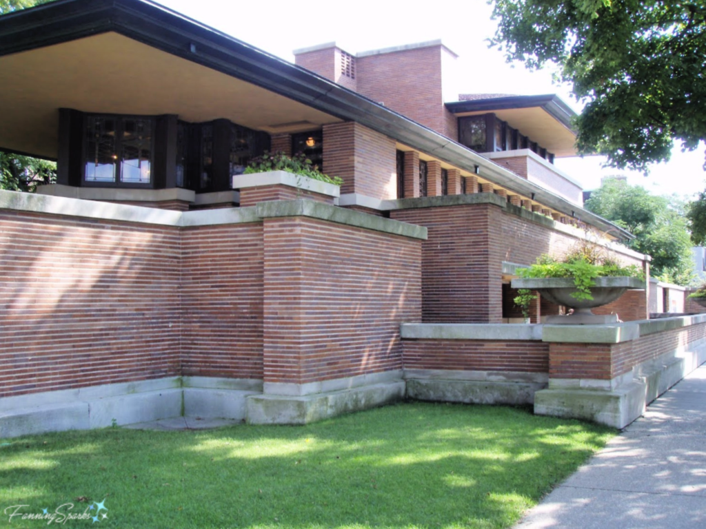
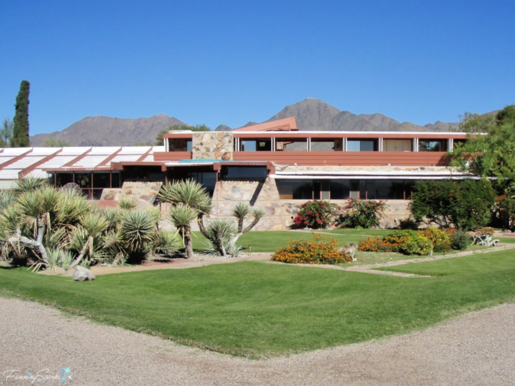 These same horizontal planes are a strong design element in Robie House in Chicago. Robie House is considered the finest example of the “Prairie Style” of architecture which Wright created in the early 1900s.
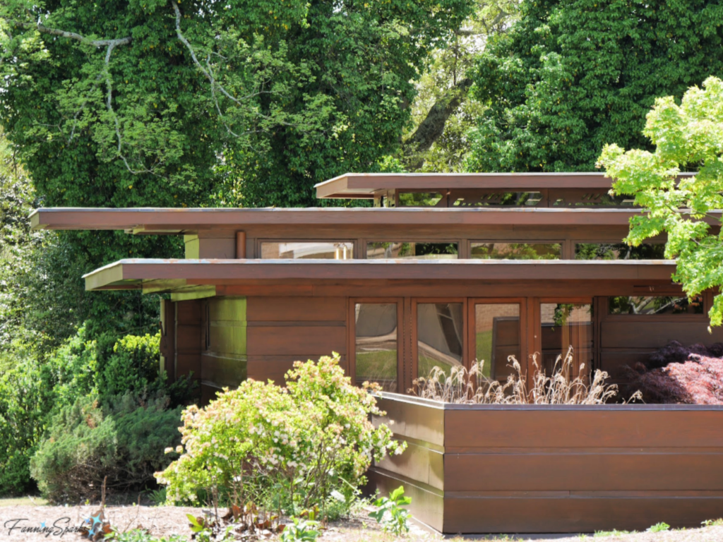
 Rosenbaum House in Florence, Alabama continues with horizontal planes and rectangular shapes. Rosenbaum is an example of Wright’s Usonian style. His Usonian vision was to make home ownership affordable for the American middle class. To accomplish this, he simplified his design (eg by eliminating attics and basements) and reduced construction costs (eg by eliminating the need for specialized labor).
 Natural Materials
Wright used local building materials to create a connection between the structure and its surroundings. At FallingWater, his generous use of local sandstone (on left) creates this harmony.
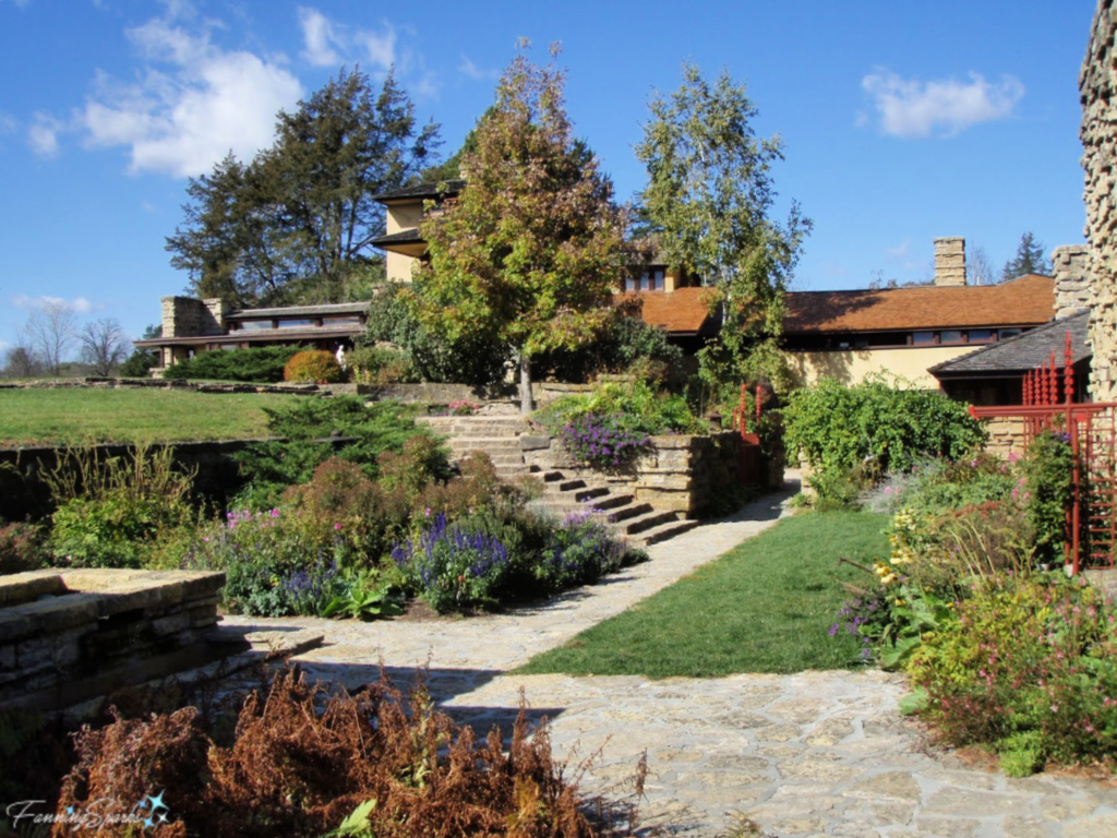
 He used a similar approach at Taliesin in Spring Green, Wisconsin where he chose local yellow limestone and river sand to construct the walls. Taliesin is of particular interest because it was Wright’s home, studio, and garden sanctuary for over 30 years. He used Taliesin as a laboratory for architecture and design and started his school of architecture there. This was the first Frank Lloyd Wright home I had the opportunity to visit.
 Cantilever Construction
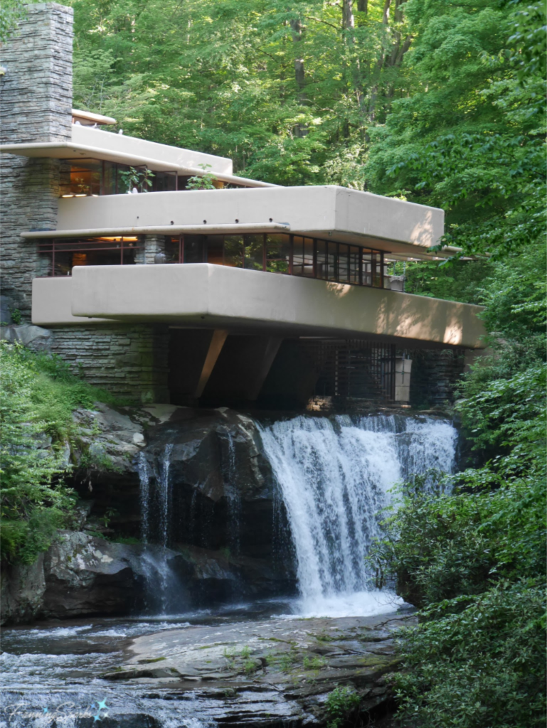
When asked about the source of his design for FallingWater, Wright replied “There in a beautiful forest was a solid, high rock ledge rising beside a waterfall, and the natural thing seemed to be to cantilever the house from that rock bank over the falling water…” I’m not so sure a cantilevered house would be the “natural thing” for anyone other than Wright but cantilever construction (ie where a beam, or other structural member, is supported at one end with the other end projecting beyond its surrounding wall or column) was a technique he used frequently.
 Natural Light
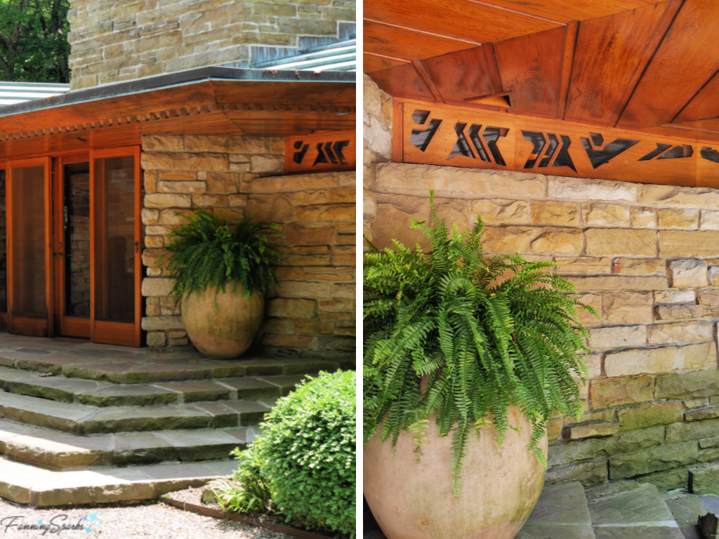
Wright maximized and showcased natural light in his designs. He is well-known for his use of clerestory windows which are a series of windows placed high on a wall to allow light in while simultaneously preserving wall space and interior privacy. Here’s the entrance of Kentuck Knob in Chalk Hill, Pennsylvania with a series of clerestory windows to the right.
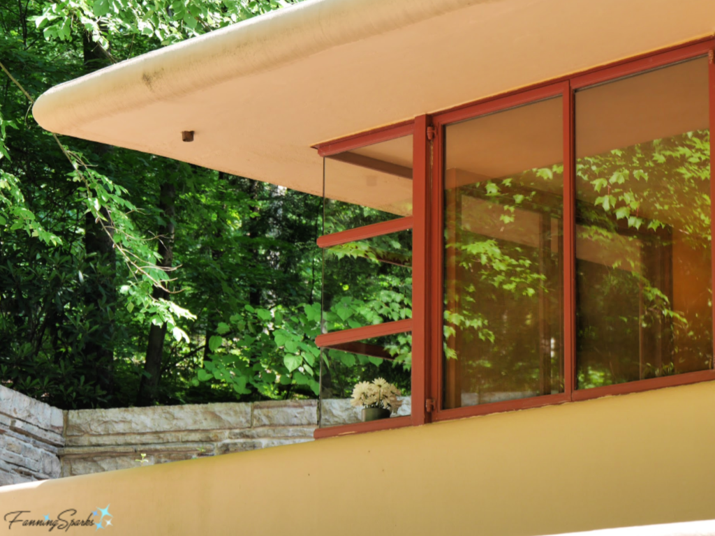
Wright created new and innovative windows along the way. This corner window of mitered glass from FallingWater is a case in point.
 Art Glass
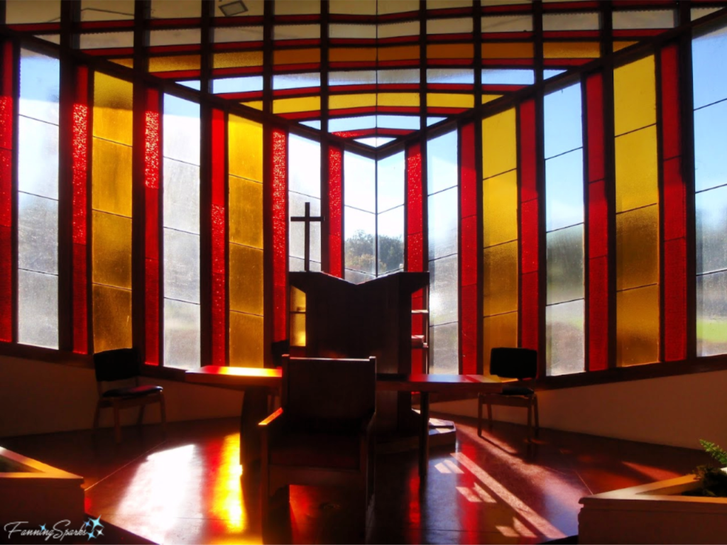
Wright often used art glass to maximize natural light. The exterior walls of the Annie Pfeiffer Chapel at Florida Southern College in Lakeland, Florida are rather unusual. But it isn’t until you enter the chapel that you can fully appreciate those small squares of colored glass.
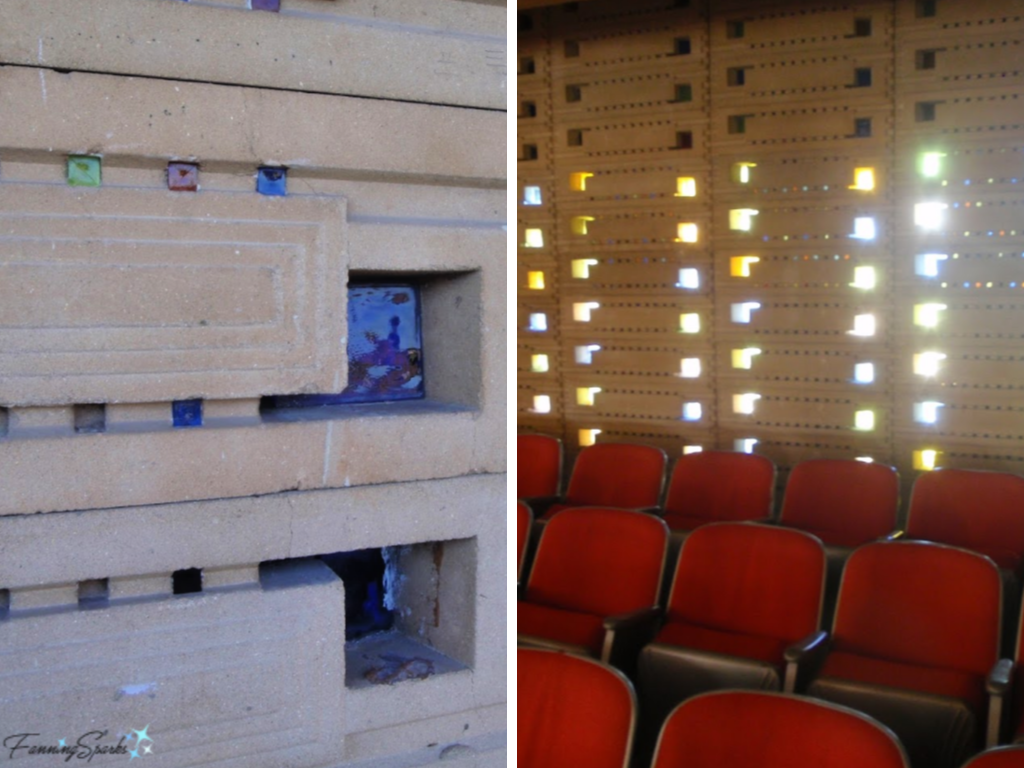 Meanwhile, the front of the chapel has this stunning display of light and color.
 Geometric Shapes
It’s impossible to discuss Frank Lloyd Wright without mentioning geometric shapes. One of his principle methods of design was a system of rotating geometric forms. Interestingly, Wright credits the Froebel kindergarten education he received from his mother for this inspiration. Part of this education included a set of wooden blocks designed to teach design and elementary geometry. Here’s how he put it in his autobiography “That early kindergarten experience with the straight line; the flat plane; the square; the triangle; the circle! If I wanted more, the square modified by the triangle gave the hexagon, the circle modified by the straight line would give the octagon. Adding thickness, getting ‘sculpture’ thereby, the square became the cube, the triangle the tetrahedron, the circle the sphere. … These primary forms and figures were the secret of all effects . . . which were ever got into the architecture of the world.”
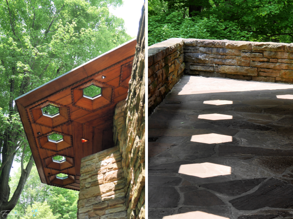
It’s fun to pick out the geometric shapes and forms in Wright’s designs. The hexagon figures prominently in Kentuck Knob. These photos show the hexagonal cutouts in the eaves along with the interesting shadows they cast on the terrace.
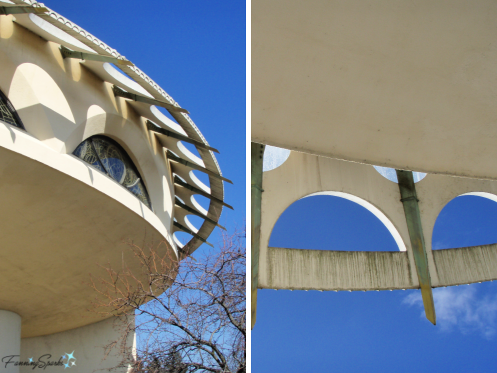
 Circles and semi-circles are prominent in Wright’s design for The Annunciation Greek Orthodox Church in Milwaukee, Wisconsin.
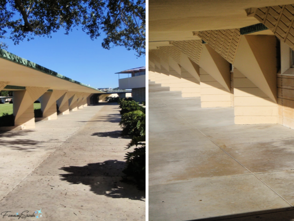
Triangular shapes are seen all around campus at Florida Southern College including along the roof of the central walkway.
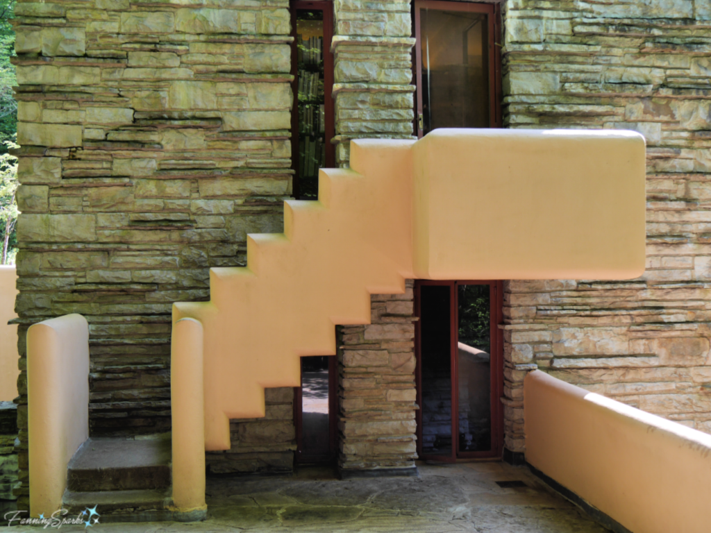
Rectangles, especially arranged into a step pattern, can be seen throughout FallingWater including on this exterior staircase…
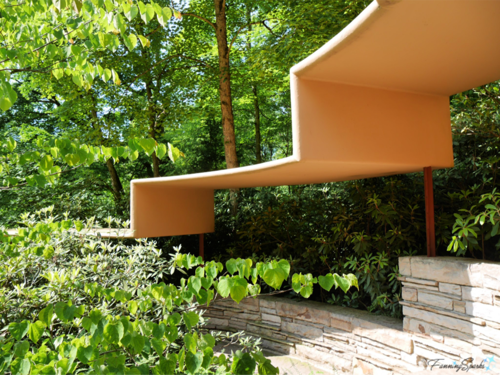
and along the covered walkway to the guest quarters.
Blurred lines, nature inspiration, horizontal planes, natural materials, cantilever construction, natural light, art glass, and geometric shapes‒these are all recurring themes I’ve observed in the Frank Lloyd Wright architectural treasures I’ve had the opportunity to visit. Certainly, all of these themes are evident in Wright’s most extraordinary house at FallingWater.
More Info
Update July 16, 2019: Check out a second post, Step Inside with Frank Lloyd Wright, to see the interior of FallingWater.
There is a wealth of information available on Frank Lloyd Wright and his architectural designs. Here are some links for the buildings mentioned in this post.
. Frank Lloyd Wright
. Taliesin and Taliesin West in Spring Green, Wisconsin and Scottsdale, Arizona (respectively)
. FallingWater in Mill Run, Pennsylvania
. Kentuck Knob in Chalk Hill, Pennsylvania
. Florida Southern College in Lakeland, Florida
. Annie Pfeiffer Chapel at Florida Southern College in Lakeland, Florida
. Solomon R Guggenheim Museum Architecture in New York City
. Robie House in Chicago, Illinois
. Rosenbaum House in Florence, Alabama
. The Annunciation Greek Orthodox Church in Milwaukee, Wisconsin.
You can learn more about the Froebel blocks Wright played with as a child on this website about Friedrich Froebel, creator of Kindergarten and designer of Froebel play gifts.
Today’s Takeaways
1. Consider exploring design outside your chosen discipline or area of focus.
2. Explore a master’s entire body of work.
3. Use a combination of observation and research to identify recurring themes.



Comments are closed.