In the previous post A Before Tour of Our New Casual Lake House, I shared photos of our new-to-us house and I mentioned our plans to upgrade some of the outdated areas. One of those areas was the kitchen. The kitchen has many positive attributes. It has an efficient L-shaped layout, it is open to the living room, has lots of natural light, and is a generous size. It also has a few challenges. The biggest challenge, and the one I’d like to focus on in today’s post, is the front entry.
The house is a Cape Cod style with a covered porch across the front. The front door, which is our primary entrance, is centered on this porch. So far, so good! The challenge appears as soon as you enter the front door; you step directly into the kitchen! To make matters worse, it’s an eat-in kitchen and the dining table is directly beside the front door. Anyone entering the house will immediately be standing at the dining table. Awkward!
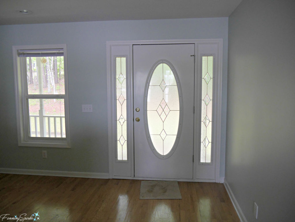
To remedy this functional problem, we decided to simulate an entry by separating the space around the front door. The plan was to construct a half wall, often called a pony wall, beside the front door. Then leverage that same pony wall to support a built-in banquette for the dining area. We engaged a contractor to build this structure. This all worked out as planned but, the truth is, a completely different part of our renovations went a long way to alleviating our concerns.
Our new house has an outstanding view of Lake Oconee. We are fortunate to overlook the lake and a small wooded island. Originally, we admired this view through a series of small windows in the living room.
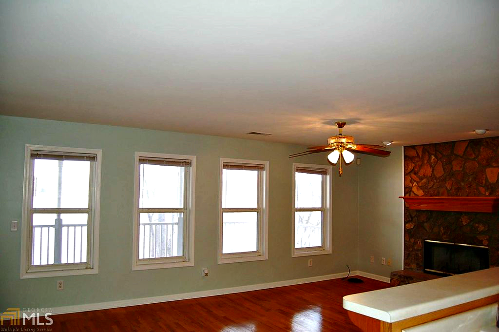
To make the most of our view, we decided to replace 3 of these windows with full size patio doors. The doors lead to a covered porch. Replacing these windows has completely changed our living space. It’s more open and lighter. The indoors space is more connected to the outdoors and it feels more spacious. What we didn’t quite expect is how much these new windows opened up the kitchen.
Back to that awkward situation at the front door. The fact is the lovely view takes over. Walking in the front door, you immediately notice the view of the lake. It’s the focal point.
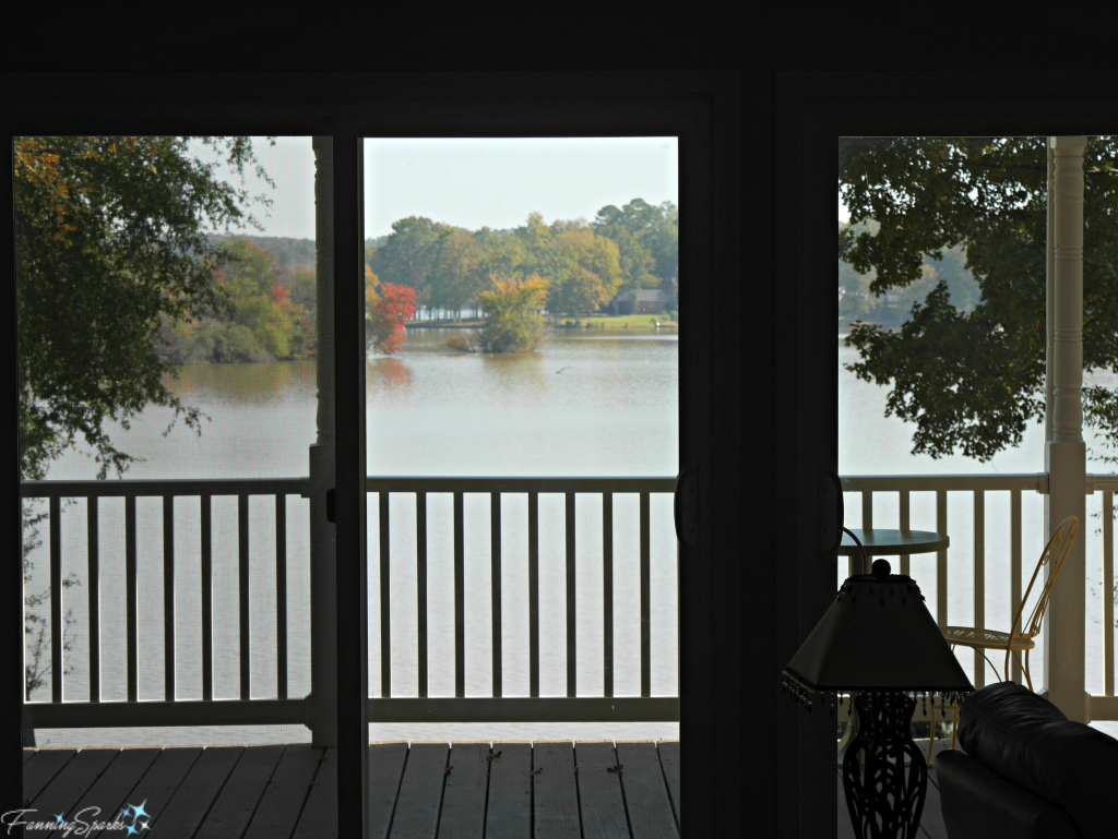
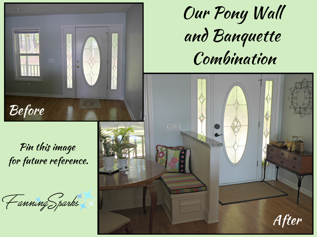
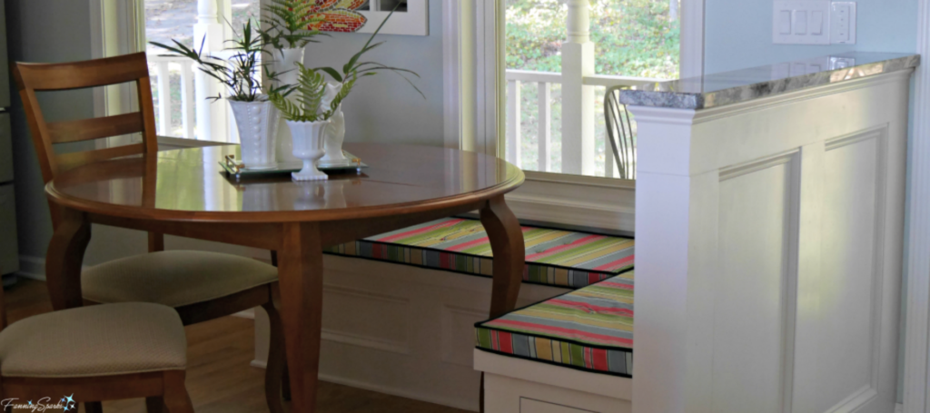
The first impression is the view, not that you’re standing in the middle of the kitchen at the dining table. Of course, while the view is a beautiful distraction, it doesn’t actually solve the functional problem. That’s where the pony wall and banquette still play a role. The pony wall is not large, only 42″ high x 50.5″ wide, but it effectively creates a separate area. This space is furnished and decorated to look like an entry. The area is still just a small corner of the kitchen but it creates the illusion of a separate area.
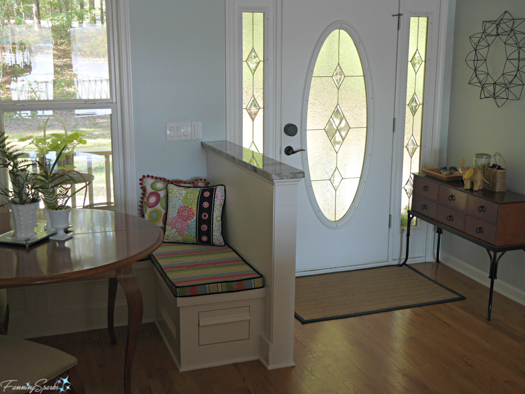
Here’s a before and after comparison you may wish to pin for future reference.
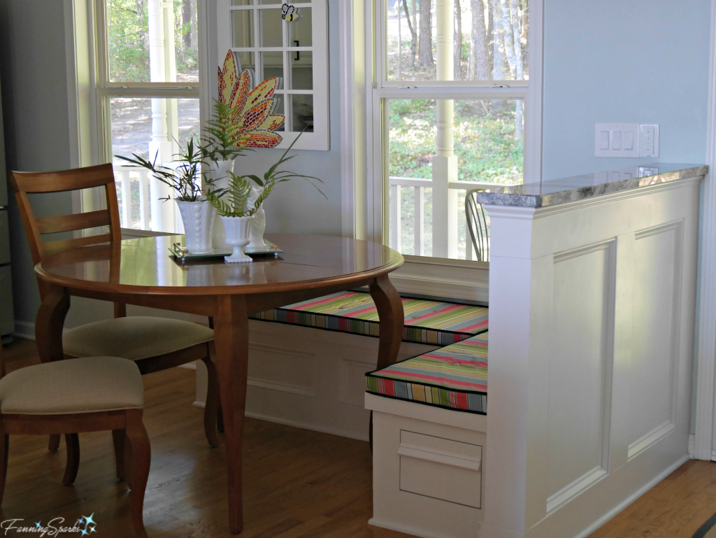
The other half of this build was an L-shaped bench or banquette. The objective was to create a more definitive eating area while maximizing the kitchen space. The pony wall forms the back of the short side of the banquette. The long side of the banquette runs along the exterior wall under the window. The banquette seat is 16″ high (plus 2″ cushion) by 19″ deep.
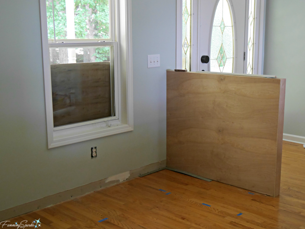
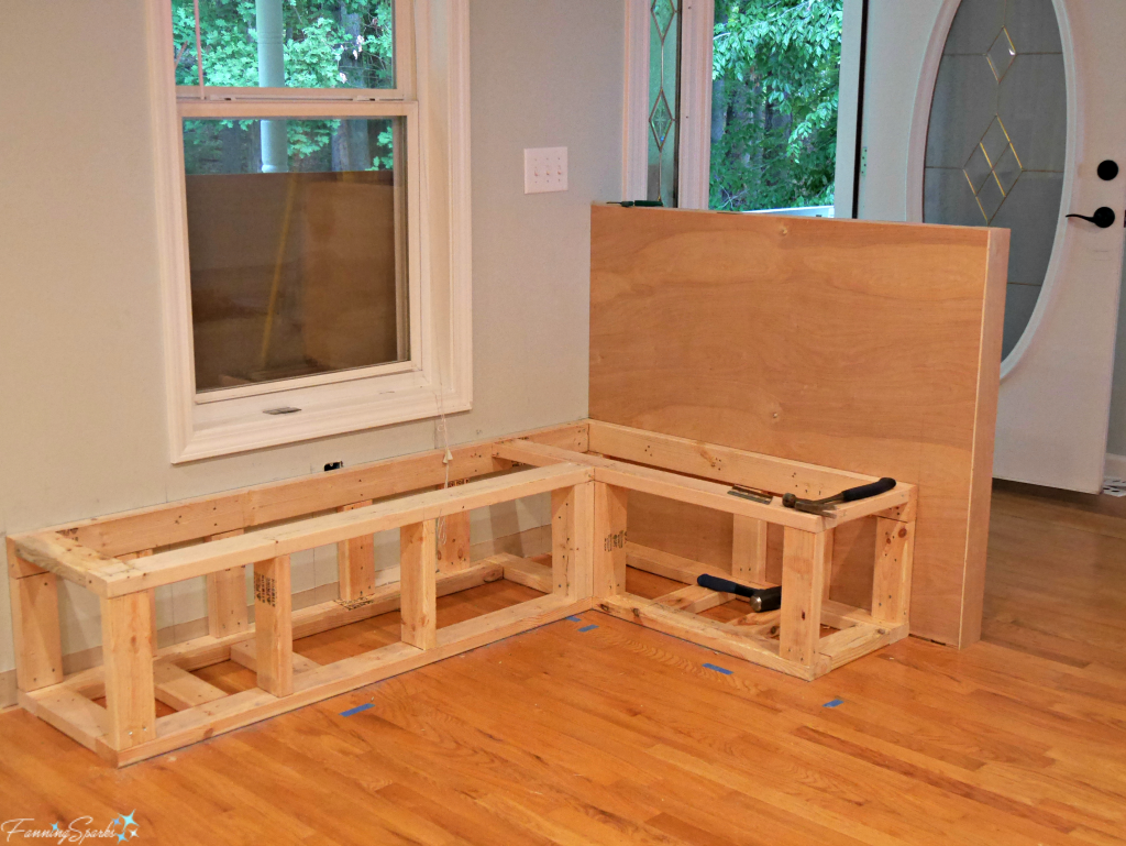
Here are a few photos of the pony wall and banquette under construction. It is surprisingly straightforward.

The pony wall and banquette are painted white to match the kitchen cabinets. The pony wall is topped with a piece of granite from our new kitchen counter tops. This keeps a nice cohesive flow across the kitchen space.
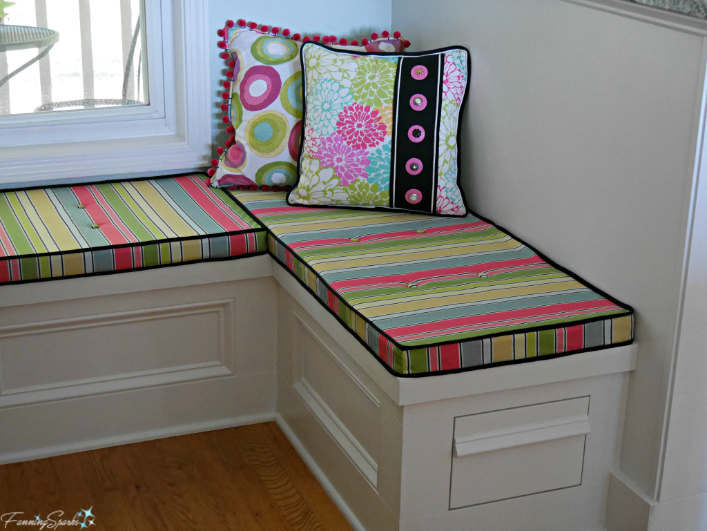
In the final outcome the banquette serves many purposes. It provides built-in seating at the dining table. In conjunction with the pony wall, it serves to visually separate the entry from the main kitchen area. It provides extra storage with built-in drawers. Plus it’s the perfect place to use some textiles and introduce color and pattern into the kitchen.
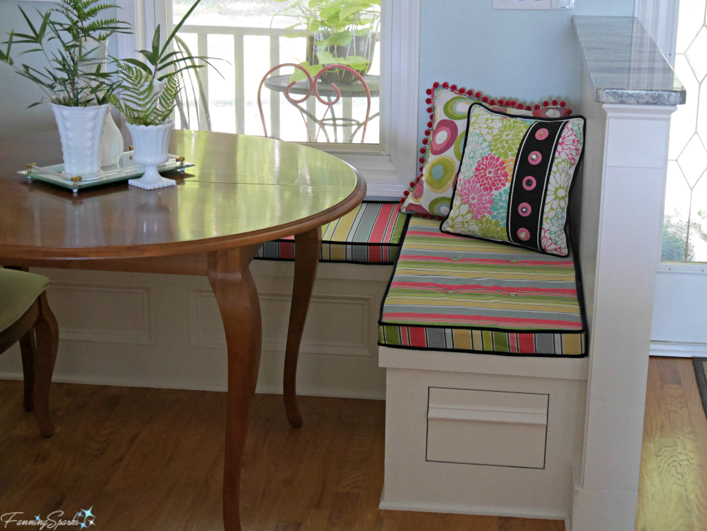
We’re pleased with how the pony wall and banquette combined to solve the challenges in our kitchen. Thankfully, the big functional changes are done and we’re now contemplating decor and finishing touches. Should we switch to a pedestal table? What about a pendant light over the table? Should we replace the rug? And so the fun continues!
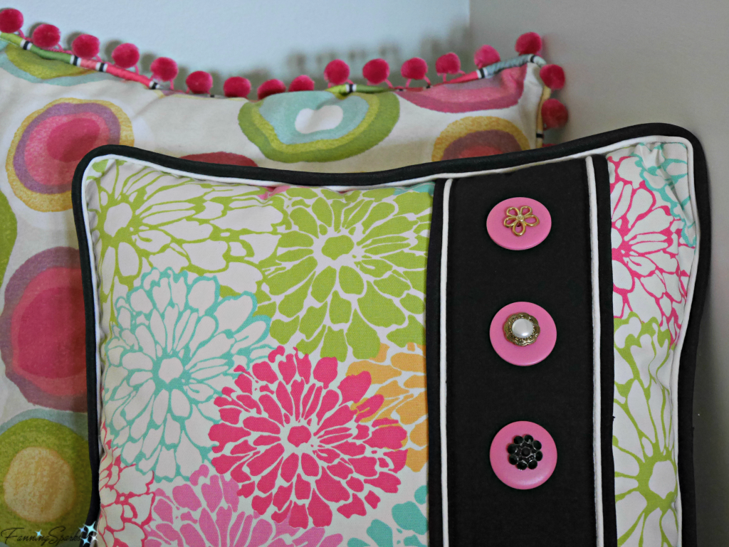
Speaking of textiles in the kitchen, I had great fun designing the banquette cushion and pillows, choosing the fabrics and embellishments, and sewing it all together. I look forward to sharing the details with you in my next post where I’ll provide a tutorial for these bespoke pillows. See DIY Bespoke Pillows Tutorial.
More Info
See the Pinterest board, Banquettes and Pony Walls – FanningSparks Favs, for more ideas and inspiration.
Special thanks to our contractor, Neil Griffin, for his work on this project.
Today’s Takeaways
1. Consider constructing a pony wall to separate space without blocking it off completely.
2. A banquette can help maximize seating space at the dining table.
3. Consider using the combination of a pony wall and a banquette to address functional challenges in your home.




2 Comments
@Marian – Yes, there are two drawers… one under each end of the bench. We’re really pleased with how it turned out. Glad you like it too! Thanks!
Beautiful! Love both the concept and the way you pulled it off.
The colors are great!
Is there a storage drawer on each end of the bench?